Sunday, December 5, 2021

Transformers Cyberverse Deluxe Slug review

Cyberverse surprised fans with the late but welcome inclusion of the Dinobots, and while their personalities are different from the G1 incarnations (which is honestly fine by me since it's its own universe), I'd rather have these guys and a female Swoop over the G1 incarnations being poorly written in the Netflix WFC series. If anything, I dug seeing how Slug was depicted in the show given how he doesn't just feel like Grimlock with a different name and a Triceratops. So with all that covered, we've now gotten him with merchandise representation, with Sludge having an Ultra and Snarl having a Warrior figure (Swoop is only a crash combiner piece). The previous addition was Cheetor, who died in Season 3, but now we have another Dinobot to join Grimlock, so let's see how Slug turned out!


Here is Slug in his triceratops mode. It's quite a stylized take on the old G1 design, which makes sense given how Cyberverse works with that sort of approach. If anything, I dig the colors that he has. The sculpt work is good for a stylized bot, but the gold combined with the dark gray and rich red makes him look nice for a basic Deluxe. The translucent red horns are especially lovely when it comes to how the plastic is used for those pieces only to make it feel a little more powered up. The gray is much better than on Grimlock's as we'll get to in a moment, and the gold doesn't look faded and pops more because of how it's plastic.


The side profile has some small gaps here and there, and you can see some parts that block the joints for the articulation, but at least it's okay for this figure since he is a Deluxe from Cyberverse and has a beast mode where posing isn't easy.


The weapons can combine and be stored on the back of the beast mode, which I think works well for the cannon since it's almost like an added artillery mode. The ax...not so much, even if it does have a 3mm peg for the attack mode. For a size comparison, here he is with Cyberverse Grimlock. You can see how obviously different the two beast modes are, and even if Grimlock is smaller, he doesn't look too small next to Slug. More importantly, the colors used on the two are different overall. Grimlock has a lighter gray and his yellow details are all painted on, which means he could go for an extra coat of paint. Sadly, the lighter gray plastic on Grimlock means that parts of him are prone to photodegradation. His forearms and the parts near the legs have yellowed, which is more noticeable under sunlight. Guess this means I gotta paint Grimlock in the same colors as Slug's gray...


Transformation for Slug is a little more creative for the G1 concept. Normally, the rump becomes the legs, the forelegs become the arms, and the triceratops head tucks in the back, and you're done. Here, they went a few creative steps, from the use of a waist swivel AND a dino head swivel to accompany the chest transformation, we even get a fake lower mouth to complete the look in a way the real one can't. It's a pretty neat transformation that I feel surpasses the Studio Series 86 version just for its creativity. The resulting robot mode isn't 100% accurate to the show, which I do believe is from Hasbro toy designers and Boulder Media having different concept art provided to one another in order to meet the deadline of the new TV movies once they found out that there was more demand for retailers with selling more Cyberverse toys as they didn't initially plan on putting out a new Transformers show until 2022-3 due to the Nickelodeon deal. So as a result, Slug, while still looking good, doesn't quite capture the character design in terms of coloring. Like the shins and shoulders should be gray. At least the robot mode is still nonetheless able to resemble the design as closely as it could, albeit being a little chunkier. There are two 5mm ports on the back for weapon storage, which I didn't even notice until making the review. Oops.


Head sculpt is the biggest inaccuracy to the character design, much like with Thunderhowl's masked face. The outer parts of the top should protrude more, while he never had a visor in the series. Still, he at least looks like how a Slag would look, even if it's not 1:1 to the cartoon. His articulation is pretty much consistent with every Deluxe figure made since Siege. Head is on a ball joint, shoulders move front and back, in and out, there are no bicep swivels, but the forearms do swivel. There is a waist swivel, the hips move front and back, in and out, the thighs swivel, the knees bend, and the ankles pivot.


The accessories are usable this time for the robot mode in proper glory, with the axe now feeling more like a hatchet, and his gun with a unique blast effect piece (thinking about it, the Cyberverse blast effect pieces are both unique from the Siege ones and may not be as compatible). I feel tempted to give the cannon to Grimlock, but it fits well with Slug, too. The lack of bicep swivels does make his posing options a little hampered.


For a robot mode comparison, here he is with his king, Grimlock. Once again, I think Slug looks better due to the plastic colors, though I will admit that Grimlock, with having 2 years of screentime on the show, does grant him the more accurate toy. Still hate how parts of him yellowed. I feel tempted to get Warrior Snarl and Ultra Sludge, even if their quality would be worse than Slug's (Sludge, especially). And that does the proper wrap-up to the Deluxe line of Cyberverse characters. Now that the series itself is ending, I'm sad to see their take on the Deluxes disappear after Slug and Cheetor completed the collection. No Build-a-Figure pieces as with the third wave, and fewer characters to choose from. I'd love to have seen Windblade, Shadowstriker, Sky-Byte, Slipstream, Wild Wheel, Perceptor, Jetfire, Strika, Clobber, Lockdown, Dead End, among other characters. You may notice I mentioned more Decepticons than Autobots, and, well, look at the last image! Such a heavy bias, and I'd say worse than the balance between Bots and Cons in the RID15 Warrior line-up. Either way, Slug's a nice figure to have, even if he is the last of the Cyberverse Deluxe line-up. Let's hope the next cartoon can deliver good toys as well as a good show.


Final ranking: ⭐⭐⭐⭐ out of ⭐⭐⭐⭐⭐

Wednesday, December 1, 2021

Power Rangers Lightning Collection Blue Space Ranger vs Psycho Silver review

I'm kind of surprised at how sparse the attention towards the Lightning Collection is on my end. That and how much I decided to skip. Ignoring any roleplay items and the Megazord coming soon, I skipped 2 figures in 2019, 10 in 2020, and 20 this year. I'm still waiting for Wave 10 as well as the Cog 2-pack but most of the 2022 releases will be skipped (mainly the Ninjetti and monster stuff as well as the repeat of In Space Blue). Speaking of, we've already got one as well as the return of the Psycho Ranger tooling now colored silver. This moment of events from In Space was fascinating, since not only did Zhane disguise himself as a fake Psycho Ranger, but the whole team pretended to be Blue Rangers in order to trick Psycho Blue and the rest of his team into utter confusion until he was killed. And while it'd be neat to kill 2 birds with one stone to include regular Silver, it'd make sense to recreate this iconic moment. Now let's get into the review!


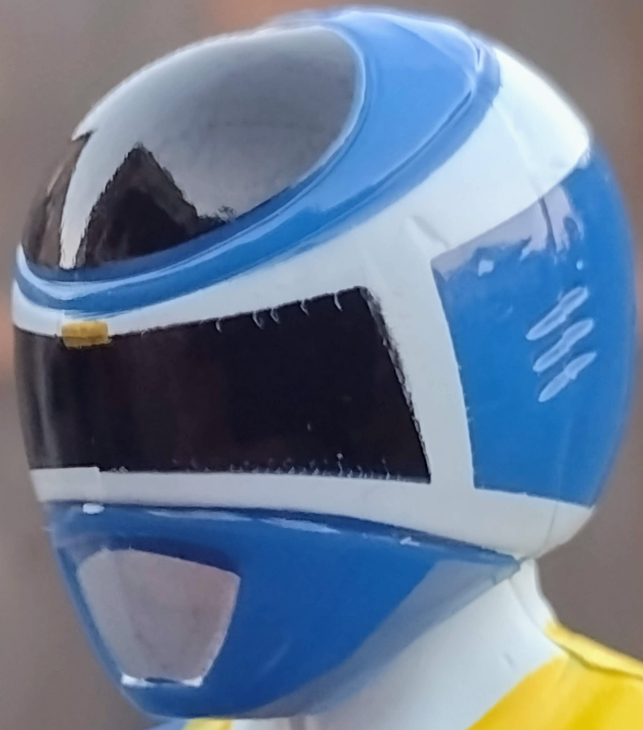
Here is the Blue Space Ranger in-hand. As you can see, he's basically the same as we have seen with the previous Red and Black Space Rangers covered in the past.  Same color lay-out, same details, just that the Red is replaced with Blue. As far as quality control is concerned, I have no severe issues apart from the alignment of the white paint apps under the butterfly joints. Apart from that, nothing out of the ordinary or missing otherwise.


Helmet looks pretty accurate to how it should look, though the lack of a sculpted visor does make it feel a little more basic reminiscent of the bootlegs. What is it with In Space being bootlegged as much as Dino Thunder and SPD? Anyways, the paint apps are mostly placed well wit ha slight misalignment here and there but nothing that'll piss me off like on the occasional mess up. Articulation is the same as with every normal Lightning Collection figure: he has a ball joint at one part of the neck and a hinge at the other, butterfly joints, shoulders that move front and back as well as in and out, swivels at the biceps and double-jointed elbows, wrist swivels, hands that hinge in and out, and both a diaphragm joint as well as an ab crunch. Hips move front and back as well as in and out, thighs swivel, knees bend at two points, boots swivel, and the feet hinge up and down as pivot at the ankles.


As far as the accessories of the Blue Space Ranger are concerned, you get the typical effect piece, a civilian head in the form of TJ Johnson, the Astro Axe, the Astro Blaster, a right fist, and a left karate chop hand.


The display options on this guy are great as always, and the likeness to the Selwyn Ward is pretty solid if you ask me. I'm sure some people are still upset that he can't have the gun separate in two pieces or combine with the axe, but I don't care.


This guy is being re-released (a little too soon, I might add), so basically in trade of the Psycho Silver Ranger you get the Astro Glider. Which is pretty basic compared to the other Lightning Collection vehicles so far. Like, 2020 at least gave us the Omega Unicycle and 2022 is said to give us the Wild Force Rider, so this may be the weakest of the vehicles in the Lightning Collection so far. Also, here he is for a comparison with the Legacy Collection and Bandai 5 inch counterparts. Same points as with Red, Black, and Yellow.


For a comparison between him and his allies, you can basically tell that the main differences include the main coloring of the suits. And the visors. And the weapons. And how well the squares are painted on the chest. I think Black's is the worst when placed next to everyone else.


And here is the Silver Psycho Ranger. It's nice to see this use of the figure again after not buying a new repaint of it for so long. Once again, this tooling is found in a multipack, with Blue and Green being the only ones to have standalone releases in the form of retail exclusives. I'm sure we'll eventually get a normal release of Black, Yellow, and Pink in some capacity someday. But yeah, the shade of silver used on him looks great, and it makes him look more premium than the other versions of the Psycho design.


Head sculpt is the same as before but with silver paint, and the same can be said for the articulation of the figure apart from the chest armor hindering some movement.


His accessories include a civilian head for Zhane, an evil version of his Super Silverizer, and two of the traditional alternate hands of a Psycho Ranger.


The display options are a little more unique for this guy since Zhane is the only Psycho Ranger to come with an alternate head, which has a good likeness to the actor Justin Nimmo. As for a comparison with his Bandai Legacy counterpart, it's the same as before: they're both good in their own rights, but Hasbro's is easier to get.


And here are the other Psychos in one shot that I own so far. These are the NFT Rangers, but don't say that to the fans because they hated the black and gold Megazord (I don't care because I am not interested in a repaint of a mold I'm not sure I'd get right now).


 And that covers the 2-pack! I'm quite happy with how this one turned out. It's great to get another Space Ranger and further reach the completion of a team with TJ, and it's also nice to have another Pyscho Ranger after not getting another one yet since Green last year. Also, both look great with their alternate heads on the figures.


This set is also great to own if you're a fan of the episode where there were 5 Blue Space Rangers as well as the Silver Psycho Ranger thrown into the mix. It makes me excited to get the Pink Space Ranger (even with her incorrect shoulder details that the PR fans had a meltdown over) and the real Silver Space Ranger (hopefully he'll be as easy to get as Dino Thunder White and MMPR Black). At first, it might not be as exciting to get this set since the figures generally have the same beats as the rest of the Space and Psycho teams.


But then I realized that I'd rather kill 2 birds with one stone than have copies of two MMPR girls when I'd be more interested in getting the more desirable Scorpina and Zeo Pink. Maybe someday. But otherwise, get this set if you must. Complete your teams. You won't regret it. I'm happy to wait for this set than get the Metallics, honestly.


Final ranking: ⭐⭐⭐⭐ and a half out of ⭐⭐⭐⭐⭐

Sunday, November 28, 2021

Marvel Legends Gamerverse Miles Morales Spider-Man review

I can't believe I forgot to give attention to Marvel's Spider-Man: Miles Morales last year, but I did make up for it by covering his cinematic debut from Into the Spider-Verse. I also reviewed the Marvel Legends figure that better captured his appearance from the movie, but I always wanted a Miles Morales figure that would capture his more serious side as much as I did his animated side. Thankfully, I was able to get exactly that in the recent Marvel Legends wave of Spider-Man characters, tying in both the game, the No Way Home movie, and the general comic lore, all within the Armadillo wave. Now, I'm not sure if I can get this wave in a consistent go like I did with the Stilt-Man wave, but hey, anything is possible if we try hard enough. Plus, I have preorders to fulfill right now. Thankfully, we have this guy to cover because I loved Miles' character!


Here we have Miles Morales Spider-Man in-hand. I have to say ight off the bat I like that the figure's suit details are sculpted instead of merely being paint apps, which is something I will get to shortly in the review. The use of black with red highlights is always an awesome combo, especially in the places where it's used on Miles' suit. It makes for a stealthy yet distinct appearance that helps it stand out from the other black suits in Spider-Man lore, especially the Symbiote one. The web pattern, apart from not being sloppily applied on my copy, reaches part of the torso, leaving for a more modern appearance that doesn't aim for rinse and repeating the same suit tropes of previous incarnations of Miles or the suit in general as far as web patterns are concerned. While they're not painted (which is accurate), the linework on the suit design is quite well implemented and doesn't feel underdone nor does it ruin the suit's sleekness. The proportions are also fitting for Miles' character. In general, the looks of the figure are well-made.


Head sculpt is accurate to the way it would look in the games, from the web pattern to the details of the lenses, which have a similar trait that the MCU Spider suit introduced with emoting lenses that have the shutter lenses of a camera. It's a neat way to make the eyes emote, and one of the few good ideas of the MCU incarnation that is better implemented with superior suit designs seen in the Insomniac games. For his articulation, the head is on two ball joints, adding more expressive range than the normal single ball joint and neck hinge. The shoulders are on butterfly joints, and they can move front and back and in and out. There is a bicep swivel, a double-jointed elbow, and both hands can swivel on their peg as well as hinge in and out. The torso can ab crunch back and forth, and the waist can swivel. The hips can move front and back as well as in and out, the thighs swivel, there are double-jointed knees, and the feet hinge front and back as well as pivot side to side.


For the accessories, you get two electric hands based on one of his attacks, two relaxed hands, two web-thwipping hands, and a Miles Morales head sculpt. The hands are equally painted nicely like the fists are, though the right thwipping hand's pinky is a little bent inward...ouch...


The display options are neat as always, giving you plenty of ways to pose the figure with either matching hands or a mixed combination of them. The alternate hands being translucent combined with the lightning effect is appreciative since it doesn't look jarring overall. As for the Miles head, it does seem a little more like an older version of his appearance in the game, though it may just be from Hasbro not doing it exactly like the Insomniac model because of how different a CGI human will look when made into a toy. At least it fits the character fine enough.
 

For a variant, Gamestop has a Camo version of the guy, basically in clear blue plastic and no alternate head.


He comes with the right leg of the Armadillo, which means you may need to get the rest of the line if you want to omplete him. Interestingly, the only figure to not come with a BAF piece is the No Way Home version of MCU Spider-Man, and I mean the one with the red and black suit with the golden logo and not the stealth one or whatever he had or will have in the movie. Then again, I'm sure casual Legends fans wouldn't want to be burdened by BAF pieces of a character they don't have much knowledge of, which is fine. Now for a comparison between him and his fellow Insomniac buddy, you can see how much better Miles Morales looks in terms of capturing his game appearance. The first Spider-Man wasn't bad, it's just that having the details being printed on instead of raised in relief like they are on the Miles figure. I do wish they both would use the same tooling of articulation that the second Retro-inspired Spider-Man would have since he has the same torso articulation of a Lightning Collection figure as well as boot swivels, which Peter has but Miles lacks. Otherwise, Miles Morales feels like a better done figure overall compared to Peter Parker, which REALLY makes me hope that if we get new sculpts for the Gamerverse suits of Peter himself, then we get a proper update on him in Spider-Man 2 with raised details in relief as well as a head-sculpt that better suits his appearance. Just don't give him the face he has in the PS5 version of the first game.


Final ranking: ⭐⭐⭐⭐⭐ out of ⭐⭐⭐⭐⭐