Friday, March 11, 2022

Power Rangers Lightning Collection Ecliptor & Astronema 2-pack review

Power Rangers in Space has plenty of great antagonists, and it's awesome that the two most recognizable examples are in a single 2-pack for fans to obtain in one swoop. Ecliptor was one of the mainstays of that season, no doubt being best known for his association with Astronema, his rivalry with Andros, and the fact that he had a few forms in the show, from being fused with Darkonda to having a red upgrade that destroyed the Delta Megazord. It's such an amazing feat if you ask me, but that's t's quite a lot to say about the villains since before this line existed, they never received any merchandise attention outside of Ecliptor having one action figure only during In Space (Astronema had 0 until now), but Hasbro is more than happy to give us the figures we all wanted, so let's see how they deliver with such a feat!


Let's go over the new mold, Ecliptor. This guy has both the slick green gridlines added throughout him in a surprisingly consistent and clean manner apart from maybe the slightly rough look on the right forearm, but the asymmetry is captured very well with this figure, from the forearms to the torso, and from the forearms to the head design. Even the waist has a bit of asymmetry to it. With how simple the coloring is for Ecliptor, the addition of a gold bracelet for the left forearm combined with the red eyes add subtle additions to his appearance where he'd otherwise look repetitive with the coloring.


Headsculpt is very well done as mentioned before, and I have to give props to Hasbro for making sure the paint apps look aligned properly in addition to having them not look as transparent as they'd normally be on a dark surface like Ecliptor's face. His articulation is the same as with just about every anthropomorphic character in the Lightning Collection, with his armor design having a few hindrances here and there. He has a ball joint at one part of the neck and a hinge at the other, he may have butterfly joints but those may be hindered by the shoulder armor, and the shoulders vary on how they move front and back as well as in and out when it comes to how the pads work with the pectoral armor. There are swivels at the biceps and double-jointed elbows, wrist swivels, hands that hinge in and out, and both a diaphragm joint as well as an ab crunch. Hips move front and back as well as in and out, thighs swivel, knees bend at two points, boots swivel, and the feet hinge up and down as pivot at the ankles. His own sword, which is picked out in a handful of matching colors, can be held by a hand that hinges downwards as one would expect for a swordsman, and it also has an effect piece that not only has you wrapping it around but also helps you break up its coloring.


The lightning-related effects don't stop there, as there is a massive lightning effect piece that can merely be rested on him to make him look like he's absorbing power so he can then use it against his enemies with his shock attack, reminiscent of the Psycho Rangers and Emperor Palpatine of Star Wars fame. Comparing him to his only other figure, it's no contest; I know some may be fond of the older figures for the nostalgic charm and probably better plastic quality, but rose-tinted nostalgia aside, Lightning Collection wins.

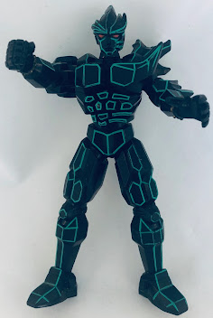
For repaint history, this is Red Ecliptor. He has been essentially retooled in a few areas to give him that cyborg look that was a result of him recovering from his separation from Darkonda before he received his red upgrade. Apart from the new tooling and sword, he is otherwise identically functional to the original figure. Honestly, this looks more like a prototype test shot model instead of an official release; I'm being reminded of that test shot Animated Bulkhead toy where it was all red.


And now here is Astronema in her more commonly seen outfit, more so in the earlier episodes of the series with her pink hair that may need to be a little more purple, and having a leaner suit design that lacks the chest armor she wore in her previous figure. She also has a necklace as well as a mesh-like pattern on her torso. Otherwise, Astronema's generally functional in the same way as her previous release. We'll get to those differences very shortly.


Head sculpt may be slightly different from the figure we had before, though I do find the hair could be a little closer to resembling how the hair would look in real life in terms of the shading that picks out the different strands of her hair overall. At least the likeness works well, even if it's a little more reminiscent of Cruella DeVille. Her articulation functions the same as Ecliptor, though with bicep swivels combined with elbow bends and having no hindrances. Her staff can be held and use a unique effect piece while the boomerang can be held either in one hand or on her thigh, though it's very flexible.


For a comparison with her previous self, you can tell that they both have slightly different suit designs, with the new one having no chest armor but at least having a more textured mesh pattern for the torso. Her gauntlets are also a little shinier, though I do like the blue hair and face sculpt of the original figure more. Either way, they're both great figures overall. And while she does scale well with Ecliptor, I do feel that it's a weird situation when Andros gets involved since he and Astronema look good together in terms of scale, though I do feel Andros should be a little shorter than Ecliptor, or maybe that's how they always scaled in the show?


Overall, this set's pretty well made in terms of the figures that we get in addition to most of the accessories. Ecliptor's easily the selling point thanks to him being a newly sculpted figure, and my copy at least has no such QC issues that plague other releases. Astronema also works well because, in addition to having everything she'd need, especially the Wrath Staff, she's at least got a new appearance that makes you feel less like you're double-dipping. I do wonder if we'd get her cyborg look at some point. If you see this set, I encourage that you pick it up.


Final ranking: ⭐⭐⭐⭐ out of ⭐⭐⭐⭐⭐

Tuesday, March 8, 2022

Transformers Vintage Beast Wars Scorponok review

People forget how different certain incarnations of Transformers can be from continuity to continuity. Scorponok's a prime example of this, being either a city former in G1 that would take over the role as the leader in certain continuities, having a pivotal role in the series with a bit of a rivalry towards Ironhide in Energon, serving as a symbiotic partner to Blackout the same way Ravage and Laserbeak are to Soundwave in the movies, or a goon in RID15. Beast Wars depicted him as a moronic yet loyal Predacon towards Megatron, even if it led to him getting killed off in Season 2. Much like Terrorsaur, who also died, Scorpy doesn't get much attention in terms of toys up until Kingdom, but maybe the original Beast Wars toy would be good enough?


Here is Scorponok in his beast mode, which is already winning me over with how badass it lookw thanks to the face, the pincers, the colors, and the tail+stinger combined. This beast mode may look a little toyetic, but that doesn't stop it from looming intimidating. Seriously, imagine someone running into this and freaking out over it. The red legs do look a little toyetic, but the rest of the beast mode manages to work pretty well in my opinion. The tail has a pretty neat spring-loaded gimmick where you push on a lever and it springs towards its victims. Long before the gory details of Beast Wars Neo toys and the bloody tusks of Universe 2003 Nemesis Prime, Scorponok's stinger is still bloody red and it also looks more like a stinger than the Kingdom version.


For a size comparison with his Kingdom counterpart, here they are in their respective beast modes. I appreciated the new toy for being closer to the cartoon while still maintaining a bit of realism, but I have to admit it fails in comparison to how the original version looks, both in the meanness and how it captures the essence of a scorpion. I think the colors help capture the vibes better, and the same goes for the stinger; the original version looks pretty intimidating while the latter weirdly looks like a dick. Also worth mentioning is that this figure is a Mega Class toy, which puts him around the price of an older Voyager at the time it was around, so while he lays lower than Deluxe wavemate Tigatron, he's wider and has the tail high up.


Transformation is very different from what one would expect with a scorpion Transformer, as the robot legs are within the underside of the body and the feet are made from the head of the scorpion; the tail also swivels around and hinges upward to give him that traditional tail over head look that Scorponoks are known for. And of course, the arms are from the pincers, but at least the torso is actually facing upwards in beast mode, which breaks the norm of other Scorponok toys (to my knowledge at least). The resulting robot mode doesn't really look like the TV show, but I think it benefits him that way. The colors of this figure are intended to better match how they looked in the cartoon, which isn't a bad thing, but I much prefer the broad, alien design of this figure much more than I do the cartoon look. He also has quite a bit of height not by his head but from his tail instead, which looks very disturbing with it almost ready to stab anyone in the back or in the front if they don't care about their well-being while standing next to this Pred! Annoyingly, the figure has the shoulders with the screws on the front, but it's otherwise something that is found with older toys back then.


Head sculpt for the mutant mask looks awesome and very bounty-hunter esque, while the robot head underneath looks a little non-descript. I think it's supposed to be him yelling like in the package art, but the pin-head look of the face combined with the sex doll-esque mouth doesn't sell it, and speaking of, remember how Peter Griffin pretended to be one when he and the family snuck into the US to go back home and was tested on? Well, it turns out that even he was tested in a similar manner because he's shedding a golden tear. His articulation is normal for the time, with a ball joint at the neck, shoulders that move front and back as well as in and out, bicep swivels, elbow bends, claw swivels, ball-jointed hips, and knee bends. One claw has the launching missiles while another claw launches a cyber-bee that admittedly doesn't stay in as well in its folded-up state. Let's hope the tab doesn't break down overtime.


As far as reuses are concerned, this is the original version of the mold, depicting a much darker color scheme for the figure that I feel makes him even more evil than the cartoon-colored version. You get a sense of that from the mutant head with the combination of black and red.


And this is Double Punch from BotCon 1998 Japan. Cast in transluscent plastic, this guy was meant to homage a European Action Master of the same name, who was basically G1 Scorponok/Black Zarak in crazy colors. His stinger appears to have the blood of an alien because it's green. The Cyberbee is amusingly named Beeline.


And here is Sandstorm, who has quite a sandy deco with the orange and gray with some purple here and there. The blood on his stinger is the only one that matches the coloring of his claws.


For a size comparison in robot mode, here he is with his Kingdom counterpart and the reissue Beast Wars Tigatron that came out around the same time this guy did. Despite being what is essentially a 1996 Voyager, he isn't that much taller than the Deluxe on his left. That comes from his tail, though. Regardless, I think the original Scorponok is better than the Kingdom version thanks to its better thought out engineering and design; the Kingdom version is fine as it is, but I do find the way the tail+scorpion legs+waist swivel clash each other does make the figure feel rather annoying, especially with the way the backpack works. That and the new toy's beast mode doesn't look as good now that the original one is here, having a more striking appearance in comparison. If you want to have a Scorponok, the reissue is great, though maybe wait for it on clearance since like the rest of the line, these figures are priced much higher due to inflation. What originally cost you $15 in 1996 costs you $40 now.


Final ranking: ⭐⭐⭐⭐ out of ⭐⭐⭐⭐⭐

Saturday, March 5, 2022

Power Rangers Lightning Collection A-Squad mini-review

The A-Squad Rangers are some of the best things about SPD, helping it stand out further from Dekaranger with its traitorous original team of Power Rangers. They stood out from the B-Squad because of their harsh attitude towards who they think is second best, in addition to them wanting to be on the winning team as they stuck with Grumm during their long absence. I dug how they also had the In Space helmets in spite of the Black Ranger being repainted as the Green Ranger. Their outfits were pretty much biker gear with the altered helmets, but they're the best evil Ranger suits meant for a specific team for the US compared to the MMPR Zedd Rangers. I know SPD loved reusing the Space helmets (also shown with the Orange Ranger for one episode), but it kind of works as a way to have SPD as being inspired by the Space Rangers. So with all that said, let's see how the first ever figures of them have to offer!


Here are the Skittles Rangers together, and yes, Blue is missing from the team due to him being already available in a 2-pack with the B-Squad Blue Ranger. Two of them are guys and two of them are girls. While Green, Yellow, and Pink are fitting for their body types, Red should probably be a little more in-between the frames of the male and female sculpts. Honestly, with how cost-effective the Lightning Collection is with usually reusing the core body with some differences here and there for the season-specific suit details, I do wish we'd get a broader female sculpt to go with the leaner Ranger sculpt that the Omega Ranger has. It'd be especially fitting for Time Force Yellow due to Katie being a genetically enhanced Ranger. They each have the same details and traits carried across from figure to figure, from the A-Squad markings for the knee pads and shoulder pads to the SPD logos on the chests in addition to the appropriate belts. Pink's vest has some of the paint scratched out of the package which is nothing good, Hasbro. Otherwise, they're basically the same except for the respective colors and helmets.


The helmets are pretty much accurate for 3/4 of them, with Red, Green, and Yellow having the same helmet-types that were brought over from the Space Rangers, though they have the additional helmet pieces that go on the back and the POLICE badges on the foreheads. The Black Ranger is obviously repainted to be green, and speaking of repainting, instead of actually using the proper Pink Ranger helmet like they did in the prototype and promo images, Hasbro instead went with the Red Ranger helmet and painted it pink despite them having an ALREADY AVAILABLE helmet. This ain't as bad as the betrayal of Bandai America where their Gold Zeo Ranger was butterscotch instead, but why have the helmet be a pink recolor of Red's helmet when the already existing helmet for the Pink Ranger was there around the same time? I'd understand that maybe that wouldn't be the case if the Pink Ranger wasn't out yet, but A-Squad Pink and In Space Pink were released around the same time, and with something like this, there is NO excuse.


Their articulation is the same as we've seen before, though of course, each guy the double-elbow joints and bicep swivels while every girl has the combined take of the two joints with the elbow swivels. They have the same alternate fists, the same blasters with the respective color highlights for each ranger, and the same design for the blasts but in their respective colors. I added the Blue Ranger from the 2-pack because he had to complete the team. So let's talk about how weird he is compared to the others: his visor outline is white instead of silver, the helmet appears to have a more noticeable etch between the visor and the outline, and his effect piece is a yellow-green in-between the shades of the other male A-Squad Rangers instead of being a proper blue like his colors are in general Even the PVC materials used for the belt and chest armor are a different shade of gray, being much flatter and not as metallic as with the other A-Squad members. With how prominent the differences are between the Blue Ranger and the rest of the A-Squad, one wonders how far in development the rest of the team was in before or after the 2-pack was made. As a team, they look awesome and are humorously a complete set compared to the B-Squad, who is currently missing its own Yellow Ranger. So while I do recommend this wave of figures since they're the first official A-Squad Power Rangers in plastic form, I will admit that they aren't 100% perfect, between their issues holding the weapons for the guys, Red requiring a body that better matches her physique in the show, and Pink both having the scratched paint apps and the wrong helmet.


Final ranking: ⭐⭐⭐ and a half out of ⭐⭐⭐⭐⭐

Tuesday, March 1, 2022

Transformers Kingdom Core Class Hot Rod + Bonus WFC Micromasters review

At last, the War for Cybertron trilogy comes to an end. While I do have plans to track down any repaints and the Titans and Commanders made in the past, it's safe to say that the line made its end once and for all. From a dynamic siege to the rise of Earth and the return of the animal kingdom, we certainly had a surprising good line overall, and what better way to end it off than the return of a shrunken Hot Rod? It's funny how the Prime Wars trilogy began with Legends Hot Rod before Titans Return made him a Deluxe and Power of the Primes a Leader, while 2021 had him in Studio Series 86 as a Voyager before Kingdom made him a Commander as Rodimus Prime and now he's a Core Class figure that ends this line while beginning Legacy much like Blaster has. So let's take a look and see what the final Core Class figure of the Kingdom line/first sneak peek of the Legacy Core Class figures have to offer.


Here is Hot Rod in his vehicle mode. You already know how these work; it's pretty much a miniature version of the vehicle mode he's known for in the past, there's not much else to say about it and it's something we're already familiar with at this point. It is a little more stylized here than the other vehicle modes, but the only complaint I do have is the lack of an Autobot insignia on the hood. Otherwise, the paint apps are good and the vehicle mode holds together well enough.


The sword can peg on top of the spoiler for weapon storage and it may or may not be as effective of a jousting weapon as one would hope. Who knows.


For a size comparison, here he is in-between Optimus Prime and Bumblebee, with the former being made for Kingdom in mind and the latter being a Buzzworthy release. These three certainly have been spoiled with WFC Trilogy toys of late, aren't they? Even Legacy has possible plans for them in the future, just watch! Butt yeah, the scale is pretty wonky but that was always the case with the Core Class crew overall.


Transforming Hot Rod is certainly different than what people are used to seeing, as it has nothing in common with either of his larger toys. The faux chest is there, but the real one is on his legs instead of being folded away, the arms have the wheels facing forwards instead of backwards, and no waist swivel is used in the transformation. The resulting robot mode certainly looks stylized compared to the other Autobots in the line. Between the proportions and lack of synergy between itself and his larger toys, he doesn't really feel like he's from the same line as the other guys do. He has more in common with the Legends figures of the past than he does the Kingdom line, with the Core Class figures before him aiming to be close to the already cartoon-accurate Kingdom figures (apart from Bumblebee the Wildcard) while the previous Legends figures were either based on the IDW comics or were closer to the not-exactly-spot-on looks of the Universe and Reveal the Shield Legends. He's not bad or anything, though I do find that the legs could stay together better while the chest should have more red paint so it can break up all that orange. And yes, he is hollow from the back, though while other figures were at least respectably hollow in certain areas, this guy can't take a break with his weirdness compared to other Core Class figures.


Head sculpt is done up nicely and is likely the one thing that helps him feel closer to the Kingdom Core Class figures. The paint apps are nicely applied at a small size, too! His articulation is mostly good but limiting in certain areas. His head can turn left and right, and his arms, elbows, hips, and knees are on ball joints. The spoiler does slightly hinder the head & shoulders (not the shampoo brand), but the latter is pretty restricted in terms of outward movement. Oh, and he has a sword, which is a very odd accessory for him to include given how he's usually associated with guns. I don't mind that perse, but I do know that the Legacy Core Class figures will have figures who come either with a sword or a fork/prong weapon that helps with combining them into a larger weapon.


Now with the spoiler, you can either remove it and turn this into some weird bow and arrow weapon or you can relocate the spoiler on his back so it can be accurate to the cartoon and free up the arm and head movement, and yeah, the back of the head is hollowed out. I know the other figures had their parts hollowed out on the back, but at least it was spread out evenly while still looking presentable. This, on the other hand, looks wrong.


And here is Hot Rod with the two other Core Class Autobots. Optimus Prime, despite being the same song and dance we've come to expect, does look good overall. Bumblebee's wonky proportions are odd but he's otherwise a nicely engineered Core Class figure. Hot Rod just feels a little lackluster compared to his two allies. Amusingly, he's shorter than Optimus but taller than Bumblebee. Still the weakest of the three.


And now, the entire Core Class line-up is here! I'll get around to ranking these guys in the near future, but it's great to have three Autobots, three Decepticons, a well-made Rattrap, and a shockingly nice new Predacon figure. Oh, and Dracodon exists.


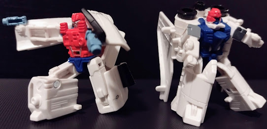
Now then, let's get some Micromasters out of the way. This is the Astro Squad from Earthrise, paired up into an officially licensed NASA space shuttle. It's such a cool ship all around, and one that makes me so excited to track down Earthrise Sky-Lynx one day. The details are impeccable, and the paint apps, while simple, are generally applied throughout the figure (though the wings could be more flush with the front of the shuttle. In general, it's a great mini-shuttle.


The shuttle can be split apart if you ever wanted the duo to separate for some reason.


The transformations are not that great, with the chunks of the space shuttles combined with the limited space making them pretty frustrating in addition to the possibility of paint chipping. Their robot modes also have plenty of issues that clash with their redeeming qualities. Fuzer's a little better in spite of his lanky arms and thighs and I like that he has molded-on pistols, but the knees don't help him stay up that well while the kibble on Blast Master makes him look even worse than either the G1 Micromaster or the Thrilling 30 Payload accessory that came with Cosmos. 


Articulation for both of them is about the same with ball-jointed shoulders and hips as well as hinge knees and a waist swivel for Fuzer, but they're not that great at posing because of the obnoxious kibble combined with the way they're molded.


And now we have the Race Track Patrol. On the left is Roller Force and on the right is Ground Hog. They certainly capture the feeling of 90s Micromasters but with differently sculpted details and worse rolling tolerances. While their colors are minimal once again, they do the job of capturing the looks of their vehicles pretty decently if you ask me. So there's not much else to say in that regard.


Their transformations are a little more straightforward. Roller Force is able to at least have his feet hinge down so he can stand up. The robot modes are what we've come to expect from them, they're the same song and dance we've seen in the past. Roller Force amusingly looks like an inverted color G1 Barricade, who was given a repaint from this guy and was renamed Runner since the bad-cop design from the Movies became the more popular depiction of Barricade, especially seen in Siege and Earthrise.


Their articulation is about the same so moving on.


Now for the weapon mode, it looks pretty bad. Like, there are times when they try to make the Micromasters work well as weapons but this really isn't the best way to do it. Especially when they look like broken-up cars. In any case, this looks so stupid.


You can have figures hold it no problem,, though the handle combined with the front of Roller Force makes it look even more awkward.


And finally, we have the Military Patrol. On the left is Bombshock and on the right is Growl. They make for nice little military vehicles, with one being the average tank with green and gray/silver while the other feels reminiscent of Animated Swindle thanks to the big cannon. They'll look cool with the effect pieces on them. They can also have the turret/cannon swivel around if you want.


Transformation is pretty similar to what we got before, with hinge-down arms and flip-out legs. But they at least look a little more original than the other guys, mostly due to Bombshock having a cannon on his back while Growl has his on his right arm. Pretty cool design choices if you ask me.


Articulation is the same as we've come to expect, though Bombshock has a waist swivel and neck while Growl can look up.


The weapon mode is a little more believable in terms of resembling what it's supposed to look like, and I'd say it's thanks to the militaristic designs and the use of the cannon underneath Growl's feet.


It's not too shabby when held on other figures, though they may need to have their joint tolerances in check so they don't weigh the arms down.


Final ranking (for Hot Rod): ⭐⭐⭐ out of ⭐⭐⭐⭐⭐
Average Micromaster ranking: ⭐⭐ and a half out of ⭐⭐⭐⭐⭐