Back in 2018, Street Fighter and Power Rangers made a collab that went very well for the 25th anniversary of the latter franchise as well as the 30th anniversary of the former. We first heard of the crossover taking place in Legacy Wars - Street Fighter Showdown as a way to give Ryu and later Chun-Li Ranger forms, and damn those suits look great. Honestly, I would have expected Sentai to do this for a brief and barely documented collab, but it appears Capcom loves to collab with American franchises more; plus, TakaraTomy already beat Hasbro to the Transformers repaints so why not let the then-newest acquisition of the toy giant have some fun with Street Fighter after Tommy and Ryu made amendments in Super Power Beatdown? Anyways, it's Shoryukin time!

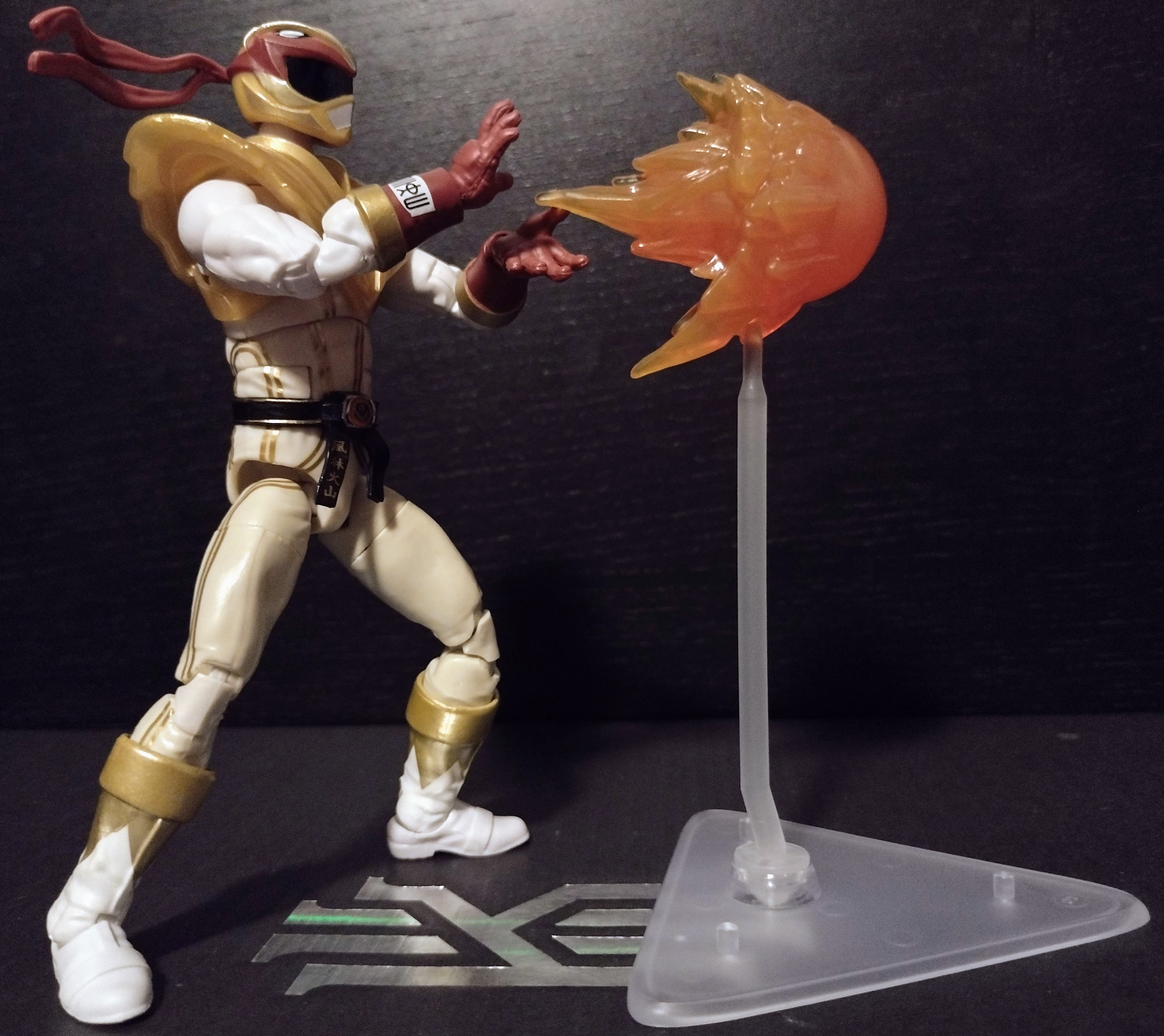
Let's first take a look at Ryu the Crimson Hawk Ranger. If you told me 5 years ago we'd get a figure of him, I'd semi-believe you; I say this because no one expected Hasbro to be more invested in the Lightning Collection than Bandai was with the Legacy line, a feat that is helped by the fact that they did more figures representing different characters and seasons with only Ninja Storm and the 2017 movie remaining untouched for now. This design looks very well done, combining the elements of Ryu's outfit with the spandex and helmet found on a Ranger suit. The gloves are red to match his fingerless boxing gloves, the belt worn on an MMPR suit is redesigned to go as his black belt, and similar to the White Ranger, the chest armor is gold and could resemble his exposed chest to an extent. The linework for the suit is decently applied, though some parts could be a bit less misaligned. And this isn't a fully white suit, as the torso and legs are a slightly creamier shade of white rather than the pure white that the arms and boots have. His boots also possess gold paint apps with triangular points reminiscent of the Green Ranger's footwear.


His helmet is sculpted nicely, but I have to comment on the aforementioned gold used on the shield and the helmet. The images above make the gold look really lovely, but this mug shot makes it look pretty bad. I do wish Hasbro would make their more silvery or golden parts use paint rather than mold them in less convincing colors. As far as accessories are concerned, we have three kinds of effect pieces, two-fisted hands, a 2-piece stand meant for the hawk, and a Hadouken effect piece.


His articulation is comparable to that of the other figures in the line, though once again, we have an issue of the drop-down hips being absolutely terrible in terms of quality control. First, the two Blue Rangers from Time Force and Dino Charge, and now this guy... But that aside, he has some unique effect pieces for the feet as he does a bit of a Tatsumaki Senpukyaku as well as the Shoryuken.


And the stand he has comes with both the Crimson Hawk blast attack of the Ranger form and a proper Hadouken that only makes sense for him to come with. And look, he has an articulated bandanna piece! So apart from the loose drop-down hips, this is an amazing take on the mashup of Power Rangers and Street Fighter in one package, and the strongest release in my opinion.

Final ranking: ⭐⭐⭐⭐ and a half out of ⭐⭐⭐⭐⭐
Up next, it's Chun-Li. Now right off the bat, my copy's visor has some gold paint splotches that get in the way, which sucks. Speaking of the gold, the gold on the loin and butt flaps are beautiful, as is the more yellow gold on the sides of the legs and the edges of the gloves. The gold on the chest armor is average for what I've expected in the Lightning Collection. The gold on the spikes of the cuffs and the bicep guards? Terrible. There is quite a bit of inconsistency with the gold, and I would like to see this be rectified for future figures that rely on golden parts for their outfits. But apart from the new tooling meant for the suit specifically, mashing up Chun-Li's elements of her outfit with the Ranger attire, the base figure's newest change that I can notice is how thick the thighs are, which is true to the proportions of the character, so don't think of that as a dirty thought. Get your minds out of the gutter.


Head sculpt, apart from the gold paint apps ruining the visor, the helmet has quite a nice bit of personality to it that matches a bit of Chun-Li's half-serious, half-cheerful vibe. I like the influence of the Blazing Phoenix as the Ranger motif combined with the headgear she generally has in the series. But once again, we have a discrepancy between the gold on the visor border and the animal crest on the forehead. She, too, has the same approach to accessories fellow Street Fighter Ryu has; the base pieces are the same but the effect pieces are pretty cool. I also like that her hands are not the standard Ranger glove designs to better flow with her sleeves.
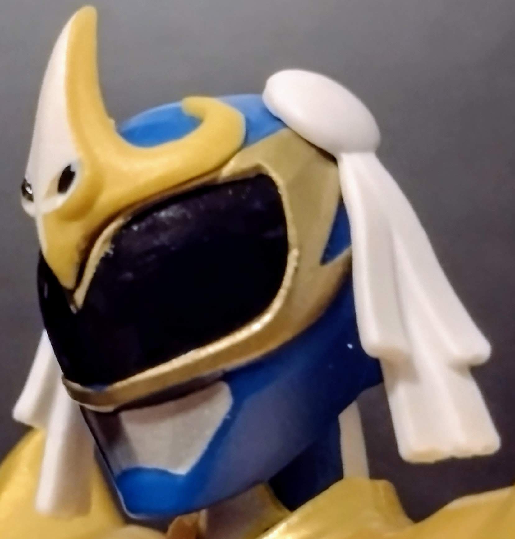

These new effect pieces are intended to give her the powered-up Hyakuretsukyaku, the powers of the Blazing Phoenix, and the Kikoken, which is molded differently from the Hadouken. Now I would pose her bent all the way forward while her rump is pointed up as the pose normally is depicted, but the problem is that the weight of the figure combined with the effect piece makes this nearly impossible to tolerate, so she is instead doing the attack in a more balanced pose. Overall, Chun-Li is around a similar caliber to Ryu, but I have to admit she isn't as equal in quality to him because the effect pieces weigh her down badly without the stand, on top of the gold parts on her being wildly inconsistent. That being said, I do like her personality radiating with her original form as it mashes with Ranger suit elements, especially with the helmet and the skirt piece retaining her outfit's more signature traits. This, along with the character's appearance in Power Rangers Legacy Wars/Battle for the Grid while morphed, make up for her being the odd one out in that quartet of heroes during the Bat in the Sun-produced movie starring her, Ryu, Tommy Oliver, and Gia Moran (aka one of the better parts of Megaforce).


Final ranking: ⭐⭐⭐⭐ out of ⭐⭐⭐⭐⭐
Up next, it's Ken Masters, who did pop up in the Power Rangers fighting games, yes, but is one of two Street Fighters who never had an in-show or game Ranger form. And the ones we do end up with are a mixed bag for him and Cammy as we'll get to. But let's start with the positives; the shade of red is able to stand between the traditional color we're more than familiar with since MMPR while bordering on the lines of the Crimson Ranger from Ninja Storm. He, too, has a black belt that matches up with what Ryu has, though it has more fabric-based paint apps rather than any kanji that is found on his frenemy. And much like Ryu, his boots have a similar pattern for the triangles reminiscent of the Green Ranger's own boots, with golden borders between the knees and ankles. That being said, I do wish it had some gold paint since it looks a bit dull on the colors of this suit compared to Ryu's, even if there is a bit of gold trimming on the torso. And I don't think I've ever seen a sleeveless Ranger suit in my entire life of being a PR fan (and by extension, Sentaider). I mean, it is new in contrast to how we see Ranger suits get made, but I think if you're going to be a Power Ranger, you might want to keep the skin on your arms covered? At least the gloves having white paint on them is a reference to them originally being fingerless gloves, so why not make the sleeves white or grey like on the Ninja Storm suits with unique patterns to have them represent the arms?


His helmet is essentially a tweaked version of the MMPR Red helmet but with the Tyrannosaurus elements modified to instead resemble the soaring falcon powers he possesses as a Power Ranger. I do think it looks cool, and in a weird way, it is reminiscent of the way VR Troopers would recolor remaining copies of the MMPR Red helmet and pass them off as parts of (very cheap) alternate suit designs for the titular trio. However, I can't help but feel a bit disappointed that we ended up with what feels more like something I'd expect the fan-made versions of the suit designs to do: reusing the existing helmets with slight modifications. Granted, it looks cool, but it does feel like the Lightning Collection team wasn't as creative with the suit designs as much as Bat in the Sun or Lionsgate or whoever makes the games, and the short film was with the Ryu and Chun-Li designs. And of course, we get the obligatory stand pieces, two attack pieces, and his soaring falcon along with the fists.


The effect pieces this guy comes with are interesting has he has his own dedicated foot and fist accessories like Ryu does, only for them to be differently sculpted while sharing the same attack names his frenemy has. I should point out that this guy doesn't have any quality control issues, but rather than have his own fireball effect piece, he only comes with the Soaring Falcon. Shame because this guy feels almost equal to Ryu as a figure much like in the games, but missing an accessory as well as his design feeling less imaginative kind of makes me feel that maybe someone at Hasbro also thinks he doesn't deserve the same love for being a bad parent and a crypto bro...maybe this all stemmed from him being absent almost entirely in the Marvel vs Capcom games?


Final ranking: ⭐⭐⭐ and a half out of ⭐⭐⭐⭐⭐
And finally, we have Cammy. With how skimpy her signature outfit is, one would expect Hasbro to reveal even more skin than on Ken's arms. However, the now 3-toned spandex materials instead homage to her more signature green outfit with elements of the blue outfits she wore in the past represented on the arms and the legs as well as the inclusion of her red gloves and the boots, which interestingly feel the most distinct due to them being a different take on the MMPR boot designs in terms of color palette while now including...shoelaces? That'll be impractical for her. Cammy's suit design sits somewhere in between the high level of creativity found on Ryu and Chun-Li and the lack of it found in Ken, though this suit design, even in spite of its amalgamation of suit designs along with her tattoos(?), this suit design feels very unfocused. Even the gold on the shield isn't helping matters. Not to mention, she has her ponytails exposed, which I do get are very iconic to the design, but chances are they'll get cut up while in battle against any villains. The only other time I could think of a Power Ranger toy with hair exposed was that 12-inch auto morphin figure from Hasbro that came out in 2020...remember that figure? Me neither, I never saw it in stores.


Her helmet luckily distinct enough from the MMPR Pink Ranger thanks to the visor proportions and the addition of her beret, which is unknown if it is a separate piece from the helmet or if it is integrated into it. She and Ken do have sculpted lips, contrasting the blank mouthplates Ryu and Chun-Li possess. Whether or not this is to make this wave distinct or if it stems from Hasbro design team wanting to only slightly tweak the Pink Ranger helmet, we can't say for certain. Cammy comes with her dedicated effect pieces for the fists, feet, and her stinging crane that goes on the stand, but unlike the others, her hands are posed slightly differently, which is a nice touch.


Her effect pieces allow you to display Cammy with a more unique punch or shield blast effect piece (IDK what Hasbro calls it) that is likely meant to be the Hooligan Fist, along with an effect piece for her spinning kick. Like Ken, she only has the bird for her blast attack and not a fireball attack or a spinning arrow attack, which might stem from her not being a projectile-based character. The worst part about this figure? That chest armor not only looks like a poor design, but it also clashes with the range of movement on her head, resulting in it popping off when you try to have her look up or even from turning left and right. And this is an extremely inexcusable design flaw on a figure like this. Sure, the head comes back on, but it still feels pretty stupid that this gets ignored during the design stage. Cammy does integrate her character traits with the Ranger form better than Ken, but she still falls flat due to the unfocused suit design along with the head popping off thanks to the collar of her chest armor.


Final ranking: ⭐⭐⭐ out of ⭐⭐⭐⭐⭐
And that about wraps up the Street Fighter Power Rangers. It's interesting how the further along we went, the worse they got. Not like a "UGH THIS SUCKS HASBLOW EFF YOU SENTAI IZ DUH BEST" but it's more like a "y'all fell off with Ken and Cammy". If you want to get all four of them, I would only recommend doing that if they cost a lower price than the nearly $38 price tag they went for, inflated with all those effect pieces and the collab with Capcom.

Overall ranking: ⭐⭐⭐.75 out of ⭐⭐⭐⭐⭐