Friday, January 12, 2024

Power Rangers Lightning Collection Wave 15 review

Three instead of four figures in the Lightning Collection for a wave is something unexpected. The past 14 waves had four characters to sell, but this might be due to Hasbro slowing down production on the line due to the upcoming hiatus for 2024, which is probably why they're making us wait for the Turbo, Lightspeed Rescue, and RPM teams to be completed later on. Amusingly, we get to have the three most reused colors on a Ranger team (even if Yellow was absent on 2 recent Dino seasons), so let's review this trio of primary color Rangers!


Let's first shift into turbo with the Red Turbo Ranger. Not counting either the Phantom Ranger or the Blue Senturion, this is our first true stab at a main Turbo Ranger in this line, and I think Hasbro did a fairly successful take on him, all things considered. The linework on the suit details is fairly solid, and better than how Hasbro handles it with the Marvel Legends paint apps. This includes the yellow on the torso and the logos. The gloves are the right shade of white, and the belt is detailed correctly. All of these details should be the standard for the Lightning Collection: nothing missing, and everything colored right. Not much else to talk about with the Turbo suits with how simple they are.


His helmet is accurate to how it appears in the series regarding the sculpted details and paint apps, though some may find the visor to be a bit stretched vertically. Just a smidge. Otherwise, everything about it looks the part save for the slight paint blemishes. His accessories include a lightning effect piece compatible with either the Turbo Lightning Sword or a Turbo Blade, one fisted hand, one weapon-holding hand, an Auto Blaster, and a head for TJ.


His head sculpt is accurate to the then-likeness of his actor Selwyn Ward, though it appears the paint apps for the eyes, eyebrows, and lips are just slightly off-center. At the very least, he holds his weapons perfectly well, though the TLS varies depending on how good the grip is on top of the angle of the weapon being held. I should point out that the symbol being upside down came like that, and it was not something I thought was correct until I saw the images of the actual prop. It's supposed to be like that, but the black line is omitted so ruined forever I guess.


For a comparison with prior Red Turbo Ranger figures, the general proportions are much better than the old 2006 Collectible figure and especially compared to the 1997 guy, while the articulation is better than all 3 of them combined. I won't be comparing the other Rangers in the review to their older counterparts as they each have like 1 other toy and it's their original iterations from 2000 with Lightspeed Blue and 2009 for RPM Yellow. That being said, Red Turbo is a cool addition if you love TJ and want to represent the history of Tommy Oliver.


Final ranking: ⭐⭐⭐⭐ out of ⭐⭐⭐⭐⭐

Up next, here we have the Blue Lightspeed Ranger, who has a seemingly skinnier build compared to the Red Ranger. As we'll get to, it may not be the wisest thing to do. The deco is at least crisp and clean with little to no misalignment issues, though I wish the gold on the belt matched that of the gloves and boots.


His helmet looks fairly good, but there isn't much else to describe the Lightspeed helmets since they have their visors shaped after badges. In Blue's case, likely that of a police officer. His accessories include a smaller than usual effect part, weapon-holding hands, a civilian head for  Chad Lee, and a Rescue Blaster in gun and baton mode.


The likeness to Michael Chaturantabut is alright but it makes him look like a sitcom character. Both weapon are painted decently, but I wish he had a blast effect piece instead of the lightning. I also have to tae points off because the diaphragm joint is either too stiff or not molded right. As a result, it causes the edges to cut into the lower torso, so gg Hasbro QC.


Final ranking: ⭐⭐⭐ out of ⭐⭐⭐⭐⭐

And finally, here we have the RPM Yellow Ranger. O have to commend Hasbro for not only getting the details right with this release, but also adding new sculptwork for the glove cuffs and the seatbelts. Granted, people will aay the sculpt gets disrupted, but it's a toy ffs. She, too, has pinless joints and double elbows as the more recent females have.


Her helmet has all of the appropriate paint apps to further bring the half-animal/half-car motif that is prominent in Go-Onger but still referenced as a byproduct of Dr. K's weird habits of making the cheesiest aesthetics in PR make sense in a science fiction context. Her accessories include my least favorite effect piece, a civilian head for Summer Landsdown, open hands, and her Nitro Blaster/Sword modes.


The likeness to the real world actress, Rose McIver, is very good. And her weapons are the best painted out of the trio we have here. However, not only do I wish she never came with that stupid effect part but instead come with her signature weapon, the Zip Charger. That being said, she turned out better than Blue, but Red is still the winner of this wave.


Final ranking: ⭐⭐⭐ and a half out of ⭐⭐⭐⭐⭐

Overall, this is a decent wave filled with Rangers that serve the most commonly used colors in the numerous teams we've had (apart from Dino seasons Charge and Fury), especially as they tease us new Ranger teams that should hopefully be completed soon. Still, I wish we had at least one more character to fill out the wave. I'd pick the Green Samurai Ranger from Ninja Storm, the Pink Mystic Ranger, Black Overdrive Ranger, Jungle Fury Wolf Ranger, or Samurai Gold. Hope we still get them in 2025 or later.


Overall ranking: ⭐⭐⭐.5 out of ⭐⭐⭐⭐⭐

Monday, January 8, 2024

Transformers G1 Astrotrain review

Astrotrain seems to be the only Triple Changer to be reissued regularly. Springer, Sandstorm, and Octane haven been brought back, Blitzwing had a Platinum Edition repaint as Flywheels/Skytread, and Broadside sucks ass. Is the love for Astrotrain because kids and adult kids love spaceships and trains? Is it because of mold availability? Whatever the case, here is my review on the choo-choo rocket himself, who I got with an Energon Steamhammer for a good price.


Here we have the Astro half of the equation. It honestly looks too much like a block with a cockpit, wings, and tailfin attached onto it. The color scheme is interesting with the dark purple and the off-white, but it feels kind of like a weird mix of real shuttle colors and anything appropriate for a a Decepticon. At least the stickers aren't annoying to put on that much. 


And as for the train side of things, which annoyingly has the side panels mistransformed since they should fill the gap to complete the etched-on wheels. The actual wheels are probably better at rolling than the ones we get with the mushroom pegs, but likely not enough to move on wooden train tracks. I still don't like the way the Decepticon insignias are cut out. At least the color scheme is more cohesive.


Finally, transforming him into his robot mode is mostly panel-based. The wings revert to their shuttle orientation, the tailfin now splits in half, and the leg panels flip back into shuttle orientation while the shins open up if you haven't transformed the front-section by hiding the shuttle front. The robot mode is a parallelogram with wings, an oversized-bowtie, and stubby arms. You can tell how primitive his engineering is since he's less defined than some larger G1 toys. I find it quite amusing how Hasbro and Sunbow were able to try and force as much better design language than this toy can translate. We'll get to his big gun in a moment, but his articulation is only at his arms.


As far as previous uses are concerned, the original Hasbro version has lighter purple instead of the one we have. The Takara version opts for making it match the NASA shuttle and a real locomotive instead.


Up next, it's the Takara eHobby Anime Astrotrain version, with a proper shade of gray and purple that matches the cartoon (al beit without the hues matched properly in the stock images). If Hasbro uses this deco in their Walmart reissues, we won't get the prototype's extending arms anytime soon.


And finally, it's the Platinum Edition version with a weird color scheme that replaces the purple with orange that vaguely homages Victory Machtackle. He came with the aforementioned Flywheels/Skytread-colored Blitzwing.


For a size comparison, here he is with my Takara reissues of Megatron and Starscream, so you can get an idea of how small this guy is. And the 86 movie wanted us to think this guy would carry toys larger than him??? Nice try! That being said, he is neat for an old toy, but the price he went for at Walmart isn't one I would trust.


Final ranking: ⭐⭐⭐ out of ⭐⭐⭐⭐⭐

Jada Toys Street Fighter II Chun-Li review

Chun-Li has two kinds of fans in the Street Fighter franchise: those who have mained her for years due to her fighting style as well as her versatility compared to her other competitors, or those who claim "lol I play Street Fighter for the plot but I wack it off to Chun-Li showering in the animated movie". Step forward if this is you so you can get grass to touch. Anyways, Chun-Li's definitely got strengths of her own when selected as the character of choice in the game, and it also helps that, like a lot of the female in Street Fighter, what she lacks in the strength of her male counterparts she makes up for with the agility of her athleticism combined with the thunder thighs making for life-ending kicks. And after reviewing her in the Lightning Collection from the time she was a Power Ranger, let's see how this figure turned out not by Hasbro, but instead by Jada Toys, similar to Ryu.


Here we have Chun-Li in-hand, perfectly capturing her appearance from the classic Street Fighter series. The signature blue and brown Chinese outfit with gold and white accents is already iconic, but the rest of the figure gets the details right for this character. The wrists' bulldog-collar-esque spikes are included for this figure and are painted nicely, while the skirt flap contains the gold trim. And of course, she has her thunder thighs that make her a powerhouse from the waist-down. These proportions were somewhat present on the /Hasbro Lightning Collection figure, but toned down in comparison. I'm happy to have this figure with me regardless, even if the materials used on the figure do feel a bit off like on Ryu.


Her head sculpt is mostly good, but it just comes down to how well the paint apps for the eyes and lips are aligned. Mine seem to be a bit higher than where they should be, but it is otherwise nothing too noticeable from a distance. Still looks better than her initial face design from MvC Infinite. Chun-Li's articulation consists of a double-ball neck with worse range than on Ryu, shoulder rotation, bicep swivels, double-jointed elbows, wrist swivels and hinges, a double-ball diaphragm joint, ball-jointed hip movement, thigh swivels, double-jointed knees, boot swivels, ankle hinges, and pivot rockers.


Het alternate accessories include two karate chop hands as well as a yelling head, with paint apps that, much like on Ryu, will vary on proper alignment. Also because of how slightly rubbery the figure feels, with the weight of her thicc thigh legs, balancing Chun-Li will vary on how you adjust her. At the very least, she won't have an issue with her effect piece representing her signature Hyakuretsukyaku move.


For a size comparison, here she is with her fellow Street Fighter, Ryu. In-universe, Chun-Li is two inches shorter than Ryu, so this makes sense. Her height will vary depending on the Spider-Man figures you own, so if you want to make an MvC display, using RYV Spider-Man will make the two out of scale in vanilla poses. Otherwise, this Chun-Li figure is just as good as Ryu, and while many would be happy that her feminine proportions are faithful (I mean look at her chest and thighs), she is at least a great $20 figure without relying too much on import prices or shortcomings you'd expect from Hasbro like with their MvC Infinite toys.


Final ranking: ⭐⭐⭐⭐ and a half out of ⭐⭐⭐⭐⭐

Tuesday, January 2, 2024

Marvel Legends X-Men '97 Wolverine & Magneto review

I apologize for the gaps made during the December reviews. I've been feeling rather far behind due to me trying not to focus on making too many reviews, and then I ended up getting a shitton of stuff that warranted getting reviewed before I forgot. So when it comes to getting things out of the way, I remembered that X-Men '97 was going to show up this year (if at all), and with how limited the marketing is for the show in question, I thought it'd make sense to add a bit more attention to it than the Marvel and Disney+ people currently are. So bla bla bla 1992 X-Men is great, Fox Kids and Jetix, look if you don't know what the 90s animated series is like, then what are you doing here? It's one of the best shows we've gotten from the history of the Marvel brand. And with the revival still in limbo, here is my review on the clawed guy and the magnet guy, aka Logan and Erik, aka Wolverine and Magneto.


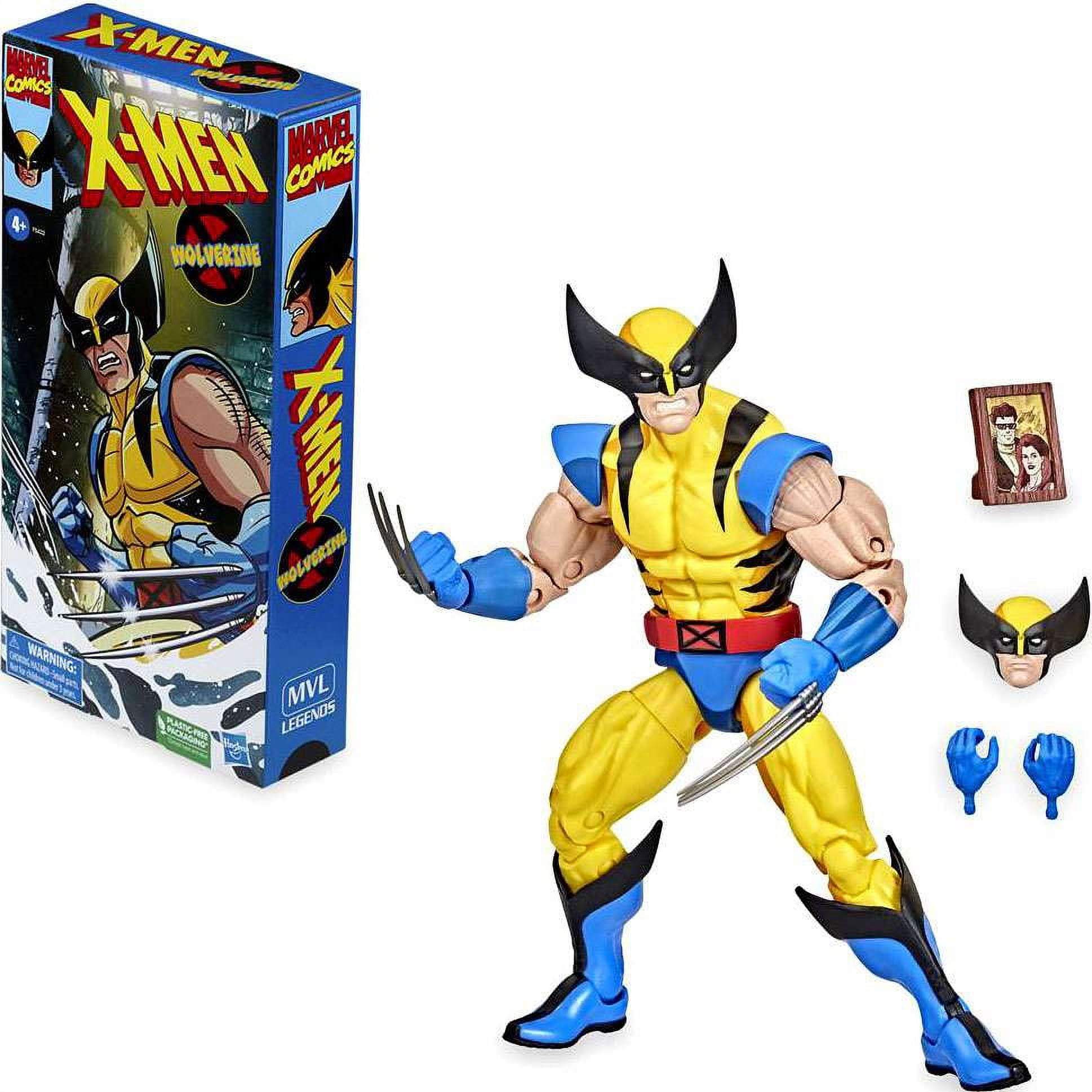
Here we have Wolverine in-hand, which brings us yet another new take on the iconic tiger-stripe outfit that was already popular with the Jim Lee version of the character, the 90s animated series, and the numerous Capcom-developed fighting games ranging from X-Men: Children of the Atom up to Marvel vs Capcom 2 (as he has the Astonishing outfit in MvC3). This figure specifically is reused from the tooling that the cel-shaded version from Hasbro Pulse utilized. Wolverine's proportions match what he already has, and I was already a fan of the base mold that was originally made in 2016 with the Juggernaut-wave version of the character. The paint apps are generally applied well and are crisp, though there are slight hiccups and lopsided areas. The shades of prominant yellow as well as the few highlights of blue and the sole red from the belt are between vibrant and faded, likely to distinguish this release from past versions of the character. One complaint I have about the cllaws is how dull they are. Granted, the gunmetal gray on him is less translucent than the light gray on other Wolverine figures, but I can't help but wish this guy had his claws painted, especially when there's going to be no BAF part included. I wish the blue didn't looks as tealish and the yellow was less lemon and more school bus. I also wish the shoulder pads could hide the skin better.


His head sculpt is already strong as it is, being able to showcase an improved form of craftsmanship from previous iterations of the character. Wolverine's eyes may be seen as a little too small if you want to go for cartoon-accuracy, but with how the 90s animated series designs basically match the looks of the comics that came out at the time, this can be your standard Earth-616 Wolverine with no issue. The articulation is standard for the buck, so you may want to find the reviews on either the Heat Claws or Love Triangle 3-pack versions.


The alternate accessories he comes with are fists with retracted hands, an unmasked Logan head that I think is the best one we got for a neutral expression (at least compared to the one from the Love Triangle 3-pack in my collection. While the stubble paint apps pale compared to the wash that made the skin look naturalistic on the Toy Biz versions, this head sculpt is comparable to the ones that Glenn Webb loved in his Action Figure Evolution videos (the Toy Biz Apocalypse wave Astonishing version and the X-Men Classics Ninja Strike version). The cowl accessory is the same from what we previously had apart from the painted eyes. It's a bit neat. And yes, the elbows and knees are pinless and the arms are sculpted to give it a texture of hairy arms but no such paint apps are added. In fact, the colors are slightly mismatched for the knee joints versus the rest of the toy.


I should bring up the previous version of this Wolverine, which is the 90s cel-shaded version. Specific to this version of the character, other than the paint job, are more appropriate shades of blue and yellow, accessory-holding hands (that have fingernails sculpted for some reason), a portrait featuring Scott and Jean, and an alternate Wolverine head whose teeth and pale skin makes him look like the Target-exclusive Red Hulk version from way back in 2008. I wish Hasbro at least added the snarling head on the release we have here and made the teeth look less cheap. The legs and arms have their joints pinned, as they are the same ones we previously had.


For a comparison with the other Wolverines I own, here he is in between the Bonebreaker Heat Claws version and the Love Triangle version. I don't have as many versions the same way I do with Spider-Man, but Logan's my second favorite Marvel superhero - scratch that, character of all time. Looking at the comparisons between these two, I like the sculpted trunks on the figure, but I can't help but feel that I'm 50/50 on if it has better proportions than the Love Triangle version, though I know the legs look a little too skinny. Interestingly, the Heat Claws one is a little taller than either version, though it could be argued that he gets a wee bit taller. Soooooooo best Wolverine figure ever? Maybe, but knowing Hasbro's Marvel Legends team, there is a tendency to make something that is said to be definitive and then the next one, and then the next one, and then the next one. So with some tweaks here and there, you can make him better than he currently is, though the price is already problematic due to the fact that Hasbro is making this about the same price you're paying for a regular figure but with slightly fewer accessories and no BAF piece. While I'd love the aforementioned alternate head to come with him if we're not going to have any BAF pieces, at least Wolverine is serviceable.


Final ranking: ⭐⭐⭐ and a half out of ⭐⭐⭐⭐⭐

And here we have Magneto, and right off the bat, this isn't the version shown in the top image with the carded figures. This Magneto is actually the Family Matters 3-pack version with the hands and head of the X-Men '97 version rather than the actual '97 version. We'll get to the comparisons in a little bit, but the proportions I feel are generally better than the '97 version. Firstly, the cape is more proportionate to the body, and the torso and shoulders aren't as narrow (could be wider, though). The arms are noticeably not as long, a major issue I have with that release. And of course, the pins are noticeable, though at least it's easier to stomach than even worse proportions. So yeah, what we have is good but I know he could be bulkier to match his larger stature in the comics. And I also like the shading applied on his cape.


His head sculpt is better than either Family Matters heads, with the more appropriate glare for the character as well as some shading to make the eyes more shadowy underneath the helmet. The only issue is that the chin guards of the helmet are a little too close to each other, so the nose and mouth shouldn't look like they're about to get squished. At the very least, paint apps are good. The articulation is the same as Wolverine's, though there are no butterfly joints both because of the cape as well as the character not using the same level of dynamic posts that the X-Man is known for. I should mention that while the '97 version has the cape stay in place better as it connects to the chest, this older buck doesn't have that benefit, so only the cape can be connected on the back. Oh and the alternate hands are all you get. :-/


If you can't tell, here is a comparison between the two versions of Magneto, the '97 version on the left and Family Matters on the right. While the pinless joints and the sculpted trunks on the hips are appreciated for aesthetic reasons, the Family Matters version is better when it comes to the proportions. The heads suck, as one looks bored and young while the other tries to make the Jim Lee aesthetics but feels half-baked. On top of the helmets looking too thick. At least '97 is better done, but boy is the neck too high.


And here he is with the other Magneto I own from the comics, that being the Age of Apocalype version. He is a little taller than the more recent Magneto (and the actual '97 one is shorter), but boy does the AOA version feel rough. All bare plastic, no paint apps, the proportions are still not appropriate, and the joints are too gummy. Oh, and I don't like how cheap the paint apps look on the head. And worst of all for AOA, the cape can barely stay in place because there are no pegs added. So yeah, I feel better getting the X-Men Family Matters/97 hybrid, even though it's still not perfect. The original version is pretty weak, but this one is serviceable. However, not coming with any effect pieces or an unhelmeted head despite most Magnetos coming with unhelmeted heads is very pathetic for a Magneto release. Especially for a price like this.


Final ranking: ⭐⭐⭐ out of ⭐⭐⭐⭐⭐