Friday, June 16, 2023

Transformers Studio Series Gamer Edition Bumblebee review

Bumblebee's role in the High Moon Studios Cybertron games is pretty big at first glance, but the fact that we'd later see him get a smaller role starting with Fall of Cybertron and later in Rise of the Dark Spark, a major contrast to his prominent in all of the TV shows we've seen from Prime, RID15, and the two Rescue Bots shows. I guess it's a tendency for Hasbro to reduce the guy's prominence after fans hated his oversaturation. Luckily, they realized their mistakes and began making fewer but better quality figures of the character in the Generations line, allowing us to get legitimate iterations of the guy in Studio Series, the WFC Trilogy, and even a proper Goldbug for Legacy. We'd also see the High Moon design make a return as a new figure after the 2010 Deluxe from the first ever wave of Generations Deluxes as well as it being made 10 years after the similarly-designed Thrilling 30 Legends toy. Let's see if this Bee is as good as Optimus or as bad as Barricade.


Here is Bumblebee in his vehicle mode. It's a Tron-cycle on all fours, and in a shape of a guacamole in a way. I love this altmode so much; it's got a very futuristic and alien look to it that feels like what I'd expect Bumblebee to turn into on Cybertron, moreso than his saucer mode. I love the linework combined with the red accents to go with the golden yellow and black paint apps. If you remember the altmode that Bumblebee had in his solo movie back on Cybertron, that was inspired by this alternate mode. And honestly, I love this one so much more. That design in the movie felt like it was made last-minute and had to go with the equally last-minute Cybertron setting while this altmode is a much stronger design overall. It feels more complete and refined, all while looking badass and adorable.


The general design of this guy is a win in my book, especially with the inclusion of pinned wheels that most transformers lack nowadays. And while the sides may seem like they're missing paint, that is not the case for this toy, which makes it kind of ironic that a figure that looks like it'd need those paint apps filled in in certain areas doesn't actually need them because of the source material.


The weapon storage on the back is pretty wonky, as it just has you slapping the bigger gun on tip while the smaller gun and dagger store on the back.


For a vehicle mode size comparison, here is Bumblebee sandwiched in-between the last two Gamer Edition figures we covered previously, making him shorter than both Optimus Prime and Barricade. Their altmodes were already slam dunks, as they were pretty faithful to the CG models in spite of Optimus's visible fists and Barricade's...well, engineering, but you see what I mean with how great they all look!


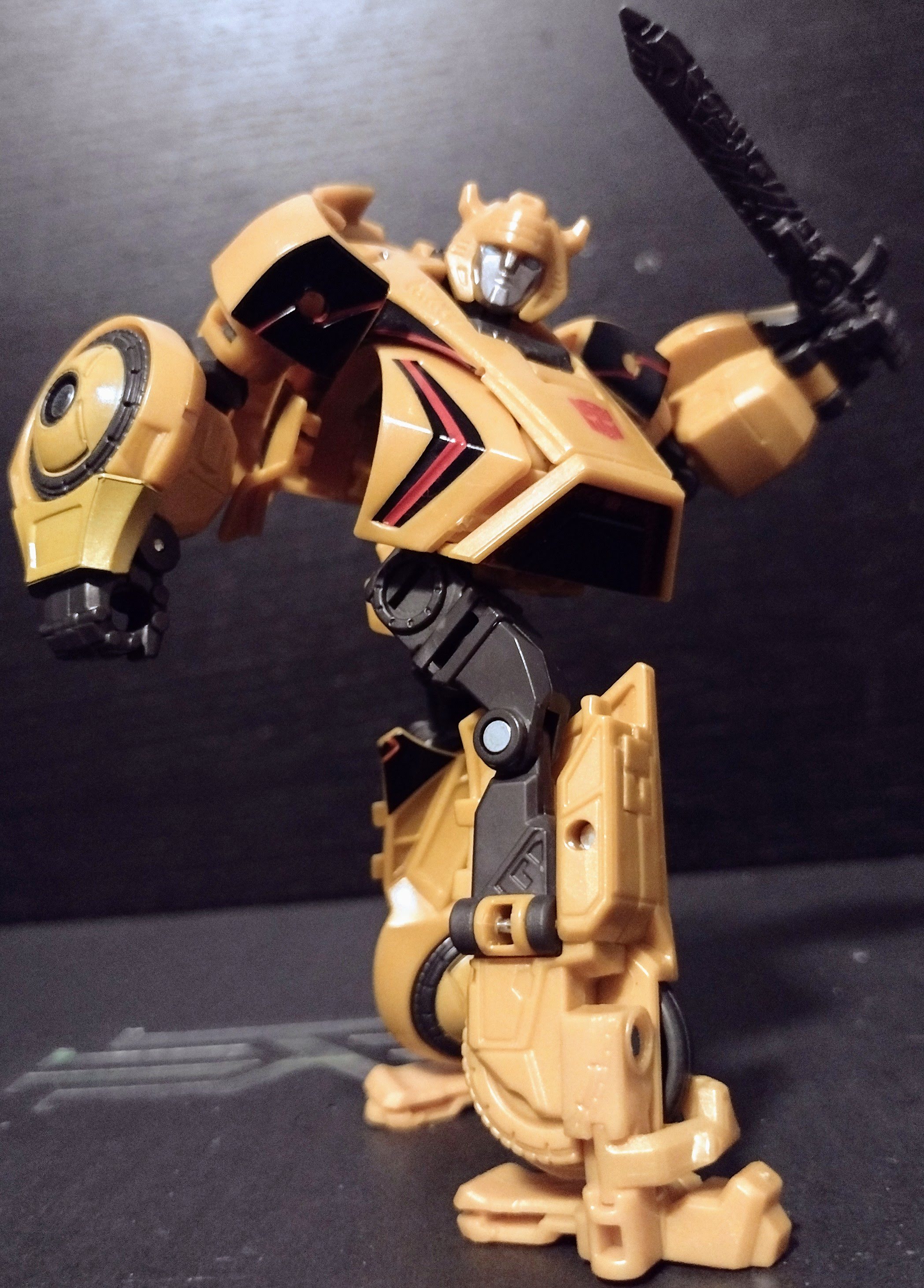
Transformation is different from the original Deluxe made back in 2010, being somewhat easier to work with by comparison to the original's somewhat shellformer approach. This guy at least tries to integrate some of the vehicle into the robot mode, though it might end up making the design a little less accurate than I'd like. I should mention that the arms being on ball joints might make them come off as easily as the thighs on the original toy. What we end up with does look like WFC Bumblebee, but I can't help but feel the torso area is worse on this guy than on the original. While I do like that the front area still becomes the chest, it sticks out more and makes him look fatter than he already seemed. The beer gut that was perfect for Leadfoot in Dark of the Moon looks rather out of place on this guy, and it doesn't help by the fact that the design, already having a stylized appearance with lankier legs and arms that gain bulk below the elbows thanks to the wheels, attempts to avoid this issue. At the very least, the backpack is less prominent from the front, but I should say that I wish the lower legs would tab in more securely


His head is well-sculpted and captures his more stylized take on the G1 look, making it look somewhat modern without being too Evergreen and making it look like it'd either sound like Johnny Yong Bosch or remain mute in the sequel, Fall of Cybertron. Luckily, there is no light-piping that gets neutered because of the painted eyes. His articulation consists of ball joints at the neck, shoulders, and hips, swivels at the biceps and thighs, hinges at the elbows, knees, and slightly for the ankles.


His accessories are plentiful for display options, with a dagger that is sort of like the blades he had on the old toy, but rather than come with a pistol, he has two alternate arm cannons that can be swapped out to represent the weapon-swapping gimmick seen in the game whenever you're altering between different forms of firepower. One is an Energon battle pistol with a narrow barrel, while the other is a meaty plasma cannon; both are blast-effect compatible.

Already, we got a reuse for this guy, and it's Cliffjumper. While he doesn't have the inverted red and yellow coloring from Bumblebee (apart from the Autobot insignia), he does gain a retooled head this time around, which is neither a G1 head or a RedBee noggin, but instead the design inspired by his appearance in Transformers Prime! AKA the best Cliffjumper head of all time! And it's cool how you don't have to swap it with any CJ head as it's already accurate to the aesthetics!


Here we have Bumblebee in-between the same characters again but in robot mode. He may be the first Gamer Edition figure, but so far, I'd rank him in second place. He's not as good as Optimus Prime, but he's still better than Barricade. If he was a little more sturdy and his torso better modified, I'd like it more than I currently do.


His original figure was probably one that would still be held with such regard, and I can see why with the engineering and features it has. I wouldn't mind getting him to scale with some Planet X guys if I ever decide to get those guys, but we'll see. For now, Gamer Edition Bumblebee's a decent figure that could use a few more improvements.


Final ranking: ⭐⭐⭐ and a half out of ⭐⭐⭐⭐⭐

Friday, June 9, 2023

Transformers Rise of the Beasts Core Voyager Rhinox review

Rise of the Beasts' first wave of Voyagers is not easy to obtain, as fans were REALLY interested in Voyagers that were lesser equivalents to the Studio Series after finding out they were actually much better quality than expected, in addition to the engineering of Prime and the very close accuracy for Primal. Rhinox is the third and seemingly final release for the line, but perhaps we can see him keep this brief line on a high note while we wait for the remaining basic Deluxes to pop up later. So when it comes to the third Voyager of the new movie, let's see if this Rhinox is worth getting, even if there is a Studio Series iteration on the horizon.


Here is Rhinox in his beast mode. This beast mode looks much more robotic than the final CG model we're getting, depicting the animal as more robotic and not as smooth in texturing as the design normally is. You have some of the inner workings exposed and painted in silver, and there are chains that are left hanging on the front legs. The toes on the front legs are painted, but not well. Meanwhile, the hind legs don't have paint whatsoever. The horn is more bronze than silver, but it at least adds some color. So it's not accurate to the movie but it still looks good.


The articulation isn't much, with the forelegs and maybe hind legs being able to articulate while the jaw opens. The design does look blockier than the CG design from this angle, not looking as organic as the final design.


For a beast mode size comparison, here he is in-between the mainline versions of Optimus Primal and Cheetor. He may be a Voyager, but the fact that he has a scale more or less comparable to his old Deluxe toy makes him amusingly look like a younger rhino when put next to his teammates. Oh and his cannons cam peg on the shoulders.


And here is Rhinox next to his Kingdom self. The head on the Kingdom figure does sit up slightly higher than on the movie toy. I feel that the mainline Voyager borrows an influence from the Kingdom figure, even if one of them is a more condensed-looking guy than the other.


Transformation is similar to the Kingdom toy, but amusingly easier to work with. The legs are not as annoying to transform this time around, as nothing clashes badly with smaller parts trying to get to their destinations. And good thing, too, because Kingdom Rhinox's leg transformation is legit more annoying than most movie figures. The robot mode is a little more movie-accurate, but as we now have the Studio Series toy for reference, this guy is halfway there between the proper CG mode and the concept art that inspired this toy. It is more accurate than the Battle Changer toy, which was literally the Season 1 design but with added greebling. The blockiness continues, with the lower legs being much chunkier than the rest of the body. It does work for some stylistic angle shots that work with some funky poses, but I won't lie when I say that the rest of the figure makes the lower leg look like they belong to another toy. In factz tbe back kibble sticks out as much as the backpack! Thankfully, the rest of the toy isn't too bad, with a good design that takes influence from Rhinox's traditional look while doing new things of its own. One complaint I do have has to do with the shoulders having a similar issue to the AOE Leaders, with either a straight up and down position for the arms or having them jut out at leas 45 degrees if they move outwards due to a piece of the shoulders locking them in place.


Head sculpt is very funny-looking. Rhinox normally has a stern face in the series, yet he looks gormless and missing a soul with how expressionless the face is. There is some good sculptwork, though, with the silver paint helping. The articulation is still good, giving him a neck swivel, shoulders that move front and back, in and out, swivels and bends at the elbows, a waist swivel somewhat limited by the back kibble, hips that move front and back, in and out, swivels above the knees, bends at the knees, and ankle hinges as well as pivots. He can hold his chainguns of doom, which are nicely painted and spin unlike the Kingdom version!


Here is Rhinox next to his Kingdom self, and the robot mode definitely diverges from the body up, ditching the lower jaw chest and the rhino head hood. Also new to ROTB Rhinox is the horn's ability to remove itself from the head and attach to either shoulder. Vaguely reminds me of Cybertron Backstop. And yeah, the cannons on this guy are better than om the Kingdom toy.


And here he is in-between the two mainline Maximals. He continues serving as an intermediate lind of Maximal, showing that Primal is close to the concept art while Cheetor is not. Rhinox is in-between them both, but that still doesn't stop him from being a toy I'd recommend. He's as good as the other Voyagers even in spite of his flaws, and I don't think he'll be that difficult to get compared to the Optimus Duo. I saw more of this guy at my Walmart than either leader.


Final ranking: ⭐⭐⭐⭐ out of ⭐⭐⭐⭐⭐

Thursday, June 8, 2023

Transformers Revenge of the Fallen Ice Cream Twins review

The Twins have not received new merch since 2011, what with Hasbro abiding with people's intense hatred towards the duo. While Skids and Mudflap weren't my favorite characters, I did wish fans would quit their whining before they'd accidentally use their anti-racist morality against themselves. I am genuinely wondering that if these criticisms were never made, how would these characters be released? Would they be individually released and be comparable to Earthrise Cliffjumper and Kingdom Huffer or would they be a Voyager 2-pack? With that said, I am more than happy to get these two seemingly forbidden characters on a scale that is close to Studio Series and give them a review!


Here we have the signature ice cream truck. This is a pretty good alternate mode that I don't think has been attempted since these two came out. I mean, ice cream trucks are still iconic to this day, so the lack of new Transformers that turn into such an altmode seems weird. Anyways, this vehicle mode is based on the alt mode that the Twins briefly took form of early on in the movie, where NEST was going after a hiding Decepticon in Shanghai. It's a pretty cute vehicle, with the white and pink color combo complimented with gunmetal grey, dark blue, and a few tampos that fit well with the ice cream theming. Creamy Ice Cream, Made Fresh For You, and the ice cream cone on the side bonnet complement the look of the vehicle mode, even though there are numerous decals not present on the vehicle, including the iconic "Decepticons suck my popsicle!". Reprolabels has fixed that issue, but there are some details that they wouldn't fix with stickers, such as the missing paint apps for the areas that are sculpted with rust in them. At the very least, the one side-view mirror, door handles, speaker, and ice cream on the top of the alt mode make this feel as complete as it could be for a regular release. I should mention that likely because of age, the right side has the seams of the two halves of the ice cream truck and the hood for Skids more prominently shown than they otherwise would be if they were fresh out of the packaging.


For a vehicle mode size comparison, here are the Ice Cream Twins next to the Arcee Sisters and Sideways, two Studio Series releases that were shown in the brief chase segment in Shanghai as a distraction from Demolishor. I'll be honest and say the scale here works much better than anticipated. The bikes don't look too out of place next to the cars that much, but the ice cream truck itself is a much better fit for the Studio Series line's scale than it ever was for the original Revenge of the Fallen line! Maybe the reason why it remained as a Deluxe was that Hasbro wanted to maintain these two as easier to obtain than they normally would be, but I feel that if the robots were to scale better with their individual Deluxe counterparts, they'd have to be a Voyager. But otherwise, Arcee and Twins got a target coming their way!


Transformation for the set is pretty intricate, mostly due to the smaller parts that are used on this set than normal. These two feel more comparable to a Scout Class toy from Revenge of the Fallen/Hunt for the Decepticons, especially thanks to the similar sizing that they would end up with in robot mode. Do be warned that the forearms would come off on Skids easily thanks to the ball joints, and Mudflap's spring-loaded gimmick doesn't really serve much of a purpose. The resulting robot modes, while accurate to the briefly shown designs they had, do look rather kibbly by comparison. Skids fares off alright thanks to him having an easier design to work with, but it does come at the cost of his forearms being flat like a pancake, and while the backpack does collapse well enough, it could go down a bit further. Mudflap's robot mode has more going on with this kibble management due to him being the back and thus requiring a bit more going on to look presentable for a weirdo design like his. He does have some chunky lower legs in contrast to Skids' being skinny. The kibble management on the front gives him shoulder pads that proudly display the tampos, but the back does at least fold in some way thanks to the hinges on the side panels of the vehicle. 


As for the it articulation, they both have ball-jointed heads (Skids is stiffer and has loose kibble pieces on the collar), but while Mudflap's shoulders are on ball joints, Skids' is only on a lower part of the shoulder, meaning it moves front and back only while outward movement is achieved with the chunk of the altmode, and not as successfully. They both have hinges at the elbow, but because of Skids' forearms, he has a ball joint to help make the bending easier to work with. Skids' right hand and Mudflap's left hand are able to hinge inwards. Skids has a waist swivel but that is moreso due to transformation, as the bumper doesn't allow for proper movement. Their hips are on ball joints, they bend at the knees, their lower legs swivel below the knees, and the feet on Skids are ball-jointed and hinge due to transformation while Mudflap only has toe articulation.


For some repaints, we only have two reuses of the Twins, both of which try to come up with different ways of being screen-accurate while tackling the rust paint apps differently. This one came in a two-pack with Demolishor, who went from being Scavenger-red to accurate-white. Their plastic colors are the same, but they both contain rusty paint apps that were missing on the regular release. In addition to that and the new stickers, Skids has CAUTION: CHILDREN applied behind the speaker, and the ice cream went from being on Mudflap's forearms to Skids'.


Another repaint of the mold popped up one last time, and it changed the paint apps once again. Replacing MADE FRESH FOR YOU on Skids is another ice cream decal on the back, but we now have not just different (and arguably better) rusty paint apps, but we also get their robot limbs cast in a matching rusty brown. Sideways is included and has less red on him than on the regular release.


For a robot mode size, here are the Twins reunited with the Arcee Triplets with Optimus Prime, Ironhide, and Sideswipe joining the group shot after a mostly successful mission in Shanghai. Yeah, these guys are definitely perfect for Studio Series While they lack the refined engineering we'd see even with the sizes of figures getting smaller, their scale makes perfect sense for the line and seems weirdly like Hasbro was more forward-thinking with this set than they were with leaving DOTM Voyager Megatron's palms with a slot perfect for compatibility with Evasion Mode Optimus Prime's shotgun. So even in spite of the mere hatred that the Twins receive, some justifiable and other times not so much, I do recommend that you get this set, but I wouldn't recommend you get it at a higher upcharge than it deserves. I was lucky to get this in an auction that no one else entered, but don't pay more than $50 for this set. It's a cool ROTF release, but not as cool as Lockdown, Breakaway, and even Wheelie. And if you do get this set, don't forget the Reprolabels!


Final ranking: ⭐⭐⭐ and a half out of ⭐⭐⭐⭐⭐

Tuesday, June 6, 2023

Marvel Legends The Blob review

NOTHING CAN MOVE THE BLOB!!! This fat fucko is the bully notorious for hanging out with the Brotherhood of Evil Mutants. He is ugly, hard to defeat, and smells like shit. If there is one thing to expect from the X-Men universe, it's that even the weirdest of mutants will likely appear as main characters in some fashion. The Blob will probably be best utilized nowadays for telling people to stop posting memes in #general before saying something stupid or continuing his voice chat with his kitten. Here, though, he returns in the Legends line after last having a 2007 BAF in the early days of Hasbro's Marvel Legends. Let's see if this guy is worth getting for more than $50 at the MSRP.


Here is the Blob in-hand. Hasbro generally captured his look very well with his overweight physique, especially when it comes to making his gut as bulbous as it should be. His legs are thick as hell, his arms are stocky and stiff, and there is a bit of flab on the upper body with his pecs. He's weirdly like Wario, where he is an overweight man yet there is a sense of musculature to him. It's a possible side-effect of the mutant ability that helps define the Blob as immovable; even though he is a fat fuck, he is still not going down without a fight. If you look closely, you would see a subtle paint app that makes the skin look rather rough and spotty, which is in contrast to the normal skin on other figures across the line. Beyond that, there isn't much paint on the figure.


Head sculpt continues his beautifully ugly appearance with the lack of a defined chin underneath his swollen neck, combined with a face that looks like it chows in a lot on a ton of junk food in a single day. He's basically like Jared Fogle, except he wouldn't become a weight-loss spokesperson for Subway; on the bright side, he's not a pedophile. His articulation consists of a single ball joint for the head, shoulders that move front and back, in and out, elbows swivel as well as bend at 90 degrees, the wrists rotate as well as hinge in and out, there is a diaphragm joint that serves with rotation and hinging front and back, the hips move front and back, in and out, thighs swivel, knees bend, and the ankles hinge as well as pivot. The only alternate display options he comes with are a pair of open hands and a screaming head. That's it.


The original BAF was much more wrinkly and grotesque in appearance, with more flab and blubber to make him looks even uglier than he already is, but in a good way! This was one of the first few BAFs from Hasbro's takeover of the Marvel Legends line; in fact, it's the second wave they ever made, consisting of She-Hulk, Lord of Asgard Thor, Ultimate Wolverine, Yellow Jacket, Quicksilver, Xorn, and X3 versions of Jean Grey and Juggernaut. The articulation appears to be mostly comparable, but I'm sure you'd be a little more content getting the new version. In fact, should you get the new Blob? I'll say that you should if you can obtain it for a cheap price. Seriously, $60 is not worth it for this guy. If it was $30-40, then it'd be easier to stomach for a release like this. But don't spend more than the retail price he is going for; the figure is good, but it's not $60 good. Even if it's more affordable than the currently-in-the-aftermarket BAF, it's not a figure I'd say you should go crazy for at full retail price.


Final ranking:⭐⭐⭐⭐ out of ⭐⭐⭐⭐⭐

Wednesday, May 31, 2023

Jakks Pacific Super Mario Bros Movie Figures review

The Mario movie was a massive success! It surprised everyone who initially doubted it because of the celeb cast and because it was made by Illumination. Luckily, it was moderated by Nintendo, making sure it had more passion put into it than any of their games since 2019. And as expected, we have the merchandise made to tie-in for the animated blockbuster(?) of the year. We'll see if we'll get other characters from the movie, like Kamek, DK, and Cranky. Until then, let's see if these figures are worth $20-30. 


Let's cover the poster boy of the movie, Mario. The same guy who was voiced by a crisp rat who people hated at first, many fans can now get this guy with no problem after most of them were accepting of his honestly not-too-bad performance in the movie. The character design is given more sculptwork added to make his outfit more realistic while maintaining the same cartoony look that one would expect from the Illumination people. It kind of reminds me of how Mario Odyssey added more details to Mario and all the other characters as he looks less and less plasticky since the N64 era. Even the M on his hat comes off less like a tampo and more like it's etched onto the article. His eyes are made to be "articulated" because they're acrylic, meaning the pupils will follow you in any direction the head is facing. It's a neat feature for photos where Mario is staring at you, but it will be annoying if you want him staring at another toy rather than you. Oh, and his butt is as small as it is in the movie, and it weirdly reminds me of Hank Hilll's lack of an ass.


His articulation consists of a ball-jointed head, shoulders that move front and back as well as in and out, elbow bends as well as swivels at the elbows, the forearms swivel too, but they are useless due to the joint cuts; the wrists swivel, the waist is on a ball joint, hips move front and back, in and out, thighs swivel, knees bend, and the feet are on ball joints. He comes with his toilet plunger, but I do wish he had more alternate accessories, like fists for more dynamic poses (as dynamic as his body allows) or an alternate angry face. I'm surprised to see an increase in both scale and quality (along with the price) when put next to the main Mario, as the details on him are crisper, the paint isn't like pastel, and the quality control is much better. The articulation is comparable to the Figuart, but the leg movement is better on this guy in my opinion. I don't have the Figuart because it's easier to compare and contrast two figures from Jakks by a decade.


Next up, it's Luigi's turn. He is thankfully not a repaint or retool of Mario as in addition to the colors and head, his body has proportions of his own with longer limbs and torso to match his leaner frame. Even the hands and feet appear to be made for Luigi. One annoying QC glare is that the L isn't painted quite right.


His articulation is the same as his brother's, but his accessory is a flashlight, which is fitting for when he's going into the Dark Lands while running away from Dry Bones and eventually getting captured by the Shy Guys. Next to his original World of Nintendo counterpart, the difference in quality and size is higher this time around. I also like that Luigi's pose in the photo combined with the eyes makes him more photogenic. He could use a terrified face and alternate hands, though.


We then go to Princess Peach, who is depicted in a more traditional sculpt of having a plastic dress that doesn't make posing her much easier. It's inevitable, let's be honest.  Her dress's creases are believable in making her look like they're fabric, while the two-tone pink coloring is carried over. The shoulders are in the hot pink as are the pads on her dress, though.There are a few creases on the gloves, which I don't mind too much. Her eyes have the same acrylic look that the Mario Bros possess. Her hair is also sculpted to look like hair, though a golden wash would both be accurate to the movie and highlight the sculptwork more. At least the crown is nicely painted.


Her articulation is much more limited, with a slight bit of head movement, shoulders that are equally limited, elbow bends, and wrist swivels along with a torso joint. It's a shame that you can't pose her in a more dynamic fashion like in the movie, but either the dress looks nice or the figure has better posing. At the very least, she is taller and in some ways a better quality figure than her original self, which was unexpectedly harder to find. This one, being more expensive and coming with an umbrella, might work better. She could use a smirking alternate head, though, especially given her personality being different in the movie.


And it's now Toad's turn. This guy is amusingly the same as his appearance in the games, but with bigger eyes that, if they didn't have the white dots, would make him almost comparable to the N64 version of the character. His mushroom hat has the dots painted, but the backpack has various non-removable tools that are at least painted in different colors from each other, with a green sleeping bag, a beige rope, a blue cup, and a brown and white lamp being part of the admittedly back heavy backpack. The buckles painted in silver are a nice touch.


His articulation is where things get a bit weird since while the head, shoulders, elbows, legs, and feet are appreciative, he can't really be balanced well enough while he's in a walking pose. The biggest issue I have with the figure are the forearms. They're small, yes, but why are the joints flexible to the point where they feel like they'll tear off while I try to move the arm out or insert/remove the frying pan accessory? I should mention I don't have a normal Toad, but you can see here how different the proportions, amount of articulation, and the paint apps not being the same in terms of sizing.


And here we now have Bowser. The best performance in the movie thanks to Jack Black, Bowser is depicted as intimidating as he is in the games, and maybe moreso since he's not usually like this in the games. The sculptwork is given a new layer of texturing that makes his skin more organic while paint apps not missing any important details for Bowser. The hair, the mouth, the shell, the spikey bands, even the claws on the hands and feet are not missed out on! New to this version of Bowser is a green face that transitions between the shell and the yellow skin. His shell is actually a PVC material, somewhat like parts of his figure. Honestly, when I first opened the toy out of the box, the smell of it reminded me of the paint that NECA's figures had.


His articulation is pretty basic, with no neck or mouth movement, shoulders that rotate 360 degrees, elbow bends, wrist swivels, hips that move front and back (with a bit of different sculpting for the bottom region with the left leg, knee bends, ankle rotations, and two points at the tail. Removing the shell leaves one spike, a switch, and a battery cover. Yes, this guy has a gimmick where you can put water inside the head and press the one spike to have him breathe smoke while a red light blinks. It's meant to emulate him breathing fire.


And here he is next to his main counterpart. Amusingly, Bowser almost fits well for a Smash Bros iteration, and possibly the closest to that style for the character. The WON Bowser figure is not only more cartoony in this form, but he also looks more limited in articulation, especially in the knees while the hands can hinge rather than swivel. He also looks the most pastel when he stands next to his movie counterpart. Their joints are both fairly loose, which is especially annoying given how they're supposed to be Deluxe.


And that wraps up the first wave of Nintendo figures. Overall, these figures are alright for what they are as tie-ins for the Mario movie. The Mario Bros are the best figures in the wave, while Peach and Toad are perfectly fine for what they are while they aren't as good as the former. Bowser is pretty decent, but I don't think he's worth getting at full price. Some of these should be on clearance, but the others are mostly worth getting at full price.
 

Overall Wave Ranking: ⭐⭐⭐ and a half out of ⭐⭐⭐⭐⭐