After the blunder of Wave 13, fans were right to be worried on how bad the quality control of future waves would be. Loose joints, breakage issues, missing accessories, it wasn't the best time to be a Lightning Collection fan (and this time, the anger is justified). So with Wave 14 now taking up the spotlight, it's only reasonable to hope that the line would be a better selection of molds rather than a shitty wave all around. This wave isn't 100% perfect, but I will say that it is a massive step-up from the previous line-up of figures, and there's a reason why that's a case as we'll get to in a moment.
Let's first go over Dino Fury Blue. In contrast to Time Force and Dino Charge's Blue Rangers, AKA the two Blue Rangers cursed with those damn drop-down hips, this guy uses the same tooling present with the original Dino Fury Red Ranger instead. This means he does not have drop-down hips in addition to lacking pinless joints. Though while we are back to traditional attachments for the joints, his QC isn't too hot as his left elbow looks as if its pin should have attached to it better but hasn't during the assembly. His right leg appears to be more bowed than the left, which is also wrong. Despite that, Ollie shares the same attributes as his leader, Zayto, only he's blue while the previous guy is red.
Head sculpt is detailed nicely and is accurate to the show, but for some reason, what should be silver for the tricera face detailing on the visor is now left in bare gray plastic instead of being painted in silver. And I thought we were done with visor inconsistencies! Anyways, the accessories he comes with are the civilian head for Ollie Akana, lightning effect piece, two alternate hands (right blue fist and left silver weapon-holding hand), and the Chromafury Saber.

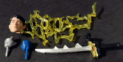
The likeness to Ollie is a good one, and the stern expression fits well since he was kind of a dick in the series. I wonder if we'll get a more evil version for when we get his corrupted Ranger form in Cosmic Fury. Also the Chromafury Saber is the same one as the one that came with the Green Ranger, meaning that both Ollie and Izzy's swords both struggle to properly implement their effect parts and end up being warped. I wish Hasbro would revert to the original sword tooling the same way they did with the buck for this character.
And here we have him next to his teammates. Generally fits in well with both characters, as he retains the same buck that Zayto has, but the lack of silver paint does make his helmet pop a little less.
And here we have the original Lightning Collection Blue Ranger with the Remastered helmet and the mainline version of the Blue Ranger, showcasing the difference in quality control between the two figures and the fact that the extra silver on the forehead of the mainline Blue Ranger should be sucked out and added onto the visor outline of this Lightning figure, which otherwise is mostly good but is the weakest one from the line.
Final ranking: ⭐⭐⭐ and a half out of ⭐⭐⭐⭐⭐
Up next, here we have the Dino Thunder Black Ranger. Now we're talking! This guy finally completes the Dino Thunder cast, and it also manages to be an improvement from the Bandai Legacy Collection version in terms of paint detailing. For those that don't remember, that figure suffered from being stuck with gold plastic left unpainted for the shoulder pads, parts of the suit, and his Brachio Staff. This guy manages to be much nicer looking by comparison, on top of already being a top-tier suit design as with the rest of his team. The only annoyance would be the pins disrupting the gold diamonds but that is expected.
His helmet looks the best out of the Rangers for this wave, both for design and in terms of detailing. It's sleek, sharp, and badass overall. That gold visor outline makes kid me happy! His accessories include an open right hand, a left fist, a 2004-era Tommy Oliver head, an effect piece that I am starting to hate, and his Brachio staff.


His display options are generally good like the rest of the series, but the likeness to 2004 Jason David Frank is not too great. Maybe it's the lighting in my setting but his younger heads and Drakkon had better likenesses. The Brachio Staff is at its best compared to past versions in figure scale, but I DESPISE that effect piece when used on skinnier, more flexible weapons. It's hard to insert the blade with the tip being bigger than the hole (SHUT YO BICH A$$ UP), and the blade is too thin to be kept straight if the effect piece was kept on for too long. It worked fine for Beast Morphers Gold and to an extent for Dino Thunder Blue, but it didn't make sense for the Lunar Wolf Ranger, it didn't make sense for Zeo Blue, and it certainly didn't make sense for this guy.


With a Dino Thunder group shot, the team is finally complete. It began with the White Ranger and his initially absent visor outline before we had Red and Blue back-to-back. Yellow popped up over a year later, and now their mentor is here. When it comes to Power Rangers Dino Thunder, victory is ours forevermore.
And for a Tommy Oliver Fighting Spirit group shot, here he is with his past forms, with the Green Ranger using a custom helmet from RangerForge on Etsy. While TJ may be the more famous wearer of this not-pictured suit, all we need next is the Red Turbo Ranger to complete the quintet.
Final ranking: ⭐⭐⭐⭐⭐ out of ⭐⭐⭐⭐⭐
Our third ranger is the Lost Galaxy Pink Ranger, which is more or less the same quality as what we expected from the Yellow Ranger. Like her fellow female teammate, she has double-jointed elbows, but unlike her, the knee joints are pinless. Why both joints are pinless while the legs are pinned for LG Pink and not Yellow is beyond me. On the brightside, the paint apps are applied on properly.
Her helmet is accurate to the show, though I kind of wish the eyes would be a little more saturated on the helmet. This design was always okay at best since it felt like Zeo Ranger I Pink's helmet mixed with an animal motif, a wildcat. It looks more like a pink bird. Her effect pieces include the standard lightning effect piece, her alternate head as Kendrix Morgan, the Quasar Saber in both deployed and holster modes, two weapon-holding hands, and a Transdagger in bow mode.
Her display options are just as good, and the likeness to the actress Valerie Vernon is good. The glasses can be removed if you want, a feature similar to the Remastered version of Billy Cranston/MMPR Blue. I like that she comes with the has both versions of the saber and her respective Transdagger weapon as does Green from two waves ago. And yes, you can have Astronema's head on the body if you want to recreate the brief moment when she wore the powers in the Legendary Battle. She loves being a Power Ranger.
For a comparison with her teammates, here she is with her teammates in Lost Galaxy. Another season completed, and one that began way back in 2019. With how much Saban Brands and Hasbro put so much focus on Lost Galaxy for a while, it surprised me how it took 4 years for them to complete the season. I mean we had Magna Defender and Red in 2019 (and again in 2021), and then we had Blue in 2021, before we then got Green in 2022. The girls were released this year. And about time, too.
Final ranking: ⭐⭐⭐⭐ out of ⭐⭐⭐⭐⭐
And finally, here we have Mesogog. Finally, a villain that isn't from the Zordon Era! Not that I'm complaining about the villain rep being bigger than normal with past seasons, but I was worried that we would not get a villain that isn't from MMPR, even though we got minions from Zeo and Wild Force as well as Ecliptor from In Space. And even better, Mesogog was an original villain from PR, who was much more sinister than his Sentai equivalent in terms of how ruthless this beast was. In addition, he has a badass character design that holds up much better than a lot of other monster designs we get in later seasons, especially when he looks less like a rubbery alien with no expression thanks to his inhuman eyes and his more convincing jaw movement vs what most villains possess. The sculptwork on this is almost all new, and it does so much right with all of the accurate details that one would expect from Mesogog, with the twisted robe to the scaly skin underneath. And those claws are not something to laugh at. I also think he has a hood on the back, which makes me wonder how he'd look if he'd wear it over the monstrous head. Now that being said, his colors do look a little too oversaturated compared to the show's costume prop. Maybe it's just how the show was filmed, but I swear it was more black if anything. Maybe they took reference from that old toy of his. But regardless, this looks absolutely badass.
His head sculpt is my favorite aspect of the character. Resembling a rotting dinosaur as very little of its organs remain on a distorted skull with piercing yellow eyes and a jaw that was never seen biting anyone but might actually do just that. And the paint work is thankfully not skimped out on, either, with the subtle airbrushing to further make this guy look organic. This is honestly above the norm for the standard Lightning Collection designs. His articulation is mostly the same as the others apart from having a single diaphragm joint for the torso and single-jointed elbows with swivels on them. He has a double neck joint with two ball pegs, though the head needs to be a little more secure. And of course, his jaw articulates. He has a lightning effect for the claw hand as well as a pair of fists and a blast effect for said fists.


The one oddity I do have to mention is that the fisted hands could really benefit from having paint applied on them for consistency's sake with the claws. Sure, it could be argued that this was because it would be covered by the effect piece, but still...

And here we have Mesogog vs the Dino Thunder team. This is my favorite shot ever from the Lightning Collection that I made. It's no secret that Dino Thunder is my favorite season, so this is a no-brainer kind of pic for me to depict the big villain of the season confronting my favorite Ranger team of all time. Dino Rangers roar. Power Rangers score. Save us from these evil forces. Victory is ours forever more. And victory may not be something Mesogog got in the end of the series as the Dino Rangers killed him once and for all, but he also gets a high score for having a lot of tooling put into him, making him a worthy addition in the same vein as Zedd, Ecliptor, and Goldar among other examples. Now I can't wait for Ransik, Master Org, Lothor, Grumm, Venjix, and Sledge.
Final ranking: ⭐⭐⭐⭐⭐ out of ⭐⭐⭐⭐⭐
Overall, this wave was much stronger than the last one, what with the male Rangers using the older, less QC-compromised bucks that don't have the crappy drop-down hips. The only weak one is Ollie, due to the warped joints and the left elbow, and even if those weren't an issue, the visor not being painted is still weak. But otherwise, Dino Thunder Black is awesome, Lost Galaxy Pink is pretty cool, and Mesogog is a badass overall. Definitely get this wave if you haven't done so since May/June.
Overall ranking: ⭐⭐⭐⭐.4 out of ⭐⭐⭐⭐⭐


