Drift may not seemingly present his Decepticon backstory from when he was Deadlock, but he does provide more of a samurai influence compared to his IDW self's more Japanese-mecha influence. I don't mind it since it makes the character feel more like he has an interest in homaging a warrior from the past like with most AOE robots. Hell, Optimus represented a medieval knight, Bumblebee as a ninja, Hound as an WWII commando, and Crosshairs as a mercenary. In AOE, he took form of a dark blue Bugatti Veyron. Now he's a Mercedes Benz-AMG GT R. How does this TLK retool stack up overall?
Here is Drift in his vehicle mode. Certainly a contrast to what he once took form of, but it does have a pretty decent color scheme overall. Black and red go so well together, though the rims being red does look off. Thing is, they look a bit too toyish on a car that's supposed to look slick in terms of color. A red trim around the rim would look fine enough. Also don't like how the red tampographs on the doors are not only ruined by the hinge but are in need of a second layer to not look so transparent. Everything else about the alt mode looks pretty good, and the clear windows being in a darker tint is a win in my book.
It's a decent looking alt mode all around, though I have to admit I'm more of a fan of the Bugatti. After all, the true Mercedes Benz MVP is Soundwave in my opinion.
Here is the TLK version next to the AOE use of the mold. Both are pretty different car modes, so it's kind of hard to decide which is better in terms being accurate to Drift. I will say that the AOE drift should have a darker blue and TLK Drift needs more black on the rims. Beyond that, it all boils down which one you like better.
You can tell just how amusing this retooling turns out if you flip the cars upside down. The vehicle shells are reversed this time, which means that what was the front of Drift is now the feet of the toy. Consequently, the head is unable to be hidden, and there is a faux chest. Also, look at all this sudden use of red we have here!
Drift's transformation works similarly to the AOE Deluxe but in reverse. I applaud Hasbro for trying to make this toy feel fresh despite it being a reuse of an older toy, though as previously mentioned, the shell is upside down in relation to its placement on the body. Also, the faux chest may seem odd to have, though it kind of makes the robot slightly sleeker.
The robot mode makes me think of Deadpool. Dead serious, guys. The red, black, and sword motif makes me think it's Driftpool because of the sudden use of red. Promo art had Drift as an entirely red robot despite his vehicle mode being black. While the movie gave Drift a black with red highlight color scheme for his robot mode, the toy still has the entirely red colors. Was it meant to be based on a color scheme Hasbro and Paramount intended back in AOE? Was it meant to sort of homage the RID15 Drift (who was more orange)? Who knows. As for the robot mode itself, the faux chest does help make the design look less clunky somewhat, though there are still the same problems from the last version, mainly the skinny arms and the feet looking a bit too big. There's also a backpack that keeps the figure from looking sleek, too.
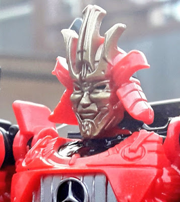
The face sculpt is somewhat of a mixed bag for me. While it doesn't have a creepy smile, the gold sort of clashes with the bright red plastic, the eyes lack any paint, and the outer horn pieces are missing their paint.
Articulation is decent at best for this mold. Head is on a ball joint, shoulders move front and back as well as in and out, they swivel at the elbow and bend at the elbow, and the wrists curl inwards. Hips move front and back, in and out, swivel at the thigh, bend decently at 90 degrees, and the feet hinge forward.
He has two swords that are reused from the AOE mold but are now in black. I don't get the reason behind it since they could have easily added some silver on the blade only.
Aside from his bigger swords, he has the little daggers that are cast in the same plastic. They mostly complete the look of his back.
Here is a repaint of the mold used in the Studio Series line. This version of Drift has a much more accurate color scheme as well as a retooled head, a new sword, and three Baby Dinobots (not pictured). The color scheme certainly completes the look for Drift, especially when there is a lot less red, though it's a retool that I would recommend to fans that want every figure in the line.
Here he is next to the AOE figure. The base mold itself has the same weird proportions found on both figures, but the TLK figure at least has a faux chest to look slightly sleeker. I should mention that my AOE Drift has his gold swords painted.
This is an okay figure at best. While not the worst figure in the line, TLK Drift needs more than just a heavy retool to make him worthwhile as much as some of the other figures. I would mostly recommend the Studio Series version, though there is another Studio Series Drift that's more worthy of your collection, and we'll check it out down the line.
Final ranking: ⭐⭐ and a half ⭐⭐⭐⭐⭐


No comments:
Post a Comment