Let's cover the poster boy of the movie, Mario. The same guy who was voiced by a crisp rat who people hated at first, many fans can now get this guy with no problem after most of them were accepting of his honestly not-too-bad performance in the movie. The character design is given more sculptwork added to make his outfit more realistic while maintaining the same cartoony look that one would expect from the Illumination people. It kind of reminds me of how Mario Odyssey added more details to Mario and all the other characters as he looks less and less plasticky since the N64 era. Even the M on his hat comes off less like a tampo and more like it's etched onto the article. His eyes are made to be "articulated" because they're acrylic, meaning the pupils will follow you in any direction the head is facing. It's a neat feature for photos where Mario is staring at you, but it will be annoying if you want him staring at another toy rather than you. Oh, and his butt is as small as it is in the movie, and it weirdly reminds me of Hank Hilll's lack of an ass.
His articulation consists of a ball-jointed head, shoulders that move front and back as well as in and out, elbow bends as well as swivels at the elbows, the forearms swivel too, but they are useless due to the joint cuts; the wrists swivel, the waist is on a ball joint, hips move front and back, in and out, thighs swivel, knees bend, and the feet are on ball joints. He comes with his toilet plunger, but I do wish he had more alternate accessories, like fists for more dynamic poses (as dynamic as his body allows) or an alternate angry face. I'm surprised to see an increase in both scale and quality (along with the price) when put next to the main Mario, as the details on him are crisper, the paint isn't like pastel, and the quality control is much better. The articulation is comparable to the Figuart, but the leg movement is better on this guy in my opinion. I don't have the Figuart because it's easier to compare and contrast two figures from Jakks by a decade.
His articulation is the same as his brother's, but his accessory is a flashlight, which is fitting for when he's going into the Dark Lands while running away from Dry Bones and eventually getting captured by the Shy Guys. Next to his original World of Nintendo counterpart, the difference in quality and size is higher this time around. I also like that Luigi's pose in the photo combined with the eyes makes him more photogenic. He could use a terrified face and alternate hands, though.
We then go to Princess Peach, who is depicted in a more traditional sculpt of having a plastic dress that doesn't make posing her much easier. It's inevitable, let's be honest. Her dress's creases are believable in making her look like they're fabric, while the two-tone pink coloring is carried over. The shoulders are in the hot pink as are the pads on her dress, though.There are a few creases on the gloves, which I don't mind too much. Her eyes have the same acrylic look that the Mario Bros possess. Her hair is also sculpted to look like hair, though a golden wash would both be accurate to the movie and highlight the sculptwork more. At least the crown is nicely painted.
Her articulation is much more limited, with a slight bit of head movement, shoulders that are equally limited, elbow bends, and wrist swivels along with a torso joint. It's a shame that you can't pose her in a more dynamic fashion like in the movie, but either the dress looks nice or the figure has better posing. At the very least, she is taller and in some ways a better quality figure than her original self, which was unexpectedly harder to find. This one, being more expensive and coming with an umbrella, might work better. She could use a smirking alternate head, though, especially given her personality being different in the movie.
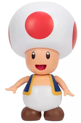
And it's now Toad's turn. This guy is amusingly the same as his appearance in the games, but with bigger eyes that, if they didn't have the white dots, would make him almost comparable to the N64 version of the character. His mushroom hat has the dots painted, but the backpack has various non-removable tools that are at least painted in different colors from each other, with a green sleeping bag, a beige rope, a blue cup, and a brown and white lamp being part of the admittedly back heavy backpack. The buckles painted in silver are a nice touch.
His articulation is where things get a bit weird since while the head, shoulders, elbows, legs, and feet are appreciative, he can't really be balanced well enough while he's in a walking pose. The biggest issue I have with the figure are the forearms. They're small, yes, but why are the joints flexible to the point where they feel like they'll tear off while I try to move the arm out or insert/remove the frying pan accessory? I should mention I don't have a normal Toad, but you can see here how different the proportions, amount of articulation, and the paint apps not being the same in terms of sizing.
And here we now have Bowser. The best performance in the movie thanks to Jack Black, Bowser is depicted as intimidating as he is in the games, and maybe moreso since he's not usually like this in the games. The sculptwork is given a new layer of texturing that makes his skin more organic while paint apps not missing any important details for Bowser. The hair, the mouth, the shell, the spikey bands, even the claws on the hands and feet are not missed out on! New to this version of Bowser is a green face that transitions between the shell and the yellow skin. His shell is actually a PVC material, somewhat like parts of his figure. Honestly, when I first opened the toy out of the box, the smell of it reminded me of the paint that NECA's figures had.
His articulation is pretty basic, with no neck or mouth movement, shoulders that rotate 360 degrees, elbow bends, wrist swivels, hips that move front and back (with a bit of different sculpting for the bottom region with the left leg, knee bends, ankle rotations, and two points at the tail. Removing the shell leaves one spike, a switch, and a battery cover. Yes, this guy has a gimmick where you can put water inside the head and press the one spike to have him breathe smoke while a red light blinks. It's meant to emulate him breathing fire.
And here he is next to his main counterpart. Amusingly, Bowser almost fits well for a Smash Bros iteration, and possibly the closest to that style for the character. The WON Bowser figure is not only more cartoony in this form, but he also looks more limited in articulation, especially in the knees while the hands can hinge rather than swivel. He also looks the most pastel when he stands next to his movie counterpart. Their joints are both fairly loose, which is especially annoying given how they're supposed to be Deluxe.
And that wraps up the first wave of Nintendo figures. Overall, these figures are alright for what they are as tie-ins for the Mario movie. The Mario Bros are the best figures in the wave, while Peach and Toad are perfectly fine for what they are while they aren't as good as the former. Bowser is pretty decent, but I don't think he's worth getting at full price. Some of these should be on clearance, but the others are mostly worth getting at full price.


