

Here is the Integrated Suit Spider-Man in-hand. This guy is basically the upgraded Stark Suit with the elements of the Iron Spider suit he previously had taken from Otto Octavius now returned to him as a favor for restoring his mind to normal. This figure is an enhanced reuse of the 2021 version released back in the 2021 Armadillo BAF wave, which also saw figures of the Black & Gold suit and MCU versions of Doctor Strange and J Jonah Jameson along with Insomniac's Miles Morales and regular comic versions of Shriek and Morlun as vague tie-ins to Venom: Let There Be Carnage and Morbius. I never got Integrated Spidey nor his black and gold counterpart, but this is the first time getting A version of MCU Spidey in proper Legends form. Compared to the original version, this guy has a proper wash for the webbing, and the black was replaced with darker blue. As for the rest of the suit, it's a typical case of MCU designs over-designing the comic suit designs, which is typical for comic-accurate suit designs in this series (the DCEU, by contrast, goes for adding texture or makes the suits look like they were made of different materials). The gold and the added lines all throughout the figure made it look more updated and high-tech, a phase of MCU's Spider-Man that thankfully ended at the end of No Way Home after years of him dickriding Stark's legacy and brainwashing fans in thinking that is right. Also, is it me or do his feet look a bit oversized?


Head sculpt is somewhat inaccurate. While the design is close to the way it appears in the movie, the lenses don't look as pointy in addition to them being flatter on the suit likely due to how overly CGI the design is. But it doesn't look terrible for this guy. His articulation consists of a double ball neck, shoulders that move front and back, in and out, butterfly joints (that barely work), bicep swivels, double-jointed elbows, wrist swivels and hinges, an ab crunch, a diaphragm joint, hips that move front and back, in and out, thigh swivels, double-jointed knees, and ankle hinges/pivots.


The other alternate hands he comes with are the two fists for when he needs to punch the shit out of the Goblin for the death of Aunt May to some web-thwipping hands. Interestingly, he still retains the gauntlets that were later abandoned for the final battle, and while you can remove them, doing so leaves his wrists looking rather malnourished. Also, if you look at the fingers, they lack the same webbing paint apps that are present on the rest of the figure. It's small but it doesn't make any sense if the rest of the toy was already given this treatment. They should have gotten all the way through.


For a size comparison, here he is with some MCU characters he interacted with and one that will interact with him in some way, shape, or form according to Kevin Feige's egghead. We got a really good lawyer, some guy who's not a good doctor according to Gwen Stacy, and a mercenary from a very popular movie in 2016, you might have heard of him. Anyways, given how short Tom Holland is as an actor, it makes sense that he'd have to look up to these other actor with how much of a small fry he is. Maybe he'll get a bit of a growth spurt by the time we see his fourth movie, and hopefully, one that is better than what we previously got.

It's pretty amusing how his relationship with Strange actually put them at odds with each other, with one screwing the other one up, unintentionally as it may seem. It's definitely a contrast to him dickriding Stark or being too stupid to know Samuel L Jackson is a Skrull. It's no wonder Miguel O'Hara hates the shit out of him.

And why not, here is a comparison of the only-other MCU Spider-Man I own in figure form along with the original version of the mold we have here.So basically, the dark grey became a dark blue, there is paint for the webbing on the red parts of the suit except for the fingers, and that's pretty much it. It is the more definitive version of the suit design, and it's better than sticking with the old basic Homecoming figure (which had less leg articulation than most of the Power Rangers), but I do kind of wish he had an updated buck that gave him better proportions and articulation than what he currently has.

And now it's time to take a look at Andrew Garfield, because even though he is Peter 3, he is the second version of the character albeit we're going in reverse order because of the incoming battle of the Tobeys. This figure does the TASM2 suit some true justice in a way no other 6-inch scale figure truly could. It captures that more stylized take on the appearance of the web slinger, where it aimed to not rinse-and-repeat Tobey's already iconic suit design while not going too far from the norm as we saw with the vigilante suit, so the Amazing Spider-Man retains the normal red and blue patterns with none of the divergent details while still retaining that stylized logo with the longer lower legs from the front and back of the figure. That being said, the coloring might fit a little better for the vigilante suit rather than the Amazing suit because it is darker than it normally is. Maybe it's trying to replicate the more metallic sheen that the fabric has, but it comes off like it should have been a little more saturated, at least for the red. The webbing being black might be seen as inaccurate to some people, but it doesn't look too bad on this guy. It at least should be a little lighter in shade while also not being too similar to the webbing on the Tobey suit. We'll get to him in a moment...


His head sculpt is accurate to the suit design, and it's the best one out of the lot. The Amazing suit knew how to do the best of both worlds with more expressive lenses while maintaining a bit of the serious factor (if that makes sense) for the pointiness they somewhat have. It's a great way for them to not retread the same ground as we already got from the Raimi trilogy's suit design, especially with the lenses being whiter. His articulation is about the same as Tom's, but instead of an ab-crunch and waist swivel combo, he has a diaphragm and ab crunch combo, a new trend for Spidey Legends of late. His butterfly joints are probably worse than Tom's, likely because of the attempt to try and look naturalistic with the sculpt of the torso.


We once again get alternate hands that basically do more or less the same thing we already got from the MCU version of Spider-Man. I do like how his wall-crawling hands aren't posed the exact same way as Tom's are, which is something I can appreciate. Andrew also features drop-down hips, which are tighter compared to either Time Force or Dino Charge Blue, but they barely make a difference in terms of how low they go, making the joints feel kind of needless.


For a comparison with other 1:12 scale versions of the character, here he is with the 2014 Infinite Series Legends figure I own, as well as some images representing the MAFEX version of the character as well as the Marvel Select from back in 2014. I think when it comes to the proportions being more naturalistic, the new Legends one did it right in my opinion. The Infinite Series version that was part of the Ultimate Green Goblin wave) was a stand out release to many back when it first came out, both because fans were happy to see a more comic-accurate suit design after the deviation of the first movie's suit as well as how better Marvel Legends were getting back in 2014 after the bumps on the road we got when the line was revived. That being said, it along with the MAFEX version (which was a premium figure for its time) do show their age with how awkward the articulation cuts and gaps are on the former and how wonky the proportions are on the latter. The Marvel Select version was a solid figure from what I remember, and it even came with a firefighter's helmet and a hose when he encountered Electro, but I feel this figure serves as a midway point between the flawed and dated first Marvel Select Spider-Man and the highly definitive Spectacular Spider-Man. So in general, Hasbro's second Andrew is definitely the best one out of the set and among his fellow TASM2 1:12 scale peers (even if Select is an inch taller).


And finally, the reason most fans are interested in this set, Tobey Maguire's Spider-Man with updated Marvel Legends engineering. At first glance, everything seems to be in order. We have some nicely textured suit patterns for the character, the webbing is present and sculpted raised in relief the Spider logo on the chest looks good, but the proportions feel...off...I know Tobey was past his prime in NWH, but this figure kind of makes him feel more off in his proportions than the character actually looked in the movie. Maybe it's because his hips stick out a little more than they do on Andrew and Tom. The torso also feels a bit rough in terms of how it's meant to look organic; almost like the upper portion of it was designed by one person and the lower region for the stomach was made by another, so when they began the assembly, they believed no one would notice. And they were right as fans critiqued the spider logo on the back for accidentally having 2 extra legs when attempting to preserve the sculpt. And as for the webbing, this guy has the worst tampograph placement out of the three Spider-Men in the set. Some parts look good like on the waist, and other parts look terrible, such as the arms. The colors, I feel, might be a bit oversaturated on him, too. The blue should be a bit darker, but the red should be a bit richer.


His head sculpt is done so poorly, it looks even worse than the CG model that was used in lieu of an actual mask. The webbing pattern is not only off like how it is in the movie, but the paint for said webbing pattern is barely present on there. The paint is there, but it looks so faint, it's almost like it experienced paint-rubbing from frequent play, and this isn't even an old toy. Also, the head does look a bit misshapen, almost like it's got just about everything we'd want from the details but it doesn't do it quite right. His articulation is basically the same as Andrew's.


And yes, we continue having the same sort of alternate hand options that we've come to to expect with this guy. What are the chances? Once again, I appreciate that his wall-crawling hands are posed differently from the others in order to make him more unique. Good touch in my opinion, and one of the things I do like about this set.


For a size comparison with other Marvel Legends representing the 2000s, here he is with Wolverine and Iron Man. FINALLY, three cinematic Marvel heroes I grew up with are represented in a good display with the best level of updated articulation and details. But I gotta give most of the credit to Logan and Stark, because their figures are generally well-made and don't feel too inflated in terms of pricing. By contrast, Tobey's figure does have some good things about it, but when you get up close, he feels like a rushjob by comparison to either figure. And it makes it feel like Hasbro didn't do much about fixing this guy because they know fans will eat it up because it's Tobey Spider-Man, even with the price tag that the set has no right to have.

The three of them don't come with alternate civilian heads, as you can probably tell by this point. I really wish they would have included them because they would somewhat justify the price that the set is going for, but I feel Hasbro didn't want to make things feel inconsistent with the way Andrew's Figuart doesn't have a head while Tobey and Andrew do, so maybe it was a good idea they didn't include their heads? You have plenty of alternate heads for Tom with recent releases, and one of the older 6-inch Walmart exclusive TASM1 figures comes with an alternate head for Andrew, but good luck finding any older Tobey heads that fit on the ball joint and/or shelling out more money for a fan made head with a chance of having to paint it yourself. More alarming, they don't have any other accessories that would have been able to justify the ridiculously high price of this set. Accessories related to the cures for the villains? Nope. A diorama depicting the battle on the Statue of Liberty? Nah. More hands for the characters to use, like pointing fingers when they made the obligatory meme reference or any thumbs up from the trio? Whaddya think, silly?! We're stuck with three of the same web accessories we've seen on various Spidey Legends of late...only this time, they're cast in clear plastic! And no, there aren't any hands meant for them to hold the damn things, because that's only for logical people!


Andrew Garfield's version of Spider-Man looks PERFECT next to Venom, as the two are a match made in fanboy heaven as someone who sees Venom's aesthetics as fitting for the TASMverse, which is explained by the more modern/organic approach a lot of the villains aim for in contrast to most Raimi trilogy's sharper use of science with the Goblin's use of military tech repurposed for evil, Doc Ock's tentacles, and New Goblin's sleeker equipment (Sandman is simpler than them both and Venom isn't as organic in the Raimiverse). If there was a movie that depicted Andrew's Spidey teaming up with Tom Hardy's Venom against a common threat, then I'd enjoy the hell out of that!

And for the most-likely pairing we'd get in a movie, it's Tom Holland's Spider-Man vs Venom! Don't take this photo as me shitting on his version of the character, I just feel that perhaps his post-NWH adventures will leave him at odds with struggling to live on his own while also dealing with new threats who are set to fight him during his new, lonely life. We can only hope that Venom doesn't repeat the Iron Boy Jr jokes, not because they're bad, but because he's moved on from simping the Avengers by this point in time.

Overall, this set is the biggest mixed bag I have ever owned from Marvel Legends. I don't hate this set as much as other people like AnthonysCustoms do, but I don't love it either like a lot of the fanbase does. There's a lot of great ideas in a set like this, but at the same time, the half-assed execution makes this feel like Hasbro is using the iconic unity of the Spider-Men in a single movie as a way to hide the lack of effort put in the set. Tom should have been a new sculpt, Andrew is the best of the set but needs more work, and Tobey is a big-time letdown, in a way much like the other Big Time Letdown Spider-Man ShartimusPrime was known for mocking. But if you thought this review was over, think again! Because these three are about to face a single figure that's worth about the same money as these three are going for!

And finally, here we have the SH Figuarts Friendly Neighborhood Spider-Man. Now normally, I hate having to deal with US vs Japanese figure comparisons because one is meant for a normal store line (in addition to Hasbro having too many eggs in one basket) vs stuff for more premium lines like NECA and the like, but if Hasbro wants to put this figure at a higher price tag and say their Tobey is worth the extra money, then I will sure as hell compare him to the Figuart. And right off the bat, this figure does a much better job at towing a balance between the proportions of his younger self from his prime and the older physique we see in No Way Home. But the webbing pattern is much better applied and is gunmetal rather than full silver, the lenses balance the look between being being reflective and entirely white, the shades of red and blue are much closer to the actual suit, and the spider logo on the back doesn't have any weird extra two legs unintentionally. The only issues I have are that the figure's elbows are in blue plastic rather than being red, so they stick out a bit more from the rest of the arms.


Now we are talking when it comes to this head sculpt. From what I can tell, it appears to be reverting to the more traditional look that the mask always had in the movies up until NWH. Maybe someone at Tamashii Nations thought the CG mask looked like ass so they thought to stick with the concept art from the original movies and replicate that from there. And hey, even with the slightly off lenses, you can tell the web pattern looks complete on him. And as we're about to delve into, the accessories are crazy, with two alternate heads and an additional neck piece for you to depict him with more of his neck exposed, a pair of short web lines, a pair of medium web lines, a single strand of web for swinging, his folded up mask, two pointing hands, two mask-holding hands, two thumbs up hands meant for him to hold the web, two thwipping hands, and two wall-crawling hands.


The articulation for this guy is insane, though. Seen here in these photos pointing, holding his mask, or holding a web while he's upside down, his head is on two ball joints (one for the neck, one for the head), shoulders that move front and back as well as move in and out on one joint connected to the arm and another connected to the butterfly joint, which itself provides more range than the average butterfly joint, we get traditional bicep swivels and double elbows, but the wrists do the same two-in-one approach that the McFarlane DC Multiverse line and the Figuarts line generally does (at least from my experience with the Sailor Scouts and Ranma). The are two ball joints for the diaphragm joint as well as the lower torso joint, with the forward range not only leaving proper extensions for the back spider's legs but also an additional torso plate on the back to hide the gap that likely would have been made if he crunched forwards. The hips move front and back (with hip/butt panels that are meant to help hide the gaps of the figure wherever it goes), in and out, thighs swivel, knees bend at two points, the ankles swivel above the rocker, they pivor side to side, and there is toe articulation...now I didn't need Hasbro to be on the same level of articulation as the Figuarts, but if they had better butterfly joints, better head/neck movement, and toe articulation, things that were present on the Renew Your Vows version of Spidey, then I'd be able to stomach the overall figure's quality better. But as it stands, this guy is unbeatable as far the range of articulation is concerned, not just from the amount of it present.


 +
+I should also comment on how good the likeness to Tobey Maguire is in the pictures above, though he does appear to be missing his stubble and looks younger somewhat. Once again, I see this as Tamashii Nations wanting to do a midway point between when we last saw him in Spider-Man 3 and his most recent appearance in No Way Home. The unmasked accessory is also pretty neat, and we don't get that a lot with Spider-Man figures apart from the Spectacular Spider-Man from Marvel Select. The webbing accessories are a breath of fresh air from Hasbro's reused web pieces, as they not only allow for smoother display options, such as when he's hanging upside down, but also when he's thwipping weblines against bad guys or buildings. The different length on the long and short weblines also adds to the display options of this guy, and who can say no to getting him in a crouching pose with better joint fluidity combined with range. The Sailor Scouts are nice-looking figures, but they're much harder to pose without the fear of stretching the skirts or breaking their delicate joints. Spider-Man, on the other hand, feels much more durable by comparison.


And here's the comparison I saved for this guy, as the Figuart and the previously covered Marvel Legends figure now go up against ToyBiz's older takes on the character, with the one on the far left being the original 2002 figure from back when Spider-Man Classics was around while the one on the far right being the 2004 Superposable version made for the second film (and if you think I'm referring to political left and right I'm gonna punch you). We can see how much the engineering and figure poseability has changed throughout the years for all these figures. The 2002 version had a fairly naturalistic sculpt and was nicely painted and detailed for its time, but I will admit that its use of the Classics sculpt from way back does make me feel weary on the use of springs, even though it is a bit of a hefty toy. The 2004 figure is very iconic for fans, especially with how much articulation it packs, with an additional shoulder joint that extends past the normal hinge long with finger articulation that is long gone. But its sculpt is probably the most dated, given how odd the torso looks overall, and my copy is so loose and beat up from frequent play as a kid. But if you wanted a more updated version of the character, I'm going for Figuarts. While it is annoyingly the shortest one of the bunch (ignoring the different manufacturer and Tobey being a short man), this is the best figure in the entire line-up we have here.


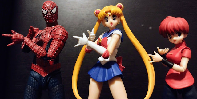

And for a very special pic regarding how much my collecting habits changed over the years, here is Spider-Man with some of the other Figuarts I own representing different franchises I own, with Mario being the first character from the line I ever got back in 2018 (and later Luigi) before a gap that lasted a few years broke with Sailor Moon and many other Scouts from the franchise. And in that same year, Pac-Man popped up. As for all the Figuarts I covered in 2023, not much in the form of SM or gaming characters, but joining Spider-Man a month later was the surprise addition of Ranma Saotome, the female version of the character. This is a pretty amusing image if I do say so myself, as everyone smiles at the camera while posing for their group photo. It's a neat way of looking back at how my interests did expand in a way, as I was a Pac-Man fan back when I was a baby while also becoming a Spider-Man fan as a I got older. Then playing video games with my older cousins got me into playing Mario games, with Super Mario 64 DS being my first ever game from the series.

It's quite interesting to see how much the variety in my interests have changed. While they remained the same throughout the 2000s and 2010s with comics, movies, games, especially with Transfomrers, Power Rangers, Star Wars, Marvel/DC, TMNT, and Mario/Sonic/Pac-Man/Halo being my biggest interests, the fact that anime that wasn't Pokemon or Digimon would be something I'd get into as seen here with Sailor Moon and Ranma standing with the webslinger proves that perhaps there's something nice to be said about the genre, or is it a medium? Anyways, I am happy to see that not all anime is bland, or degenerative, or try-hard. And in case you're wondering, I'm trying to get more characters from Ranma as well as any figures of Inuyasha, Urusei Yatsura, Neon Genesis Evangelion, and (after years of not knowing what iterations of figures to start with), Dragon Ball.

The thing that I find amusing with the Figuarts line is how expressive they can be with not just the articulation but also their faces. Spider-Man's a more traditional fellow with how he has the entire head be a swappable part so you can depict him masked or unmasked. But the fact that there is an alternate neck piece shows more of his skin to go with his unmasked head adds an extra layer of uniqueness compared to when you normally swap heads on a Spider-Man. The face plates on anime characters, on the other hand, allows them to be more expressive than the usual faces real humans possess, allowing for even more photogenic images such as Sailor Moon and Ranma trying to get their weapons back. And yes, he can hold them no problem.
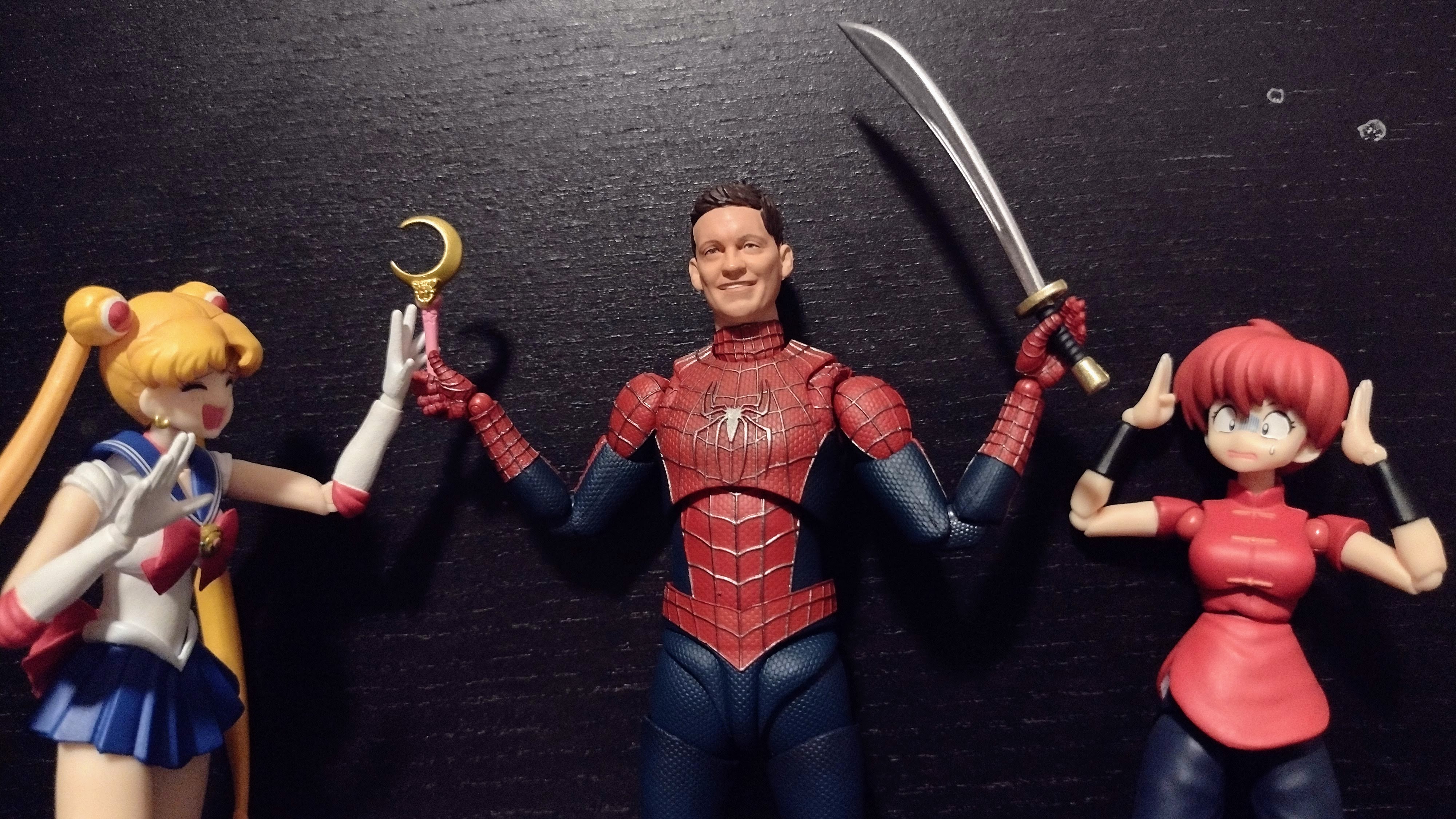
And when they have more alternate hands to choose from, we can make them do poses we normally don't see them do. So we have Spidey joining the lunar heroine as they both doe the "In the name of the moon, I will punish you" pose. Ranma can try something similar but she isn't as effective as the others are. Also amusing how Ranma's clothes are red and blue like Peter's suit.

So that leads into the question: will I get the other Spider-Men in the Figuarts line to complete the trio? Probably not right away. The biggest factors come down to the price. A 3-pack and a single Figuart are already past $200, but to pay about twice the amount for the other two Figuarts right away? Not likely, especially after buying about a year's worth of Sailor Scouts and Pac-Man in 2021 even if they're each cheaper than a single Spidey. I am also unhappy with the lack of an Andrew face for Amazing Spider-Man, even if the actor wanting more money from his likeness is to blame and not Tamashii. So why have 2 Spider-Men with alternate heads while one is missing his?

And what about the Red & Blue suit along with Green Goblin? That's a cool design, I admit. And a great way to show Tom Holland is past simping the Avengers and i stead got a wake up call from learning how to be more like Tobey amd Andrew, arguably better superheroes than the Avengers are. But I'll wait till its on clearance. Especially the already expensive Green Goblin. Plus, cool as he looms, I wish it was the pristine design from the first movie; he did have that look for a brief moment before breaking the mask.

So overall, this review has been a long one coming, but with my love for Spider-Man and the Raimi Trilogy, I had to talk about my opinions on the Figuart AND the Legends set simultaneously. Now you are left with a choice: would you rather pay for one figure only for nearly $100 but it has a ton of accessories, nearly perfect QC, stellar articulation, and a better presence on a shelf? Or would you prefer to buy 3 figures for the same price yet their QC is worse, one is a reused sculpt, ant the two new molds have limited neck and butterfly joints in addition to all 3 having fewer accessories? It's definitely a case of quality vs quantity in a review like this, and again: I don't like comparing Figuarts to Legends even if there will be people who would mention ToyBiz or other companies that have fewer licenses than Hasbro. BUT when Hasbro wants to boast about how good their NWH set is and put the 3-pack at a higher pedestal than the average Marvel Legends set, even with sets like the Love Triangle 3-pack or the Symbiote 3-pack having better value for money than this, then expectations are going to be mich higher. And alas, those expectations were definitely not met.

If you can't tell, I recommend the Friendly Neighborhood Spider-Man over the No Way Home 3-pack any time of the day. If you want to get the NWH set at a lower price, maybe wait for the price to drop if this somehow gets to Entertainment Earth or BBTS like with the Retro Carded Iron Man and the VHS X-Men sets....if they'll ever do that, that is. I'd say maybe wait for them to do proper waves solely dedicated to the movies if you want not bust the Spider-Men but also the villains at hopefully lower deals. We'll see if Hasbro will win or not on that front. But until then, get the Friendly Neighborhood Spider-Man. Even at the full price, he is worth every penny.

Final ranking: ⭐⭐ and a half out of ⭐⭐⭐⭐⭐ (No Way Home set)
⭐⭐⭐⭐⭐ out of ⭐⭐⭐⭐⭐ (Figuart Spidey)
And with that out of the way, I personally want to thank everyone who has read the past 500 toy reviews I made. Whether it's taking a look at my Transformers reviews, hearing my "free-thinker" opinions on Power Rangers/Super Sentai, seeing me give attention to video game characters, watching an increase in Marvel Legends and Star Wars Black Series reviews, and seeing the occasional DC, TMNT, Sailor Moon, etc review, it's been great making various posts that cover plastic crack, with an occasional blog here and there. Will I get to 1,000 reviews? I don't know. But whether I reach that milestone or retire at some point, I want to thank you for being with me since 2019...or 2018...or 2017...or 2016 IDK WHEN I BEGAN THE SITE HELP!!!!!
Ah, screw it. Peter can close this off better than me.


