Saturday, July 31, 2021

DC McFarlane ZSJL Cyborg review

The real soul of the story is none other than Cyborg, with a past that is enough to make a grown man cry and a devotion to his role that makes us want to root for him. While Josstice did some vague illusion of that, people will never forget him commenting on his toes at the wrong time as well as a huge removal of scenes that compromise his character. Most important of all, we can't forget how Warner Bros fired him when he started to call out the terrible treatment that the cast and crew received during the reshoots...and they want to claim they're not racist by putting not one but TWO Black Supermen in production?! Oh and it's amusing how they're going all-in with diversity, but much like how Disney has to abide with China, WB puts their POC-led films on HBO Max rather than in theaters. Anyways, enough comments on the Wanker Boomers, let's talk about Cyborg's new figure!


Here we have Cyborg in-hand, and what a nicely-sculpted figure he is! The character design was certainly more alien and somewhat technorganic in appearance compared to the other bulkier designs of the character in other versions. It all makes sense given how much more alien the Motherboxes are by comparison, and the proportions, while fragmented and skeletal than the norm, works so well nonetheless. The design is nice, sleek, athletic, and still feels strong enough to go against any Apokaliptian threat. The sculpting is rather exquisite, and the silver paint mixed with some drybrushing gives him a worn look that makes him look more life-like than a plastic toy. The only bad thing is the red on the chest. It's meant to evoke the glowing light that he has but it looks sloppy and poorly executed in terms of concept. Part of his chest and his waist are made of PVC, and his waist is kind of annoying since it kind of doesn't stay in place, nor does it hide any gaps left when it's lowered.


Head sculpt looks much loser to the actor, Ray Fisher, and while half of his face is somewhat hidden, the likeness to him is done up pretty well. It's not 100% perfect, but it's much closer and looks less like a generic black man. As for his articulation, he's on-par with the other figures in the line, but with some differences overall. His head can move around left and right as well as up and down, his shoulders move front and back, in and out (on both a butterfly joint and a shoulder swivel come hinge), bicep swivels (with the shoulder armor flexing somewhat while attached onto the outer side of the biceps), elbows that bend 90 degrees only, and wrists that can only hinge in and out as well as swivel. There are two torso joints for the diaphragm joint as well as the abs, hips that move front and back, in and out, swivel at the thighs, bend at a single joint for the knees, and the ankles can swivel, hinge, and pivot. His left forearm can be swapped in favor of a cannon that he can use if you want him to have an attack mode. It's nicely sculpted and painted, though only the left arm can be switched to allow that to happen.


As far as variants are concerned, Walmart has a variant with the battle mask deployed. The rest of him is same,but it would be nice if he had something else to make him more incentive than just making you barely buy the same toy twice, like, IDK, THE EXTRA ARMS?! Anyways, for a comparison with his Mattel counterpart, it's night and day. Cyborg looks more toyetic in the Mattel line and has a bit of comic bulk to him. McFarlance Cyborg, on the other hand, is much more accurate to the movie and has nothing missing from his proportions, even if he might not be as solid as the Mattel one in terms of durability. Also, the face is much better than the Mattel one, who looks more generic and not proportionate.


And here he is for an articulation comparison. I like the more natural poses that Cyborg can have with the McFarlane version compared to the Mattel one, who struggles and is more rigid by comparison. That being said, I wish his right arm can also be used for cannon-switching.


And here we have Cyborg with the rest of the league. He fits in rather well, and while it's weird that the other League members tower over Batman, they make for a rather dynamic display if you ask me, and we need two more members to complete the team. Believe me, it's building up to make for a great display.


Overall, Cyborg is a pretty solid figure even if his range of motion isn't as good as the others. The single elbow and knee bends could be better, and I wish he had more accessories than just the swappable forearm cannon. Either way, he feels much more fulfilling than the Mattel one, and while not as complete as the higher-end versions, he is a great addition to the line nonetheless. Just look out for any of the paint mistakes.


Final ranking: ⭐⭐⭐⭐ out of ⭐⭐⭐⭐⭐

Tuesday, July 27, 2021

DC McFarlane ZSJL Aquaman Review

Aquaman's one of those guys who never got to be taken seriously for the most part. Many associate his character to be rather lame, and it doesn't help from all the comedy skits that poke fun of his powers from the likes of the Superfriends show. Yes, a campy, toyetic show it may be, the other characters didn't feel as compromised as Aquaman was (okay, Darkseid simping over Wonder Woman is a thing, but come on, now!); this meant that a live-action version was definitely going to aim for a different tone from what casuals think of when they see Aquaman, but much like the 90s comics, Aquaman was a badass in the Snyderverse, from his brief yet memorable scene in BvS to his characterization of being a loner with a grudge at his Atlantian nature is everything that makes him worthwhile if you ask me. Even his solo movie had some form of way of keeping him badass in spite of him being treated the same way he was in Josstice (with the last part of his solo movie being the strongest act if we're being honest). Now let's take a look at what we've got for the Snyder Cut's king of Atlantis with McFarlane's version of him!


Here we have Aquaman in-hand. His suit captures the way it looks on-screen, with the appropriate paint applications of green and bronze applied over the mesh of the patterns with an appropriate wash to give it a worn look. The shoulder The more vibrant parts of the suit include the belt as well as the boots and part of the gauntlets. Honestly, color scheme works well if you ask me, as it manages to have a good balance between looking familiar while being brand new (especially compared to the later suit looking too close to the comic lore even if it is decent in my opinion). The shoulder pads are made of PVC, but one of them is sadly warped somewhat out of the box. I hate it when that happens.


Head sculpt is better in-hand than from the stock images, and while the facial likeness to Jason Momoa is good, it's not 100% perfect, and my copy's eyes are not aligned that well. It's not horrible but it is noticeable in some areas. His articulation is the same as with the other guys in the line; his head can move around decently in spite of his hair, his shoulders move front and back, in and out (on both a butterfly joint and a shoulder swivel come hinge), bicep swivels, double-elbow bends, and wrists that swivel and hinge at two points (as well as having the wrists have the ability to both move in and out or up and down). There are two torso joints for the diaphragm joint as well as the abs, hips that move front and back, in and out, swivel at the thighs, bend at two points at the knees, and the ankles can swivel, hinge, and pivot (with some hinderences). The waist piece is once again made of PVC material, which allows the sculpt to not look broken up from his articulation while also keeping its range of motion smooth. His staff can be hend on his hand, and while it's not painted, its materials at least give it a metal feel (if a little too pristine compared to his suit).


Here he is with his Mattel counterpart, as he is one of the few characters in the wave to not have a variant. The Mattel version was sort of decent for what it is, even if he lacks articulation and has knees that feel too stiff for his own good. I like the color of his quinlet better, and I just noticed that Aquaman's staff from the McFarlane version is thicker than it should be. Also makes it too bendy for my liking, but it is manageable. That being said, he's better at being articulated than the Mattel version and can easily hold the staff with both hands...well, posing it is the easy part but getting both hands to hold it isn't as easy.


Here is Aquaman in-between Batman and Superman, and it's nice to see his outfit stands out more from the black and grey/silver of the World's Finest. He looks great with both of them if you ask me, and I have no complaints whatsoever when it comes to the aesthetics or way he scales with them (though I think Batfleck should be taller). Overall, Aquaman's another solid figure with some minor issues that I can overlook for the most part. He's well-poseable, has good paint apps, and his accessory is decent enough. I wish he had alternate hands and some water effect pieces, but I can't really get what I want (which mainly goes for the slightly off-painted eyes). Thankfully, he more than makes up for it if you ask me.


Final ranking: ⭐⭐⭐⭐ out of ⭐⭐⭐⭐⭐

Saturday, July 24, 2021

DC McFarlane ZSJL Superman review

Superman's a character that I loved seeing in the Snyderverse, from the origins being much more believable to the spirit of the comics and other media being unleashed beautifully and the presence he has being much more organic than with his previous cinematic appearances. The average nostalgia fan or MCU fan would say that his character isn't the best, but I prefer seeing this unique Superman that doesn't have to deal with the been-there-done-that tropes from Reeve. Sadly, his role was turned to shit in Josstice, combined with a terrible CGI face and scenes that not even a Reeve fan would even care about. Thankfully, the Snyder Cut finally shows us proper Superman scenes that depict his character much better than Josstice wished it could, and let's celebrate that fact by reviewing this figure!


Here we have Superman in-hand, which generally looks quite good as far as the accuracy is concerned. I don't have any major complaints about the anatomy of the figure, though maybe the neck does look hunched over. The sculpting of the figure looks very nice, with the texturing throughout the suit giving the suit a more regal appearance, the linework for the areas around the hips and wrists, and the subtle paint apps like the silver around the waist. I also like the way the silver pops when applied on what is normally the red of the suit's emblem, and the black further accentuates it. The cape is a PVC material as is the case with Batman, and while it may be underwhelming for those who prefer cloth capes, the sculpting at least makes it feel more complete and is of good material.


Head sculpt is not that great. IT doesn't really look like Henry Cavill up close, and while I appreciate they tried to make the face look realistic, the execution isn't that good. I'll give credit to the skin tone looking naturalistic and the paint apps being decent, but this figure is yet another instance of a toy company not doing Henry's face justice (no pun intended). His articulation is the same as Batman's, but with some minor limitations here and there. His head can move around on a ball joint fluidly, his shoulders move front and back, in and out (on both a butterfly joint and a shoulder swivel come hinge), bicep swivels, double-elbow bends, and wrists that swivel and hinge at two points (as well as having the wrists have the ability to both move in and out or up and down). There are two torso joints for the diaphragm joint as well as the abs, hips that move front and back, in and out, swivel at the thighs, bend at two points at the knees, and the ankles can swivel, hinge, and pivot. Weirdly, he doesn't have quite the same flexibility that Batman has, what with the way the hips move to the front and the butterfly joints, too. Even the torso joints don't work as well, which sucks because I would LOVE to have him better recreate the statue pose from Batman v. Superman.


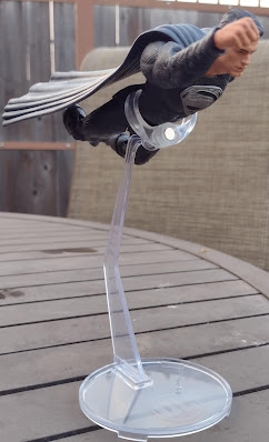
His flight stand is the only accessory that he comes with, meaning he has no alternate head nor does he come with any alternate hands. The latter would especially be appreciative, but as for the stand itself, I have mixed feelings about it. The thing certainly stands out compared to the boring black circles, and it is thin enough to look somewhat like it's giving the illusion of Superman floating of flying, but it is pretty thin, somewhat flexible, and getting it to hold Superman can be a little annoying since it's not as easy for it to wrap around his body, especially with the weight of the figure. What I do like is that he can be posed either floating normally or when he is flying since you can readjust the clamp to have it be where it now looks like he's flying.


As far as repaints are concerned, Superman has a Target-exclusive version of his suit that is basically as it appeared in Batman v. Superman. The traditional colors are brought back in, and it looks very nice! I do wish cosmetics weren't the only change, as I'd love to see him with a reverse of his hands or a new head altogether. Ironically, his card is a black-and-white version of his normal release card. But since we have this Superman here, let's compare the differences between the McFarlane one and the Mattel version! Apart from the colors of the suits and the height difference, McFarlane's a much stronger figure overall. Admittedly, he has some unusual range limitations for his hips and butterfly joints, and it is a shame his face doesn't quite match Henry Cavill, but the articulation overall, as well as the face for the most part and the proportions overall, are much better than they are with the Mattel version. Even the face looks somewhat closer to Henry Cavill than the Mattel version, which reminds me too much of the 90s/2000s stuff on top of having an inaccurate skin tone. The most notable thing is that Superman's cape is cloth on the Mattel version. While it is a nice thing, in theory, the execution leaves it as cheap and lousy compared to the cape of the McFarlane version. 


The differences in articulation are especially worth bringing up, as the pose of him doing a bit of a superhero landing a la the promo art makes the McFarlane version close to how it should be, and the Mattel one looks pretty amateur by comparison. That is because Mattel forgot that their Multiverse stuff was aimed at the collectors and not the kids who just want the toy for the toy and won't normally complain about the lack of articulation. The addition of diaphragm joints, wrist hinge/swivels, ankle pivots, etc helps justify a toy as one of the reasons you should buy it.


Here he is with Batman, the same man he went after fighting him and eventually being an inspiration for Bruce to seek the other metahumans. While they look great together, Superman was not the tall one in the Snyderverse. It's amusing how that turned out, but it's still a good display nonetheless. And once again, let's make fun of Jossenwolf as he fails to kill Sailor Moon. Overall, this figure is not too shabby in terms of looks and articulation, though there are some things I'd wish McFarlane to do like the alternate pieces and put them as the same figure that is considered a regular release. That being said, good luck finding this guy AND his regular suit desifg.


Final ranking: ⭐⭐⭐⭐ ou⭐⭐⭐⭐⭐

Monday, July 19, 2021

Transformers Kingdom Rhinox review

Rhinox is a great character for many good reasons; he's the perfect balance of being smart and strong at the same time, he's a major contributor to the Beast Wars, and he's so awesome that he doesn't even need to change his form in the entire run of the original show! He's almost like the love-child of Ironhide and Ratchet if we're being honest, given how he fits those roles (and maybe a bit of Wheeljack for good measure)? Some may find his transformation into Tankor to be unusual, but I find it to be a good idea nonetheless in terms of making Rhinox feel like the most antagonistic of the Vehicon Generals if you ask me. He was previously represented in the Generations Thrilling 30 line-up, which was paired up with Rattrap as the better Beast Wars update duo compared to Universe Cheetor and Dinobot. Now that Kingdom's going all out with the Maximals and Predacons, how does our new Rhinox stack up?


Here is Rhinox in his rhino mode. It's sculpted and proportionately accurate to how one would look in real life. I like the textures added to make the skin bumpy and wrinkly in areas, especially in the eyes where they're worn because he has red eyes (which look tut of place). The horn, ears, and the nostrils are nicely sculpted, and I appreciate that the ears are not only firm plastic but the horns are not super bendy and flexible despite being made of PVC. As far as paint apps are concerned, some lighter gray is applied here and there in order to make the skin look more organic, and I appreciate how his toes have paint applied. As for his robot kibble leaking through, I have to commend the designers for not making the design feel as broken up and remain naturalistic as possible (the forearms and the green of the robot shoulders are exposed, though). 


The articulation of the beast mode is okay at best, with front and back leg movement here and there, while the hind legs are on ball joints. The jaw opens up and has some decent paint apps applied for it. Not that poseable but it is expected for a beast his size.


For a size comparison with the other Maximals, you can tell how wack the scale pretty much is. He should be the biggest one of them all but is no bigger than Cheetor is. He looks funny next to Optimus Primal and Dinobot, especially. 


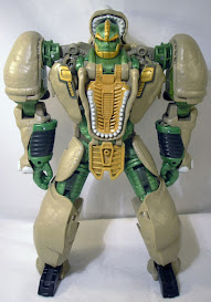
Transforming Rhinox into his robot mode is a lot more involved than expected. It's mainly the way the legs transform, as you need to make sure the hind legs are tucked within them in order to fill in the gaps. Additionally, the way the torso transforms requires that there be a faux chest. As for the resulting robot mode, I think it looks fairly decent in terms of the likeness to Rhinox. I do find the coloring to not be that accurate, and there are some paint apps missing, but what is there looks perfectly fine otherwise. I do not like how the legs look at times when they remind me of baggy jeans, but the gaps are even worse, especially from the back. They're pretty unsightly and remind me too much of the gaps that Siege Impactor had. Commenting on the fake chest, I like how it turned out as it helps make the chest pop even more if you ask me, especially with the silver trim of teeth surrounding the gold chest.


Head sculpt is certainly a Rhinox head, but it does look more angular and younger than I'm used to. I appreciate the gold paint apps applied, but the lighter shade combined with the facial expression makes him look younger than he needs to be. His articulation is on-par with the WFC trilogy line. His head is on a ball joint, the shoulders move front and back, in and out, the biceps swivel, the elbows bend, the waist swivels, the hips move front and back, in and out, the thighs swivel, the knees bend, and the ankles can hinge up and down as well as pivot.


The cannons can be held in his hands, and they have one pro and one con compared to the Thrilling 30 version. The pro is that they have paint compared to their predecessors, but the negative comes from the fact that they can't spin! Not even manually! WHAT?! They at least have some storage, but it's not enough to make me feel bothered that they can't spin at all.


After not getting a reuse (not even a Dark Designs one), Rhinox finally gets one in the Beast Wars again subline. It saturates the colors and makes Rhinox feel much more alive thanks to a richer brown and a metallic shade of green. His legs probably get annoying to transform, and his guns still suck.


For a comparison with prior versions of Rhinox, here are some pictures of the Generations and original versions of the character. The Thrilling 30 version certainly has some liberties of his own to make him look less like how he did from the cartoon in terms of proportions, and his rhino hide may not match the cartoon's brown exactly, but at least the figure had more paint, as well as a nicer headsculpt. I also like the way the legs look, but Kingdom Rhinox's feet are better designed as well as have tighter knees. The original Rhinox definitely shows his age with the dated design, kibble-tastic appearance, and amateur sculpting like with the Ninja Turtle-esque face.


Since I left her out from the beast mode comparison, here is Rhinox next to the Transformer he created, that being Airazor! They may be of different sizes and didn't get to stick together as much since Rhinox was able to reunite with his team while Airazor and Tigatron were far away from the rest, but it is nice to see these two with nicely done and modern versions of the characters that match up with one another in terms of their sculpt work and consistency. The only other time that was the case was with regular Beast Wars.


For another size comparison with the other Maximals in the line, here he is with the rest of the core-5 Maximals in the lineup. He's appropriately taller than everyone else except Dinobot, and I have to say that he fits in with the rest of the WFC figures in terms of aesthetics and quality if you ask me. Granted, he's probably supposed to be half a head taller than Primal, but it still works nonetheless. 


Overall, Rhinox is one of those figures that I can be mixed on at times. The figure looks pretty solid for the most part, though some coloring choices could be handled better. I also don't like how the hollow gaps ruin the look of the figure, and I don't like how the guns can't spin. Does that make him a terrible toy? Hell no, but he doesn't feel as complete as the Thrilling 30 version despite this one having better proportions. I recommend getting him but know he won't be as good as the Thrilling 30 version in some areas. As for repaint potential, I hope Selects gives us an evil Rhinox!


Final ranking: ⭐⭐⭐ out of ⭐⭐⭐⭐⭐