Tuesday, August 31, 2021

Transformers Kingdom Scorponok review

Scorponok doesn't get as much attention in the Season 1 Predacon team compared to the likes of Megatron, Waspinator, or Blackarachnia. He's basically killed off in the second season, has not gotten any new merchandise that fits him (excluding a repaint of Scamper from the TFCC), and ironically, the Beast Wars Scorponok homage in RID2015 isn't even named Scorponok (instead he is Paralon). That's not to say that the love for the guy is missing outright, but let's be real here: he's quite the underdog of the Predacons and was in need of a new incarnation. Thankfully, the Beast Wars cast is returning into the Kingdom line, and after having 2 of the Predacon All-Stars in Wave 1, it's great to have this guy pop up as we continue deep into the line. Now let's get into the review!


Here is Scorponok in, well, his scorpion mode. It certainly doesn't have the cartoony look but does capture the coloring of the beast mode quite well, I'd say. Much like with the textures of fur, wrinkles, and feathers applied into the beasties, the exoskeleton of the scorpion mode is given the appropriate amount of textures to provide a slightly bumpy feel that makes it look less toyetic and more organic. Sure, the red legs stand out and maybe the stinger looks too much like a red tip penis, but the beast mode overall feels accurate to what the actual animal is for the most part. The proportions are generally correct even if some liberties were character-specific for this guy. His articulation consists of ball joints on the legs as well as the swivels and hinges for the arms and pincers. Not that much to do but we can't expect it to do much given the type of animal it is.


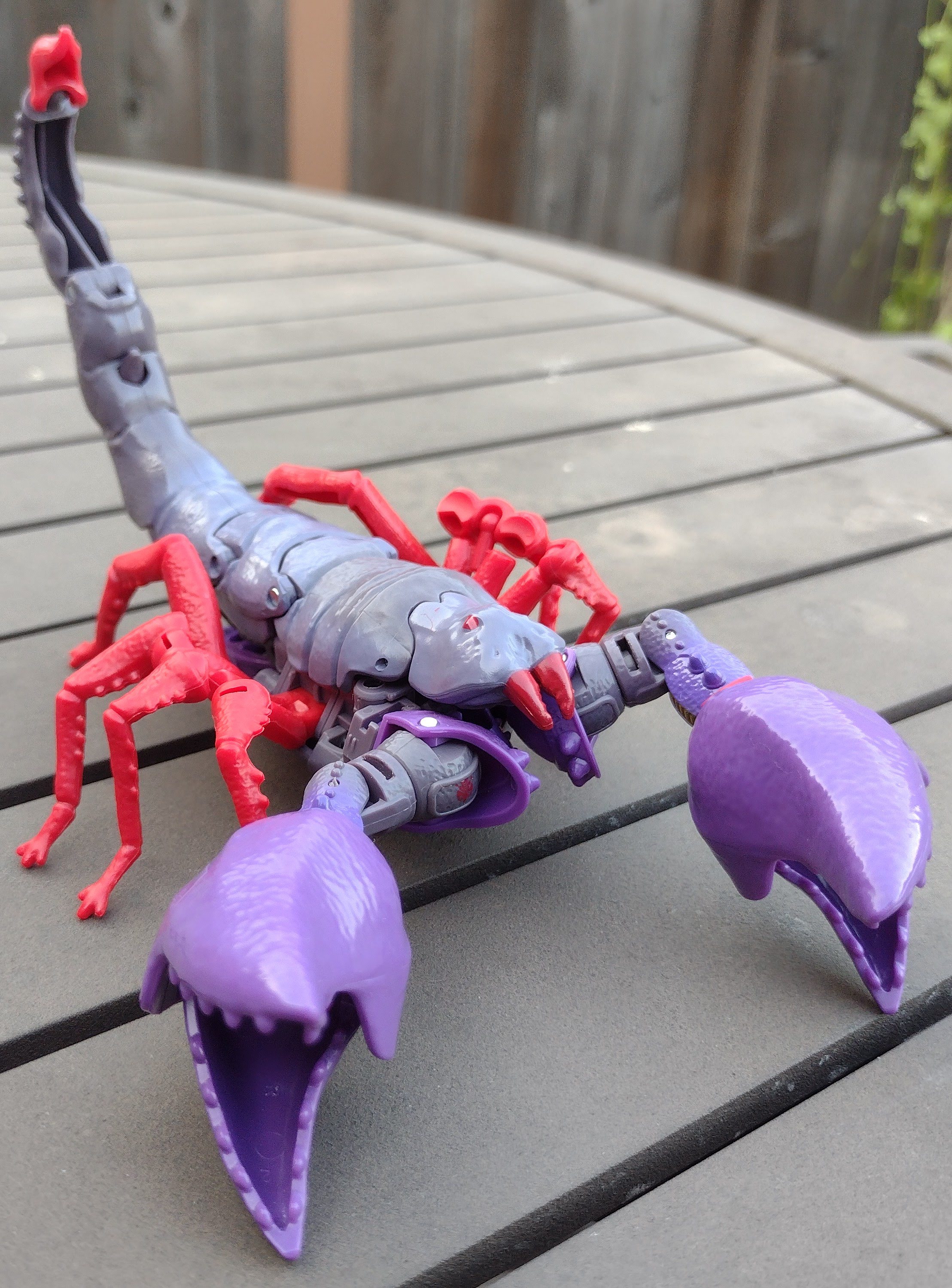
For a beast mode comparison, he's quite a big one in this size in terms of the amount of space he takes up. The height of his tail makes it formidable enough to combat Megatron given how big the tyrannosaurus yes-man is. He's definitely low in terms of height but is comparable to how much space gets taken up when compared to Blackarachnia.


Transformation for this guy is somewhat involved. The arms transform exactly how you would, but aspects of this guy like the way the legs transform as well as how the scorpion head and legs fold away aren't part of the traditional scheme. The waist hinges up to the chest as it closes, and the legs can be stashed away decently to keep kibble from taking up space. The resulting robot mode is certainly accurate to the cartoon, with the design traits, color scheme, and overall proportions. It's an execution that the Kingdom line goes for, and while it certainly is accurate to the show, I do find some of its aspects to be a little underwhelming. Not that he's a bad figure, but it's things like the hollowness of the front of the tail and the back of the legs that are bothersome. I can get behind the gaps on the back of the biceps or the back of the tail for the cost-effective nature of the line, but the ones I do have a bigger problem with are more noticeable and bothersome. Additionally, the backpack could be managed better, but I can at least get behind it if it fits him somewhat and doesn't compromise the stability. His feet are thankfully big enough, and the weight of the rest of his body and the claws help balance everything.


Head sculpt is the first to accurately depict the head in the cartoon, with a mouth, the underslung horns, and the visor, all in the appropriate colors. The Netflix show weirdly gives him two eyes, but then again, the Beasties don't really have the same CAD-file accessibility that a majority of Autobots and Decepticons have. Only exceptions I can think of are Arcee, Bumblebee, Alpha Trion, and Galvatron, even if some of them did have toys in the later lines. Anyways, it's a nicely done head sculpt, and the same goes for the articulation. Ball joint for the head, shoulders that move front and back, in and out, bicep swivels, and claws that swivel as well as open and close. The waist swivels, hips move front and back, in and out, swivel at the thighs, bend at the knees, and the ankles pivot as well as hinge up and down.


The accessories he comes with are just the two rockets and the Cyberbee, both of which are in character for Scorponok. The missiles have mostly red paint on them but the bee's a nice touch overall since he was known to use it at times, most-notably in Gorilla Warfare.


As far as reuses are concerned, Scorponok had at least a Legacy repaint in the form of Sandstorm, which replaces most of the gray and red with beige, orange, and purple with a new head sculpt based on the Mutant Head that was a gimmick Year 1 Beast Wars toys had at the time. If anything, it helps make the figure much more worthwhile than had he not come with it. It also sells him as a separate character even further than a mere palette swap.


And for a reuse that includes both heads and takes us back to Scorponok himself, here we have the Buzzworthy Bumblebee Creatures Collide 4-pack version that not only gives him a toy-accurate deco but also has translucent purple parts. You can also give him normal or mutant heads if you so choose. He comes with Skywasp, Ransack, and Goldbug.


For a show-accurate repaint, Scorpos gets the Beast Wars Again treatment to have a less plasticy look to better resemble the Mainframe CGI model. He was included with Rhinox.


For a figure comparison with the only other example he has, here he is next to the original 90s version, and...I'm sorry, but it's hard to compare them if they're not apples for apples. One is meant to be cartoon-accurate and the other was made before the cartoon (I presume), they are in different size classes, and the engineering is different overall. Admittedly, the original one had a fragile right claw, but if you can at least move past that, you have two radically different takes of Beast Wars Scorponok. The original version is still a great figure from the reviews I have seen.


For a size comparison with his other Predacons, he may fill up the Season 1 ranks after not having any re-Pred-sentation, but he's a short one! I know he is meant to be short in the show, but it feels surprising given how the WFC Deluxe line-up works of late. He's even shorter than Blackarachnia, and it makes me wonder how the other Predacons will scale. Overall, this guy is a surprising addition to the line in many ways. The engineering's not too shabby (the underside looks pretty weak), the articulation and overall plastic quality is good, the paint apps are solid, and the accessories, while small, fit his character appropriately. With Wingfinger being a mid-tier addition to the line, I guess Scorponok may be the strongest of the Wave 3 Deluxes (ignoring the Wheeljack repack since he is from Earthrise). Let's hope Tracks will be as good as him...right?


Final ranking: ⭐⭐⭐⭐ out of ⭐⭐⭐⭐⭐

Friday, August 27, 2021

Transformers Kingdom Wingfinger review

Wingfinger is the third addition to the Fossilizer subgroup, and he's certainly going to break a few tropes present in the line; he's the skeleton of a flying dinosaur, he's a Maximal, and he's going to have a unique design compared to the asymmetrical nature of the other figures in the line. On top of that, he's going to make for an impressive beast of a machine when we delve into the unnamed Fossilizer combiner, but in a wave of Deluxes that consisted of an updated version of a previously released character from Reveal the Shield as well as a highly anticipated new mold of Scorponok (also a Wheeljack repack), does this guy manage to be a great entry into the line? Let's find out.


Here is Wingfinger in his skeleton mode. It's very much a Pterodactyl or Pteranodon, and with the mindset of it mimicking how the beast looks in the museum, I'd say it does a very good job. The plastic color is certainly more of a creamy look compared to the dark beige of Paleotrex and the gray and white of Ractonite. It's a nice way of making him visually distinct while making the dino skeleton look realistic. And I also like the black for the inner section of the ribs and where the eyes would have been. As far as the articulation is concerned, the head can spin loosely on the 5mm peg, the arms move out, hinge at the elbows, and the feet can move down on the ball joints. The beak can open but when you close it, it makes a loud snap!


For a size comparison, he definitely is thinner than both of them but is certainly taller. I'm not sure if that's accurate to the real scale of dinosaurs, but at the very least, it does make you appreciate the kind of details put into them. They're definitely the most unique as far as the line-wide gimmick theme is concerned, given how they're different from G1 Cityformer accessories turned into robots and Micromaster bases that can stand up. These guys are original characters with designs that feel unique while reminiscent of the Beast Wars II and Neo aesthetics.


Transforming, or in this case, partsforming, Wingfinger, just about what'd you expect if you're familiar with the way you change Paleotrex and Ractonite into their robot modes...although the main issue comes from the way it's handled here. While the forearms and legs attach no problem, the Pterodactyl head doesn't feel like it's integrated into the robot mode nicely, and the torso...or I guess, spine, of the body ends up feeling too loose overall. It's just not as well-handled as the other two are, and it's a shame. The robot mode definitely has a slender design to him, making him lean, mean, and overall a skeletal fighting machine. Is it me, or do I sense a bit of Animated Swoop in him? He's got a similar head silhouette to him, but the proportions are definitely skinnier than the other two bots. The biceps may seem too similar to the thighs of Paleotrex, and the thighs may be too similar to the lower legs of that guy, too, but they're newly tooled for this guy. Also, you notice that the swords are on the back of the shoulders for weapon storage.


Head sculpt is very sleek and not as descript compared to the fragmented look of Paleotrex or the brutish look of Ractonite, but it fits well for the ninja visor of the character. Also, nice Maximal insignia applied onto the forehead. His articulation is pretty much on-par with what we got before, but with a few exceptions. The head is on a ball joint, shoulders move front and back as well as in and out, bicep swivels, elbow bends, and ball-jointed wrists. The waist swivels, or in this case it's the upper torso, the hips move front and back, in and out, there are swivels at the knees, and the knees bend at two points to get a digitigrade look, and there is no ankle pivots. It's rare that figures don't have waist swivels (Apeface and Blackarachnia come to mind), but it's even rarer to see a figure not have ankle pivot when that's been the trend for every WFC figure made since Siege.


The accessories he has are two swords made from the wingtips of the beast mode. They can be made into a makeshift dual staff weapon, and I guess the Pterodactyl can peg onto the underside of the arms to be a weapon of some kind. 


For a size comparison, he is taller than both Paleotrex and Ractonite. While he's not perfect, I do appreciate that he's different from those two as far as proportions and coloring is concerned. That and he is a Maximal instead of a Predacon. Makes me wish we got a Mastodon and a Sabertooth Tiger...sadly, he is the weakest of the three due to his stability.


Disassembling him is pretty easy, but be warned that the upper arms and the swivel of the pelvis do not come off. And if the head crest comes off, don't worry, it serves a purpose in a future mode we'll get to. But basically, the thighs, lower legs, forearms, upper torso, pelvis, dino head, and swords are removable.


And as for the weapon modes he has, you can turn him into some form of a pickaxe or scythe with a dino head on the top. The wings can go on the back to make some form of flight tech maybe, and the forearms can be claws if you so desire. Tracks here isn't the best example due to how he's designed, but I'll get to him in his review, trust me. The versatility is neat, though I think it'll work with some better figures in the line. At the very least, you can also make a bow if you want.


And if you think we're done with Wingfinger (and the Fossilizers), we've got a final mode to go over! This unnamed Fossilizer combiner is the result of using a good majority of parts made from Wingfinger, Paleotrex, and Ractonite into a decently sized but somewhat unwieldy combination. The way it all works is pretty unique, but the execution could be better. The main factors are the proportions being very wonky, with skinny arms and legs, a chunky torso, and a skinny midriff. The tolerances of the parts can be a little annoying, especially if it all depends on the QC of each figure. Then comes the way the execution works. The chest doesn't have any proper security due to the lack of devoted tabs to keep it from being kept in place, and the way the arms attach is not the best, especially with the forearms. Also, the colors work well on their own but they look ugly when combined. There's a reason why color schemes like this don't look as nice as traditional decoes made up of different characters like the Combaticons or Stunticons.


The head is made up of the dino head of Ractonite with the crest of Wingfiner. It's why the thing comes off at random and why there's a blue slit within it. It's an interesting combination of parts for a somewhat unique head design that gives it a little more of a contrast of drone appearance than what Combiner heads usually go for. The articulation is a mess because of the many parts used for the combined mode, with a neck swivel and slight hinge, shoulders that move front and back, in and out, bicep swivels and elbow bends at the weird way the forearms peg onto the upper arms, fingers, a weird method of a diaphragm joint, hips that move front and back as well las in and out, thigh swivels, too many knee bends, and some ankle pivots. See, the articulation wouldn't be too bad if it wasn't made up of parts that were already given a lot of joints on their own. 


The accessories are made from the three Fossilizers, and I came up with a sword tail drill thing from the two Preds and a weird cannon made from the pelvises of Ractonite and Wingfinger. Both are as successful as you'd expect.


For a size comparison, he's around the height of a pre-War for Cybertron Leader Class Transformer like Ultimate X-Spanse and Grindor. It's certainly got a rewarding feel for anyone that completes the trio, and I'm sure there's more mix and match potential if you use Skelivore, Transmutate, or Tracranius! It makes me wonder what the two Fossilizers shown on the Hasbro PulseCon 2020 poster would be like if integrated with this set, but I doubt those will see the light of the day as much as an MMPR Megazord homage out of the line. So Wingfinger on his own is the weakest of the three in terms of the quality of the toy, but maybe you might find some enjoyment from the dino mode if you have the other two. The combiner, on the other hand, is a cool idea on paper with an execution that can be done better. Maybe fans can do the idea justice with their creations. After all, that's the point of the WFC-izer figures!


Final ranking: ⭐⭐⭐ out of ⭐⭐⭐⭐⭐

Tuesday, August 24, 2021

DC McFarlane ZSJL Steppenwolf review

Nearly two weeks before the Snyder cut was announced, I was thinking of how Steppenwolf could possibly change his appearance from his BvS appearance to what would be a hypothetical Justice League cut that is not compromised. That being said, Zack Snyder's Justice League uses the design we saw in the Ultimate Edition of BvS, and it's a rather lovely one as far as monstrous aliens are concerned. It's the perfect blend of looking metal and organic, and part of me wondered if the Apokoliptians were meant to be technorganic in the Snyderverse, but their armor is more on-par with the nanotech of Iron Man from Infinity War (except with better CGI) like when he sort of disrobed himself in front of Darkseid. It's a great design and I'm happy we got to see it come to life in the Snyder Cut compared to that weird Josstice version. Now let's delve into reviewing the figure!


Here is Steppenwolf in-hand. Right off the gate, he is a very spiky figure, and while the points are either bent or blunt for safety reasons, you still get a prickly feeling for the guy overall. It's accurate to how he looks in the movie, but it can be a little annoying when your hand or fingers presses onto him while handling the articulation at times. That being said, the sculpt work applied onto the armor is done rather nicely, especially as far as the lines of the metal are concerned; they go well for the segmented armor that retracts whenever he disrobes himself, and while a cliche for anyone who's tired of the nanotech/metal designs that is present in modern comic book movies, it at least works better than whatever simpler designs that the characters had (and don't give me that "oh you're not a comic book fan" if you're praising character designs that you suddenly praised just to shit on Snyder). Back to the figure, the silver paint (or is it metallic plastic?), as well as the dry brush, give this figure a worn look that better sells his days as a war-torn villain in the DC universe. Contrasting those aspects of him are the organic parts of the character, mainly the face, fingers, and toes. They're the exposed skin of Steppenwolf, which further distinguishes him from the metal armor with the dirt brown colors, the textures of those parts, and the overall contrast they present. Certainly less skin revealed than with Steppenwolf, but maybe it's a little too dark for him? Either way, it's great attention to detail, especially with the hands having more fingers and an extra thumb on each other than with Darkseid.


Head sculpt is very well-done, though I will say that while the skin was a little dark in some pics, it is a little less noticeable of inaccuracy when viewed up close and in some lighting. I don't think his skin was too dark in the Snyder Cut, so why he was treated like that is beyond me. At the very least, the details on the face are added on very well, though the eyes do look a little less life-like than they should be (and the left eye isn't applied on properly). Darkseid's eyes were different from this guy, but at least he felt more alive than Steppenwolf does. As far as the articulation is concerned, the head is on a ball joint, shoulders move front and back as well as in and out, the biceps swivel rather stiffly, the elbows bend as well as have a swivel of their own, the wrists swivel, and they hinge in and out (with the same ugly joint design that Darkseid has but worse). There are two torso joints that move around for the diaphragm and the abdomen, the hips move front and back as well as in and out, the thighs swivel, the knees bend, and the feet do pivot unlike Steppenwolf yet they do not swivel at the ankles like with Darkseid. Oh, and his toes have independent articulation while Darkseid has just the one. His electro-ax, which is annoyingly hard to put into his hands, I might add, is sculpted nicely and has some decent paint apps applied, but I do wish that it came with some electricity pieces to add some additional display options. I don't want to repeat the same comments I made on the lack of accessories, but if Hasbro can display their figures with effect pieces, why can't McFarlane if they want to go for the collector route? Just seems so unusual for that to be the case.


For a size comparison, here he is in-between Darkseid and Black Suit Superman. Now, I do think that the average person would find the height between the New Gods and a 6-foot tall human such as Superman to be weird, but since they're 8-feet tall in the movie, it matches the heights that they have, even if Superman was either floating when fighting Steppenwolf most of the time or on his knees when Darkseid walked to him. Whatever the case, the scale works well, and it allows the two to recreate some scenes or add new context to them, like Darkseid facepalming at his uncle's struggles in defeating the Kryptonian!


And for another comparison, here he is with the Josstice version of the character, who may look decent in some areas yet looks pretty lousy as far as the entire package is concerned. The textures of the suit look alright while the hands are both oversized and lack any of the attention to detail that his face has. That being said, it's a surprise that they're both at the same height and possibly at eye level. I'm sure some would wonder why that is the case since one was a standalone figure and the other was a build-a-figure, but I suppose it's not a bad thing. Either way, Steppenwolf trumps Jossticewolf in pretty much every aspect, from the representation to the articulation and the value for money. It's not a fair comparison, but when is an impressive figure in his own right and the other requires 6 underwhelming figures to complete an underwhelming figure that's taller than all of them, I think fans would be happy with Steppenwolf. Though he's not 100% perfect with how loose the shoulders are and how unbalanced he can be at standing, I appreciate how fulfilling he is by comparison to the previous take on the character. Still needs more display options.


Final ranking: ⭐⭐⭐⭐ out of ⭐⭐⭐⭐⭐

Saturday, August 21, 2021

Power Rangers Lightning Collection Wave 9 review

After a handful of delays and mostly getting reveals of repaints left and right, I am happy to see the Lightning Collection receive its 9th wave finally be in my possession. Honest to god, it was revealed in February, and after completing Wave 8, I was ready to get to the next wave but had to wait until August for my Amazon pre-orders to be done. Meanwhile, other people had their copies released as early as May, and other reveals consisted of things like the Metallics, too much Pink Energy, A-Squad, and a few interesting releases like Andros and Red Sentry. At last, we have the 9th wave in my possession and I'm stoked as hell because I'm getting close to completing In Space, Lost Galaxy finally has some additional representation, SPD is always a treat, and we get a new MMPR Minion that isn't a Putty! Let's dive into this wave for once!


Here we have In Space Black, who is our third Space Ranger in the line overall. It's the same suit that the team wore in general, from the chest patterns to the yellow collarpiece and the white chest and bicep details that stand out more amongst his other teammates. The black-and-white pattern he has is pretty good overall, and the paint apps are generally applied onto the figure solidly. And considering how basic this suit design is, I can't really have any other complaints about the figure when everything is on-point.


Helmet sculpt is pretty accurate to what it looks like, and is pretty solid if you ask me (even if it needs some indents for the visor itself. Paint apps are at least applied properly. Articulation is the same as with every normal Lightning Collection figure: he has a ball joint at one part of the neck and a hinge at the other, butterfly joints, shoulders that move front and back as well as in and out, swivels at the biceps and double-jointed elbows, wrist swivels, hands that hinge in and out, and both a diaphragm joint as well as an ab crunch. Hips move front and back as well as in and out, thighs swivel, knees bend at two points, boots swivel, and the feet hinge up and down as pivot at the ankles.


As far as his accessories are concerned, he has his civilian head, a more open right hand, a fist, an Astro Blaster, an effect piece, and the Lunar Lance. 


The display options are always a treat, with the likeness to Carlos Vallerte (or the actor Roger Velasco) is very good! The Astro Blaster is the same as we've seen with the one that came with Yellow and Red, but the Lunar Lance is a new addition overall. It's pretty decent in terms of paint apps and accuracy, but the base feels weirdly sticky. Must be a paint error. The new effect piece does make it look like a purple mop, but it's a breath of fresh air compared to all the lightning pieces.


For a comparison with his prior releaseshere he is with the Bandai Legacy Collection version and the 1998 5 inch figure. The Bandai version definitely has better handled paint apps (notice the squares on the chest), but there's not much else to complain about between one or the other. It's interesting how the Bandai Legacy figure doesn't have the white outline on the circle of the cranium. The 1998 figure is pretty much dated but good for what it is back then. To its credit, the mold was the first time we got normal Ranger figures.


And here he is with with his teammates, who look just as good as he does (though I'll admit that Red's visor is still wonky). This makes me want to get the other Space Rangers since they'll make the core team feel complete at the very least! Also, here he is with Mighty Morphin' Black! If you've seen In Space, you'll know that Adam returns to give his successor a boost in confidence since Adam was the Green Turbo Ranger and was replaced by Carlos mid-season. So overall, In Space Black is pretty basic but what is new to him is at least appreciative, especially the effect piece for his weapon.


Final ranking: ⭐⭐⭐⭐ out of ⭐⭐⭐⭐⭐

Next up, we have Lost Galaxy Blue! About time we've gotten some attention for this guy since we've mainly seen Red and Magna Defender in 2019 only! Excluding the re-release of Red, nothing from Lost Galaxy was added to the line since then, but the Blue Ranger has broken the streak! Of course, he is just the same as the Red Ranger but with his appropriate colors, but at least his paint apps are applied on pretty well. The zig-zag could be a little more lined-up better.


Helmet is pretty nice, and I appreciate that the paint apps are nicely applied (apart from the visor missing a bit of black). I do find it funny how so many fans lost their shit over the top of the head having white instead of silver, but it turns out to be a photographic thing. In short, the PR fanbase overreacts once again. His articulation is the same, if a little less stiff than In Space Black's.


Here are all of the accessories he comes with, which are his civilian head, a lightning effect, the Quasar Saber in its extended and shortened mode, a karate hand, a fist, and a Transdagger in the Ranger-specific Cosma Claw form! 


Once again, the display options are a treat. The likeness to Kai Chen (or the actor Archie Kao) is very good, and while the sword and effect pieces are the same as we've seen before, the Cosma Clas/Transdagger is a nice touch to help give him some distinction. Makes me wonder who would get what accessories since you'd either have these or the Quasar Launcher. Knowing the fanbase, they'd either bitch about one accessory being missing or they'd take action and make custom accessories (I prefer the latter).


Here he is with his prior counterpart. As expected, he didn't get any subsequent releases until now, and I think it's obvious that he's the winner.


And here he is with the other two currently-made teammates of Lost Galaxy. He seems taller than Leo, which makes him around the same height as the Magna Defender. Maybe Kai's taller than Leo, but I should check. Either way, it's great to have half of the team complete, and I hope we can get Green and the girls as soon as possible. So once again, the Blue Ranger may not be that distinct from Red as far as details and most of the accessories are concerned, but he still makes it through as a normal release and having a better consistency of blue on the ab-crunch. Also, his Transdagger is included!


Final ranking: ⭐⭐⭐⭐ out of ⭐⭐⭐⭐⭐

The third Ranger we'll be taking a look at the SPD Green Ranger! I have to commend this figure to having the right shade of green that is close to the TV show since his suit doesn't quite have the same shade that the other Green Rangers usually have. He's definitely got a slight mint influence to the shade compared to characters like Zeo Green or Time Force Green, and considering how it works for him, I'd say he's done up quite well overall. I will say that the badge on the chest looks wonky, and the line-up for the 3 on the left of the chest is not the best in terms of lining it up properly. 


Helmet is very accurate, but once again, we've got more inconsistencies with the Ranger helmets: the visor outline is white like with Blue yet is incomplete and not thick like with Red. It's better than nothing like with the Pink Ranger, but COME ON! At least the sides have a nice application of silver trimming and red lights. His articulation is the same as with the other Rangers covered, but the hands to hinge up and down on this specific pair that he has.


Here are the accessories of the figure, which are the effect piece, the left karate hand, the Deltamax Knuckle, the Delta Morpher, the civilian head, the morpher-holding hand, and both a shortened and lengthened Deltamax Striker.


The display options are once again appreciative, and the likeness to Bridge Carson (or the actor Matt Austin), but I'm not a fan of the inconsistencies of the Morpher detailing. At least the weapons are more accurate compared to the Blue Ranger having his blue instead of black.


For a comparison with his prior forms you can see how muscular and dated the Bandai version was and how skinny and frail the Figuart version is. Also, is it me, or does the 3 look too long from the bottom?


And here he is with the currently available core team members. I'd put in Shadow and Omega, but I think it'd be even better if they were together with Yellow. Come on, Hasbro! Make her now! Once again, the Green Ranger adds to his team even if he himself isn't that different apart from the accessories and color.


The civilian head is perfect for using it on the Blue Ranger like in the end of SPD (even if we never saw him morph, but I think he looks awesome in the Red Ranger suit as he did in the glorious Once a Ranger team-up!


Final ranking: ⭐⭐⭐⭐ out of ⭐⭐⭐⭐⭐

And finally, here we have the Tenga Warrior! This is a new sculpt and one I've been surprised we've gotten of late! Considering how easy it is for the Lightning Collection to save money, I'm happy to see a new mold pop up because of how infrequent it is! This figure has been made from the ground up a la Goldar, Lord Zedd, Rita, Magna Defender, etc, and it's great to see him with the sculpting for the feathers as well as the colors used on him. The black and purple already make a great color combo a la G1 Skywarp, but the metallic teal on some of the feathers makes him feel even nicer overall. On top of that, he has some heft to him! 


Head sculpt is done up very nicely, with a variety of colors applied onto it with the gray face, the black feathers used as hair, the gold for the pupils and beak, and a purple spray added on said beak! The eyes are also applied on pretty well! His articulation is the same, but his diaphragm joint is tight when it swivels while the elbows bend at single joints. Also, his beak opens!


Here are the accessories he comes with, which are interchangeable feathers, two fists, an egg, and a lightning effect in white.


The alternate wing set is very cool, and it doesn't compromise the articulation as far as being an alternate display method is concerned. They're even given designated slots and letters (L and R) to help make the switch between wing pieces easier!


The other display options are pretty nice to have, though the lightning piece is nothing new apart from the color, and the metallic egg is neat if a little hard for him to hold if you want to display him holding it.


For a comparison with a previously released Tenga Warrior toy, you can tell that it's a night-and-day difference! It's no contest so let's move on to say that the Tenga Warrior's awesome overall and is the best we've gotten of the character and a hefty addition to the collection since he's pretty heavy compared to the average Lightning Collection figure.


Final ranking: ⭐⭐⭐⭐⭐ out of ⭐⭐⭐⭐⭐

And here is Wave 9's figures together in one shot! This was kind of a neat way to revisit the Lightning Collection reviews, as although they are pretty much similar to what we covered before (apart from the Tenga), it is easy to get back into the line after waiting for them to show up. It's both great and it makes me happy to see teams get closer to completion while also having a new mold to boot.


The civilian heads are great for all three of them, and I have no complaints about each of them. My favorite is Bridge's because he has an added smug personality to him on top of being a bit of bias for my love towards SPD.


The normal weapons they come with are pretty much what we've come to expect if you noticed the earlier reviews, but I like the Transdagger and the more accurate Delta Strikers. The new wings are especially nice for the Tenga if you ask me.


And the lightning effet pieces are pretty new from what we have seen apart from the one that comes with the Black Space Ranger, but they all do the job in my boot!


And of course, it's nice that the representation of MMPR is now for a villain since it's normally that season that gets the most amount of attention and usually has a main character. After Wave 8 having no MMPR presence, it's nice to go back to it but with a foot soldier...too bad he's being attacked by the Rangers, who don't seem to like him much. Either way, it's a wave with 3 solid repaints and one new mold that is outstanding overall!


Overall ranking: ⭐⭐⭐⭐.25 out of ⭐⭐⭐⭐⭐