Tuesday, November 29, 2022

Transformers Kingdom Ark review

The Titan line-up of the past has been somewhat unique considering how everyone in the past is either a larger-scale character from G1 or a combiner. There were plenty of different milestones, too, with Metroplex being the first of his kind and having a mix of G1 and FOC design elements, while Devastator and Predaking would tower over other combiners, and Fort Max being well-known for being a retool of Metroplex. But the established G1 quadrilogy has been completed in addition to two of the unique Decepticon combiners means there's not much else that can be done with the spot for the Kingdom line. So we get the most unexpected addition of the Autobot Ark, a ship that never presented any possibilities of transforming into a robot...until now, and while the Netflix series may suck as a whole, this is one of the strongest parts of the franchise given how it was a creative robot that is a new form that Teletraan-1 can utilize rather than being a new character altogether. So let's get to the review!


Here is the Ark in the mode you're likely going to keep it in. It's a surprisingly detailed recreation of the Autobot's home, with panel-lines, turret guns, a bridge, the cockpit, and some scorch marks from the ship's approach towards the atmosphere, that result in a very faithful take of the vehicle in plastic form. There are a few paint apps in the form of yellow markings, the blue panels around the front, the Autobot insignias, and some gray on the sides. As impressive as it is, the back doesn't like to stay tabbed in that well, and there is a bit of color mismatching. There are a few gaps, which might be because of the way the figure transforms even if some could argue budget cuts are a thing for parts of the Kingdom line due to the pandemic. Either way, the ship looks good in general, though a darker shade on the plastic coloring like the promo images or prototypes.


The back has a boarding ramp that doesn't really scale with anything apart from the tiny Optimus that is included. This guy is the same type of item that you'd find with the Centurion Drone, only in red instead of gray, and other characters are included with Unicron and Behold Galvatron. Detaching the roof from the ship results in accessing the main bridge, with the globe almost resembling Vector Sigma. There are plenty of ports for other micro figures to stand on. This is no playset as I kind of hope, however...


If you remove the main bridge, you have enough space for a Core Class figure to pilot it, though whether or not this was intentional is unknown. Also spoiler alert for the robot mode but the blast effect pieces can peg onto the boosters though they look a little underwhelming inside them. As for what you remove from the interior, you end up with a hunk of cheese-looking thing that turns out to be a robot folded up.


Transformation for that hunk of robo cheese is fairly basic, as it revolves straightening his limbs before he turns into Mainframe. Yes, the same Action Master is now able to go along with the Ark as the transforming figure in a manner similar to Scorponok's Mega Zarak or Trypticon's Full-Tilt. The resulting robot mode is very different from the one fans are used to, mostly because he has to become both the bridge of the Ark and Teletraan-1, but it's got the same torso, head, and shoulder designs, only much more refined thanks to the competence of the WFC engineers. He does feel a little baggy, probably more so than Classics Bumblebee or Power Core Combiners Bombshock, as the arms, legs, and back all have a shitton of kibble that is, again, from the other modes he possesses. Some may find it impractical since he's going to scale weirdly with everyone if he's meant to exist with the ship, but whatever. It's funny how the bridge is literally on his back, with Optimus still pegged on.


Head sculpt is definitely Mainframe with the simple visor and mouthplate combo, though with better details, though I'm sure there are fans that'd want to give him a gray head and replace the gray paint apps on the forehead and visor with blue so we can have a more broken up color scheme on the guy while maintaining the yellow visor. His articulation features a neck swivel, shoulders that move front and back, in and out, bicep swivels, elbow bends, a slight waist swivel, hips that move front and back, in and out, thigh swivels, knee bends, foot rotation, and ankle pivots.


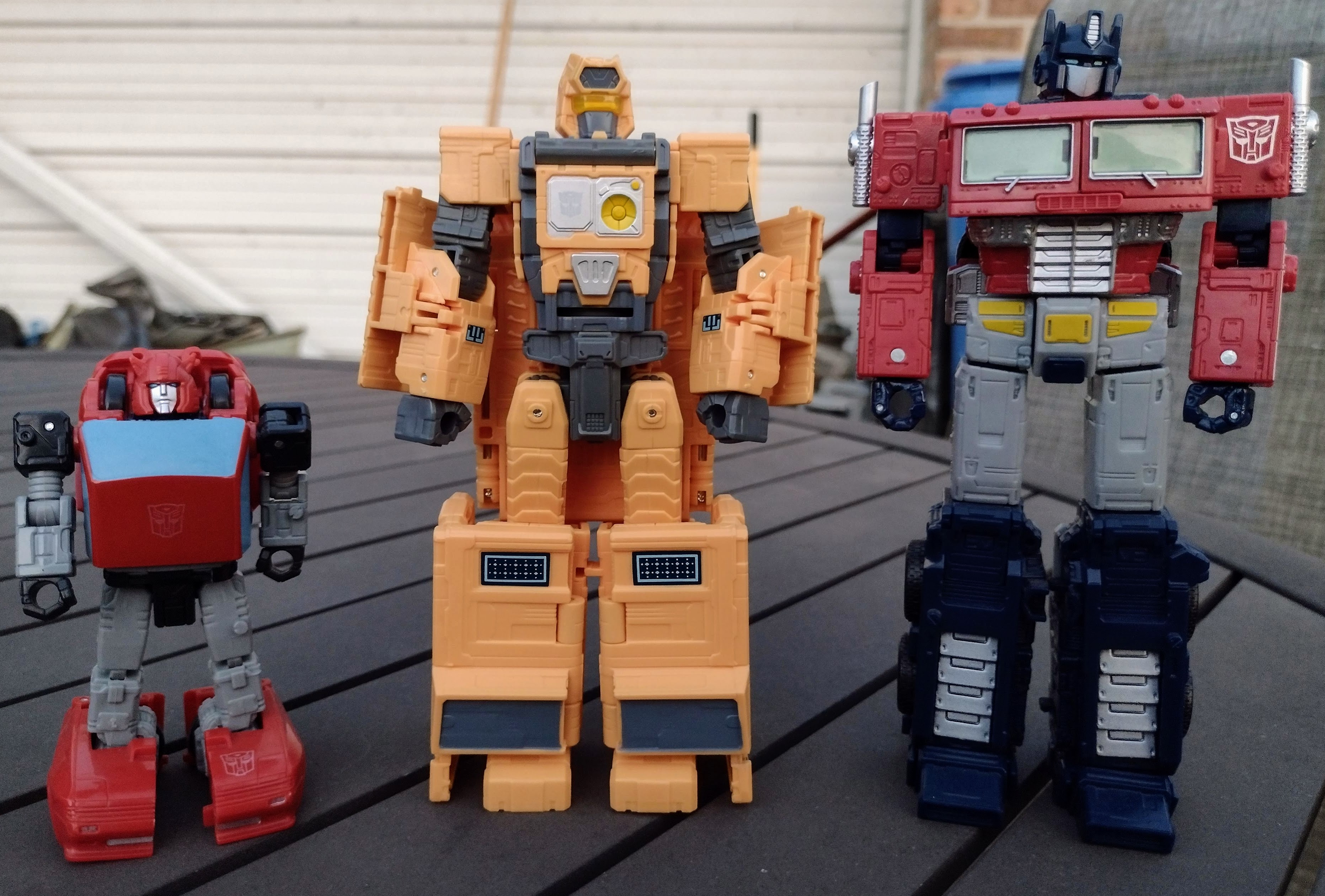
For a robot mode size comparison, here he is in-between Cloutworthy Cliffjumper and Netflix Prime (not the Premium Finish one); he's abut the height of a normal Voyager, yet his engineering isn't as involved as that of the size class. His intermediate engineering is mostly reserved for the three modes he possesses.


Turning him into Teletraan-1 is a case of folding him inside out, as the panels that make up the Teletraan-1 design take shape into the iconic supercomputer of the ship, and likely the first time we ever got an actual representation of it in plastic form via Hasbro. It's a pretty solid take on it, though how it'll scale with your figures will vary, as it's a little too small for Deluxes, Voyagers, etc yet scales right with Core Class figures. I like the fact that we get various tampographs representing gridlines, schematics for things like the map of the Earth and the Ark, and the various sculpted details that keep it from feeling plain.


While the backs of the two Golden Disks are the same, they both possess unique details from one another. The one on the right hand of Optimus is that of the Sounds of Earth, while the one on the left hand is of Vok origin. If you recall, The Vok's disk was included with Terrorsaur, only it as darker paint. 


There is even a Sky Spy included with the set! Yes, the same little drone that scanned the vehicles of both Autobots and Decepticons aboard the Ark is also included. It's missing the blue paint on the center, but it's otherwise accurate.


Transformation for the Ark is weirdly familiar in some way, as it has a bit of a Tidal Wave vibe with the way the legs and the arms to an extent transform. Even the torso has a weird Tidal Wave look to it, though with elements of the Ark and that of the Last Autobot. Yes, this guy is an homage to the Marvel Comics creation of Primus, mostly in the head, waist, and thighs. It's a very unusual set of proportions that makes the waist and thighs super skinny compared to the upper body and arms. It's likely some thing they had to work with considering how the Ark was never made to be a proper Transformer until now, and it kind of makes for a compromise that the toy has as parts of it felt hollow. At the very least, there are gap fillers in the backs of the forearms and lower legs courtesy of the transformation. 


Head sculpt continues capturing the look of the Last Autobot, and it's amusing how the role of the Arkbot (yes the robot has a name in the Netflix show) plays a bit of a similar role to the LA by solving the conflict and going back home with everyone else. And as mentioned before, having Teletraan-1 turn the Ark into a robot with the help of the Allspark. His articulation amount is mostly the same as his companion, Mainframe, though he features ratchet joints on every joint except for the neck which uses a swivel, and his hands can rotate in addition to having articulation at the fingers and thumb. Now he can recreate holding Megatron in his hand, which is probably not in scale, but it looks cool nonetheless!


For a robot mode size comparison, here he is with Scorponok from the Earthrise line, and in front of the Titans is Studio Series Devastator with the DNA Design upgrade kit, Legacy Menasor (who will soon get completed with my acquisition of Dead End and the inevitable Breakdown release) and MPM Megatron. He does look big, though his skinny waist and slightly hollow parts kind of betray that aspect. That being said, he looks very cool and is kind of underrated among the many Titans we got. And would you believe me if I said I'm not done talking titans yet because of Metroplex? The Ark may not be perfect with his slight color mismatch and hollow parts, but I like how he stands out from the others thanks to his design, alt mode, and inclusion of Mainframe, who also includes Teletraan-1 and other neat features that make this set a flawed yet still enjoyable toy. This guy is likely getting discounted in some stores, so get your hands on The Ark ASAP at half the price if possible!


Final ranking: ⭐⭐⭐⭐ out of ⭐⭐⭐⭐⭐

Friday, November 25, 2022

Marvel Legends Fantastic Four (in one) review

If you haven't noticed by this point, I've been in a bit of a 90s Marvel kick thanks to the review I'm making for the Fox Kids Marvel Universe (as well as the DC Animated Universe). The 1994 Fantastic Four show wasn't perfect, especially compared to the X-Men and Spider-Man shows made in the past, but season 2 was a massive upgrade compared to Season 1. A similar thing happened to Iron Man, and the reverse occurred with The Hulk. I also wanted to have my own chance of getting the Fantastic Four since, unlike the average MCU fanboy, I want to have these iconic characters in some form. Now that these guys are discounted on Walmart.com, I now have a chance to own these cool characters with no issue! The only concern is seeing if they weren't rushed on quality control, but let's see how they turned out!


Let's first take a look at Reed Richards. He is currently donning the lab coat he's normally worn in the lab on top of the Baxter Building. It's likely been reused from previous figures, as are the arms, but it fits well with him being one of the smartest humans in the world. It kind of hides the fact that the paint apps underneath the suit aren't that applied onto him as well, but it's something we'll get to in a more up-close look. At the very least, the labcoat helps him look unique from the other members with the way it covers most of his uniform.


Head sculpt is fairly alright, though I'm pretty sure the eyes are painted on weirdly, though probably not as weird as the gray temples looking pixelated due to the digital paint transfers rather than being properly tampographed on. At least there is a subtle use of paint for the lips. As for the articulation, it's on-par with the average Marvel Legend seen in the past; ball peg for the head, hinge for the neck, shoulder rotation and hinge for in and out movement, bicep swivels, double-jointed elbow bends, wrist swivels from the pegs and inward hand movement; both sets of arms have this amount of articulation. Because the arms are swappable, there are no butterfly joints. There is an ab crunch and waist swivel, hips that move front and back as well as in and out rather tightly, thighs swivel, knees bend at two points, the ankles hinge up and down as well as rock on both sides as expected.


Next up, here we have Susan Storm, the Invisible Woman. This figure is undoubtedly using a female mold, but it carries over the same uniform design Reed is wearing. In fact, I believe the dark blue spandex/white glove & boot combo was used in the 90s, as shown in the animated series as well as the unreleased movie. Her deco is sort of like Mr. Fantastic's where the white parts aren't really applied on as well as they should be, and I feel that the more mass-produced characters suffer from that. Either that or Hasbro doesn't see this wave as crucial as the other lines.


Head sculpt is not that great. It's not terrible, but she feels like she's about to get upset over someone making the same damn joke about her or the team as a whole. Her hair could use more of a dry brush to make it look realistic. Her articulation is mostly sane apart from her torso articulation featuring only the diaphragm joint and the elbows having a single bend; her alternate splayed open hands go well with the effect piece representing her forcefields made from bending light. Some people may see her as needless for having invisibility as a power, but it has benefits for keeping people unaware of her presence while also making forcefields for both offense and defense.


After that, we have Johnny Storm, aka the Human Torch. He's the member that is best known for not just being one of the two popular members of the Fantastic Four, but he's also the most interesting when it comes to trivia: his name originally belonged to the android Invader that teamed up with Captain America in the 1940s, Johnny Storm himself was not in the 1978 Fantastic Four show because of some weirdo rights issues that had him belong to NBC for a movie that was scrapped, he is usually paired up with Spider-Man, he was previously portrayed by Captain America actor Chris Evans in the two movies made in the 2000s, and then he was portrayed by Killmonger actor Michael B. Jordan, and if you ask me, the raceswap for Johnny Storm in Fant4stic is the least of the movie's problems given how everything else about it sucks dick. And yes, this guy has the similar suit design and so-so paint app quality on the white parts.


His head sculpt is the best of the three normal human-type members, and I dig the confidence he possesses as typical for the character. I still wish he had a bit of dry-brushing for the hair. His articulation is similar to that of Reed Richards, except his boots swivel and he possesses butterfly joints. He has a neckpiece and leg accessories that allow him to flame on somewhat, and he also has alternate hands with white painted on to make them look opaque apart from the flames.


There is also a variant of himself that is cast in clear plastic and uses a few lines on parts of him to represent comic art details of the past as well as new sculpting to make his flame powers more presentable. You can swap some parts of him to further make the flame powers work. Flame on!


And now, The Thing. This guy is chunky as hell, and it makes sense considering his character design combined with the increased strength and height he has. He may not be as strong as The Hulk, but he is much faster and stronger by comparison, so perhaps The Thing would have some form of opportunity to win. The heft of this guy is appreciative, especially being at the same price tag that the other figures in the line share. He could easily have been a BAF or have parts of him cheapened out, but the simple character design and subtle use of paint apps make him a lot more appreciative. All he needs is a simple wash to accentuate the sculptwork and the blue trunks to ve set.


He has one of two different head sculpts in the line, with this one being more of a neutral expression that some may find as a bit dumbfounded. Perhaps he can use this head sculpt for when he's confused by any weirdo shit going on in the Marvel universe. With his fists and snarling head sculpt on, he shows his articulation by possessing the same amount of joints that the other characters possess, with the main differences being he has single jointed elbows.


One of the things I wanted to do is get Morlun and have the thing accuse him of stealing his catchphrase, only to realize it's not Morlun that's the culprit but Morbius. Regardless, it's clobberin time!


And that concludes the look of the heroes themselves. Are these figures perfect? No, but much like the show they're based of, they're a mixed bag in terms of quality, but if you got to buy these at discount price rather than full retail you can do much worse. I can at least say I own the Fantastic Four at half the price they'd normally go for. And it encouraged me to get the whole wave, even if they don't have a BAF line-up since the prices got generous for some of the villains. We'll see them later.


Overall ranking: ⭐⭐⭐ and a half out of ⭐⭐⭐⭐⭐

Monday, November 21, 2022

Marvel Legends Amazing Fantasy #15 Spider-Man & Supaidaman review

Spider-Man turns 60 this year, which is quite a surprise since there hasn't been as much of a big celebration as in 2012. Still, we got some merchandise to keep us happy, mostly in the form of Marvel Legends. We have both the debut of the webhead in comic history and the near 45th anniversary of his Japanese incarnation in the same group. It's great to discover how much of an impact that first comic cover did Superman and Batman did long ago, and we can also agree that discovering Supaidaman is pretty awesome with how different he is from everyone else. So what are we waiting for? Let's delve into the review!


Let's first look at Amazing Fantasy first. And yeah, I'll give them their specific designations for this review. AF15 appears to be a new mold that better suits the teenage body proportions Peter Parker had when he first became Spider-Man back when he was 15. It's hard to imagine that since a 15 year old looked closer to an adult in the past than in the current timeframe we are in. His shoulders are lower than they should be, but the rest of the body otherwise looks good. You will notice the armpit wings on the figure, and these are actually kind of neat. They pull off a similar thing to Spider-Woman from waaaaaaay back in the Thanos wave of 2015, where you have both stationary and splayed pieces for the webbing. It makes the display options more effective, or you can leave them off like I do at times. As for the deco, it is applied on the figure nicely and doesn't appear to have any major misalignments. 


Head sculpt is where some fans might have some issues with it, as the jawline is not supposed to be wide, but it is said that it usually varies on the artist at times. The left lens is slightly crooked but it otherwise looks good. As for the articulation, he has a ball for the head, a hinge at the neck, shoulders that swivel 360 degrees along with in and out movement, butterfly joints, bicep swivel, double elbows, wrists that swivel at the peg as well as hinge in and out (while the accessory holding hands instead have them hinge up and down), a diaphragm joint, an ab crunch, hips that move front and back, in and out, swivel at the thighs, bend at the knees, swivel at the boots, and even hinge and rock at the ankles. All around, it's pretty good, and yes, he has the flight stand because I love him so much.


The alternate display options are mostly from the hands, so we have AF15 doing a typical landing pose with the splayed open hands, and then we can have him ready to shoot a webline while swinging around New York. 


And since I am weirdly missing this guy's web accessory, he'll borrow the one that came with Supaidaman because, again, I love AF15. For a quick comparison to how this guy looks next to the other Marvel Legends iteration of the past, this is the Toy Biz version of the character. Many still hold ToyBiz high in their views due to the effort they pushed with changing action figures for good, what with the finer sculptwork and peak levels of articulation. That being said, Hasbro's version, despite being more expensive and likely softer plastic, is an improvement thanks to the better proportions, more subtle articulation joints, and being able to retain almost all of the articulation present on a lot of figures. Sure, we have no finger and toe articulation, but the benefit of alternate hands makes the display options more effective. And hey, the toe articulation is on Renew Your Vows Spider-Man!


Final ranking: ⭐⭐⭐⭐⭐ out of ⭐⭐⭐⭐⭐

And now we have Toei Spider-Man, aka Japanese Spider-Man, aka Supaidaman. This guy was the one I anticipated the most ever since I saw the reveal, and is it worth the wait? I honestly don't think so. Paint apps are crisp and aligned well, but I think his colors might be slightly off. The red has aslight hint of orange while the blue has q slight hint of purple to it. It's not a bad look, persee, though it usually depends on the lighting of the show and the image quality in general. He does at least have the Bracelet used for his webbing and various other actions in the show, like piloting Leopardon.


This head sculpt is a little weird. It does and doesn't look like the mask used in the show. The lenses were probably part of the fabric rather than being made separately from the mask before being inserted. The eye shape, I feel, varied on how it was work since the Classic, TASM, and MCU versions had shells that the masks went over. Anyways, the articulation is nearly the same as AF15's, except there are no butterfly joints, the ab crunch and waist swivel combo is used rather than the more updated diaphragm joint and ab crunch combo, and there are no boot swivels. It's such a stupid decision not to give this guy the same range of motion as AF15, IDC if Supaidaman lacks the same athleticism of his American counterpart. Oh and in addition to the alternate hands we use for his Emissary from Hell pose, we get spiderwebs of different size and details. Not as impressive of display options as AF15; an MP40 with effect pieces would be perfect, but he remains without a firearm the same way Spider-Bitch was in the Space Venom wave.


Compared to the S.H.Figuarts version, Hasbro's take on Supaidaman relies more on deco rather than making the sculpt of the costume more unique. He has a few more accessories and is less likely to have his left arm come off like with Hasbro Supaidaman. So while AF15 is a triumph of a release that surprised me since I initially didn't want it but now having it makes me value what it does more than Supaidaman.


Final ranking: ⭐⭐⭐ out of ⭐⭐⭐⭐⭐