Wednesday, April 30, 2025

McFarlane DC Multiverse Batman 1989/Begins review

As expected, many fans of either generations or portions of a fan base would always argue over which Batman is the best. It's especially common before the mid-2010s where you had either 80s/90s babies growing up with Michael Keaton Batman or more experienced comic book nerds and 2000s kids standing by Christian Bale in spite of what his naysayers say about him. And of course, some will prefer the Burton touches while others like the crime thriller influence more. And if Nolan haters bring up "copaganda", they better explain how that's nothing compared to the interference WB made with Batman Forever and the toyetic everything of Batman & Robin. But we're mostly here to talk about figures instead. Let's see if either actor's take on the Dark Knight is better than the other.


Here we have Michael Keaton in-hand. This figure is a reuse of a prior mold we had in the 6-pack and Gold Label Batmobiles with cloth capes on both. This figure is functionally the same as with those prior versions, though the main difference comes in the accessories as we'll get to. The proportions of the figure feel like a weird halfway point between matching the way he looked in the movie and deviating somewhat. Maybe it's from how the figure is solid black beyond the logo and belt where they aren't super noticeable, but it could benefit from looking more matte to keep the plastic from bouncing light off everywhere or not sharing the same proportions as the Flash suit. I also find the cape for this version to be really annoying to work with when it lacks any wiring, though we'll get into why it doesn't. The logo should have a black trim for the oval, and while we're at it, anyone found it unusual with how the logo has the two extra points for the tail despite the merch not having it on there? It should also be a more honey shade of yellow instead of the bright banana shade it has.


His head sculpt is halfway there between being accurate and not at the same time. The obvious neck separation and the lack of Keaton's distinct lips are already major compromises, as are the possibility that this was based off the CAD file for suit used in the Flash movie and then retooled to be proper 1989. It doesn't fully work if accuracy was the thing. It also doesn't help that the suit was infamous for not allowing proper neck rotation, requiring Keaton to move his whole body around to look in any direction. It's sort of possible to mimic that with some poses, like the one where he holds his decently-detailed microphone for his Batmobile, but with this being an action figure, you can always pose the neck without issue. It's just funny how you have one crowd that really hates the neck articulation, and appealing to that crowd means the neck articulation is lost, which will upset other fans.


The main draw for this figure is the ability to do the glide that involves holding two bars that to inside the cape's pockets on each side to simulate that look of him simulating how a bat spreads its wings. Problem is that 1) that's not really how he did it in the movie since he held it by the hands, and 2) this could have been aided with a wired cape.


The Grapnel Gun is decently sculpted and proportioned, and I like that the hook is painted copper to distinguish itself from the belt and logo.


And of course, he has throwing stars as well as a larger Batarang. That's not even mentioning coming with 5 extra hands for specific poses or accessories to hold!


Here he is next to Christopher Reeve Superman, no doubt a wet dream for any 80s babies out there. Pretty cool to have them together for anyone that sees them as a better match than with Adam West, and now that these two along with Cavill and Affleck are on my shelf, how long should Routh come along for Bale?


Speaking of Christian Bale, this is the Batman Begins suit worn primarily in the first chapter of Nolan's trilogy as well as briefly in The Dark Knight before replacing it with a more agile one. The second suit is more iconic in pop culture media, though this first one still has its appeal (apart from comic purists liking this one more). Thankfully, the black plastic isn't super shiny, and the cape has a wire implemented on each side. The figure reuses parts from the second suit, though thankfully they mostly blend in decently unless you get real up close. Nothing awful like turning Marvel Legends Icons Cyclops into SDCC 2015 Giant Man, but still. The bulkier proportions on the TDK figure annoyed me, but they work better on this suit given how it looked in the movie.


His head is the exact same as the one from the second suit, which is annoying to some who don't like how inaccurate it is, though others mostly find the thinner neck more of an issue. It isn't as annoying as the Keaton neck problem, but that's mostly to how dynamic Batman Begins is overall compared to the stiffer 1989 movie. For accessories, he comes with an oversized Batarang that thankfully isn't as thicc nor unpainted like the one that came with Affleck last year.


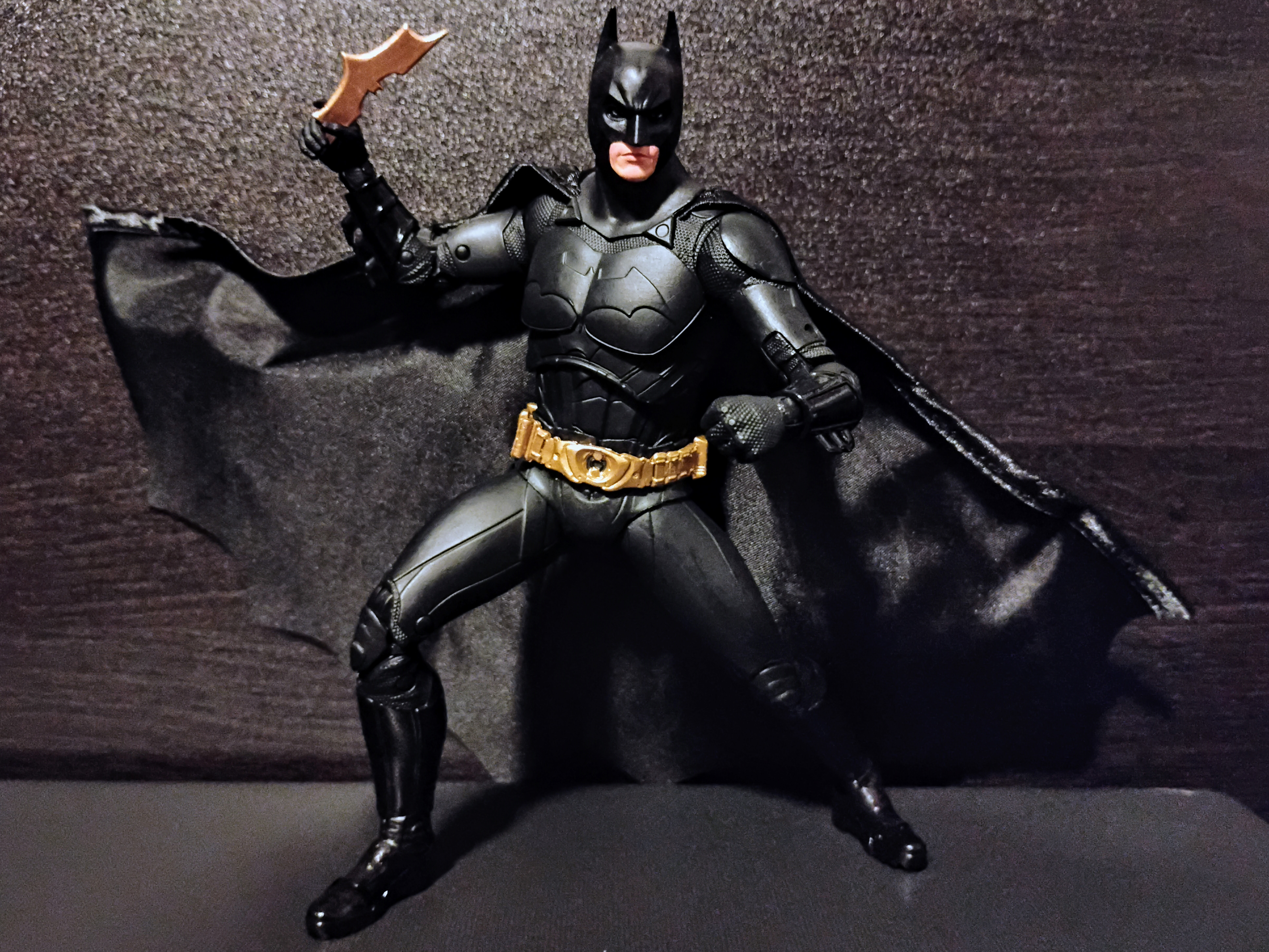
He also co.es with a still oversized Grapnel Gun, though it also has some copper paint. I do wish it had some added paint apps to break up the solid color. He also has a right hand meant to hold 3 Batarangs that scale better ironically (a la Batman Hush), and he also has a left hand meant to hold a grenade or smoke bomb...though it's barely noticeable so it makes you wish he had a right fist. 


And that wraps up the two Batmen provided by McFarlane. Overall, neither is perfect, but I think Bale wins overall for being better in terms of not being entirely shiny black plastic, having better proportions, using a wired cape, and better resembling the costume from the movie, even with the reused parts. Keaton is only a purchase I would recommend if you don't have either the 6-pack or Batmobile version, and while the accessories are neat, you're better off waiting for the Batman Returns version if it'll be more accurate. 


Final ranking: ⭐⭐⭐ out of ⭐⭐⭐⭐⭐ (1989)
⭐⭐⭐⭐ out of ⭐⭐⭐⭐⭐ (Begins)

Monday, April 28, 2025

McFarlane DC Multiverse Collector Edition Power Girl review

These two takes on Kryptonian beings is always going to result in a bit of duality between the alt-world Power Girl and the classic Fleischer Superman. For those unfamiliar, PG comes from Earth-2 and is it's version of Supergirl; while her costume was a lot more Girl Scout-ish in design, Power Girl is a lot more adult in appearance, no doubt thanks to her thicc thighs and huge breasts that were said to increase in size until DC noticed. Seriously, that boob window gives her some identity compared to reusing the House of El logo. As for Fleischer Superman, he is probably man's first exposure to the character if they either somehow saw the cartoons as they first premiered or were in later generations that got vintage cartoon compilations featuring Popeye and Betty Boop amongst others. While those were iconic in their own right, Superman was renowned for the realistic character designs and artstyle, shaping Superman's lore even more than the comic could do, and adding iconic elements like the "Look! Up in the sky!" beginning segment. He was also granted the ability to fly as it made animating the show easier. Fleischer Superman is more iconic than Power Girl for sure, but she gets to take the spotlight first since she is generally new tooling. So get your Fleischer DVDs ready, quench your thirst on Kara's rack, and be sure to keep Andrew Dobson's dumbass away from comics in general as we delve into this review!


Here we have Power Girl in-hand. The curvy, busty, thicc-y proportions we have befit a feminine yet powerful character like her. While the design may scream "fan service" and get shat on by puritans for being "made by perverted men", this is an almost huge contrast from the design Supergirl was normally depicted in. Instead of a blue top with the traditional logo complimented by a red skirt and boots, Power Girl's white leotard combined with the blue gloves and boots deviate from the look we usually see from the classic Kara Zor-El. The gold shoulder plate and chain that goes through her right arm pit also adds to the identity, as it has some asymmetry that fits well with the mostly patriotic color scheme. Her cape is the only Sueprgirl-ish trait she remains with, though she lacks the S-shield. It's also unique for having a wire at the bottom of itself since most McFarlane figures with capes only add them to the sides, but maybe its size could have something to do with it. The thighs are reused from Wonder Woman, which may cause some scale issues to some, though others would probably want her to be a bit taller to go with that sort of "mommy" fetish I know some people would go crazy for a la She-Hulk. Pmapart from the red belt, I love that the soles of the boots and the buttons are painted.


Head sculpt looks perfect for an older, more mature Kara that could make herself more of an equal to Superman. The short hair has undoubtedly made many think of her as a Karen, but I'd rather see that first approach I mentioned than people comparing her to some not-so-popular people. Being a McFarlane figure, the articulation is the same we've seen before, though she lacks toe articulation due to her boot size and possible stability concerns.


She comes with Streaky the Supercat, a female pet owner's answer to Krypto the Superdog. Unlike the puny pup that PedoGunn thought was a good idea to use for his flick, the size of Streaky makes perfect sense given how he's usually the size of a house cat unlike Krypto's usual large-scale dog meant to be smart and reliable while still being part of the marketable cutesy character cliche. As shown above, she does come with a pair of fists (one on display), though the trigger finger hands can cleverly be repurposed as scratching hands meant for her cat. See, not the end of the world for hand choices. As for her chase variant, she is depicted in an alternate costume where the cape is replaced with a jacket and the legs are covered up. The belt is gold, but at least the boob window is intact. This costume is based on her more current look, which is fine apart from making this a Platinum version instead of a separate release. Also doesn't help that her head is stuck with heat vision.


As for Fleischer Superman, this is another COIE body reuse, which is one that worked perfectly for Superman apart from how the original mold user turned out. As for this costume specifically, the proportions are a good blend between comic book-y and grounded in physique. He's also better handled than Action Comics 1000 solely because he's got better legs as well as double jointed elbows and better articulation cuts as well as joints all around. The Fleischer costume also looks great, with a darker blue that goes nicely with a simpler yet still well made A shield that fits the era of the character. The yellow outline goes well with the black more than with a yellow interior. Some would say that the belt is supposed to be painted more, but it actually stayed a solid red in the cartoon. 


Head sculpt is unique for matching that artstyle with the less-detailed and smaller eyes that the character was usually drawn with. It turned out much better than I expected, and it makes me wonder why anyone who would make Fleischer style fan art only does the Popeye/Betty Boop approach a la how Cuphead did when Superman is unique for being more realistic in proportions. His articulation is the same as before, he has alternate open hands, and comes with no flight stand so game had to borrow one. Kind of a shame since we know how price increases are something McFarlane kind of hates. Would have been cool to come with an X-Ray vision head or something else beyond the alternate hands.


With no variant for Superman to bring up, let's see how he looks next to Action Comics 1000. The proportions, the joints, and the reduced McFarlanizations are greatly appreciated for the COIE figure, especially with how he manages to gain a few inches. The pic almost looks like Fleischer Superman meeting his doppelganger in the cartoon.


Fleischer Superman is a great figure that I'd argue could be McFarlane's best figure in terms of looks, though he should really use a few more accessories than he currently does. Maybe an alternate head for his heat vision or the person disguised as him (even if he wasn't as buff, though neither was Hugo Strange). As for Power Girl, I like her overall as a figure, though getting her will be very difficult if you know how easily it sold out. If you get her, be sure to keep her away from Andrew Dobson or jars. Especially Andrew Dobson's jars.


Final ranking: ⭐⭐⭐⭐ and a half out of ⭐⭐⭐⭐⭐ (for both)

Friday, April 25, 2025

McFarlane DC Multiverse Superman (1978) review

The legacy left behind by Christopher Reeve needs no further explanation. He kickstarted the Hollywood trend of making superhero movies in a way how Blade 1998 revolutionized them. Reeve looked like the perfect casting for the character at the time, and while the quality of his movies went downhill, many still find him to be the best Superman yet, whether it's because of being actual fans of the character or using him for clout to put other versions down. With McFarlane making plenty of live-action Batman figures in a 6-pack after we had Affleck, Pattinson, Bale, and Bale sold individually, it made me wonder if we'd get anything like that since only Cavill got a handful of figures. Currently, Reeve and Corensweat join the Man of Steel of 2013, but we'll see if Routh, Hoelchin, and any others will join them for a 6-pack. Until then, let's see if we can believe Man from r/BatmanArkham of all places can fly. Or see how these two turned out.


Here we have both versions of Superman in-hand. While the blank body may appear reused from characters like Adam West Batman or Jim Carrey Riddler, the proportions are specific to Christopher Reeve's build. The musculature maybe soft to some, but it's still better than what people feared with McFarlanizations, or how off Batfleck's proportions looked next to the Fondjoy version. The golds on the sleeves may be the slightest bit of deviation yet, but it's miniscule compared to the added details on Action Comics 1000. One big issue I do have would be the wrist joints not being flesh tone, though the rest of the figure turns out great. The chest emblems are usually flat on the costume like on the actual costume, but they shape is raised in relief while the rest of the logo remains a tampograph. Evil Superman is unique for his darker blue (that I find would rock well with the red on good Superman) as well as the brown that replaces the bright red. Not only that, but the figure has a dirty wash applied to it in reference to the events this corrupted Kal went through, such as the battle at the junkyard with Clark Kent...which was as stupid as the rest of the movie. And people say that "Emo Peter", whose real name is Bully Maguire, was lame when he isn't! Also, the S shield in the back of the cape is easier to show on good Superman than on evil Superman, which may be intentional.


Their heads are generally accurate to the actor himself, though the angry head may be the closer to that likeness than the neutral head. Evil Superman's heads are painted even further with graying temples comparable to Reed Richards and a five o'clock shadow.  


Articulation is standard for the figure(s), with a double-ball neck joint, ball joints for front and back motion in addition to having them shift around with the rotator cuffs hiding said joint, hinges for outward arm movement, bicep rotation, double-jointed elbows, and double-purpose wrists that can rotate at two pegs, with the connection at the forearm allowing the hands to hinge either vertically or horizontally. The torso includes a diaphragm joint and dumbbell waist, hips can move front and back as well as in and out, slight thigh rotation is included, knees bend with double-joints, and the feet can rotate, hinge, and pivot. Finally, the toes can bend for running poses. Good Reeve has the flight stand on display, but both come with it since they're functionally the same.


As far as hands are concerned, we get 4 alternate pairs of them, with one set of relaxed hands and one set of open hands and a set of more flat-karate hands. These kind of come across as oversized on this figure like the ones on Page Punchers/DC Classic Superman.


They also have their alternate heads to go with them, with a slightly cleaner angry head for good Supes and a neutral head with the same evil deco painted on as well as heat vision for Evil Supes.  Both also have a right pointing hand and a left hand holding the green crystal that eerily looks like Kryptonite but is actually from the ship he was transported to as a baby. It also led him to the Fortress of Solitude where he trained to become Superman. Also included is a more gestural right hand and a slightly more splayed open left hand.


Here we have Christopher Reeve Superman next to Adam West Batman since some pair him up with the Caped Crusader of the 60s. Also because I don't have Keaton out of the box yet. I'm pretty sure West being slightly shorter than Reeve is accurate since the former was 2 inches shorter than the latter. They make me wonder how much they'd work as a pair since the camp of 66 was better than the slapstick of 78. That being said, I think you should get Reeve if you're lucky, because scalpers and limited runs make things way less fun than they have any right to be. BigBadToyStore took too long to process my order but GameStop was lucky to save the day. Also, I have no plans for Page Punchers because the body isn't the same (it's the Crisis on Infinite Earths version and not the same one we have here) and also because I'm not a big fan of shading on human characters than on the Transformers like Grimlock and Straxus. It's better than MMPR Pink's comic version but still.


Final ranking: ⭐⭐⭐⭐ and a half out of ⭐⭐⭐⭐⭐

Thursday, April 24, 2025

Transformers Age of the Primes Air Raid & Slingshot review

Out of all the G1 combiner teams out there, the Aerialbots have got to be the most samey cast out there. We got a set of four similar-looking jets that transform the same and mostly use the same colors, even if one is prominently black in jet mode and another red. With how distinct their rivaling Stunticons were, I just look at these plain planes and find them way less interesting by comparison. They had a new stab at toys a decade ago with Combiner Wars, and I only got Air Raid who felt so cheap his torso started to split at the sides because of the combiner joint. Anyways, let's see if the Aerialbots can redeem themselves in the Age of the Primes, consisting of Air Raid again and now Quickslinger, now back to Slingshot.


Here we have Air Raid and Slingshot in their jet modes, with the former being an F-15 Eagle and the latter a Sea Harrier. Both are unlicensed approximations, of course, and I doubt that having Air Raid share the same altmode as the Seekers means he will scale. The prominent black on Air Raid almost makes him fitting for a Decepticon, though the white on the edges of the wings and the Autobot Insignias make him less of a Skywarp imposter. Slingshot is a bit more unique thanks to the shape of his jet mode, even if it does look a bit chubby in some areas. And yes, the black stripe is painted on the black to simulate the cartoon trying to be toy accurate.


The undercarriage for Slingshot is surprisingly well rounded and almost void of obvious robot parts, though the same can't be said for Air Raid. Also, the way their landing gear works is different from each character, with SS having his at the back of his head while AR is in his chest.


Transformation is mostly the same between the two, though Slingshot mostly has his double jointed elbows to help him be more involved. Transformations still feel mostly the same as the Combiner Wars versions but with the benefit of having the feet not be sculpted onto the shins. The robot modes are as clunky and kibbletastic as you can get. Fuselages in the backs of the robots, tailfins on the legs, all in the name of G1 accuracy. To be fair, this was a thing for the Combiner Wars versions, but it just comes off as another reminder of how being slavish to the source material can make things feel lame in comparison to other toys within the line. The Stunticons were generally great because they weren't trying so hard to be exactly like their lame ass originals and felt a whole lot more refined by comparison. Where is the progression here? 


Their articulation is mostly the same, with ball jointed necks, swivels for the shoulders moving front and back, biceps, waist, hips, and thighs. Hinges are used for the outward arm movement, elbows, knees, and ankles. The only differences are that the hands hinge inwards on Air Raid while Slingshot had double jointed elbows. Makes me wonder how Skydive and Firefly will turn out in terms of articulation.


For a size comparison, here we have G2 Breakdown sandwiched in-between the Aerialbots. The scale is what I expect for the fliers, and while Breakdown is the weakest link of the Decepticon subgroup, he still remains more interesting as a figure than the rival faction currently is.


For turning them into their limb mode configurations, you simply bunch Air Raid into a mess of a crushed up jet since he will combine onto Superior while Slingshot will instead split in half when he combined onto Superion. It's similar to how Dragstrip and Dead End attach onto Menasor. And without a Silverbolt in my possession, I think this sums up how I currently feel about the duo. Not awful but they feel more like they serve a better purpose for a combiner than the Stunticons limbs normally were. Get these two only if you want to get a new stab at Superion.


Final ranking: ⭐⭐ and a half out of ⭐⭐⭐⭐⭐