Wednesday, December 22, 2021

Transformers Kingdom Tigatron review

Tigatron is the Cliffjumper to Cheetor's Bumblebee; the difference is that while Cheetor at least had some frequent reappearance in recent fiction, most notably in Cyberverse, Tigatron instead has been found only in all Beast Wars-related media, all within the multiverse of G1 iterations. At the very least, he has received new merchandise of late, especially shocking on one line since he appeared before 3 of the original Maximals! And now, after struggling to wait with getting this guy, from my preorder being taken down and struggling to find a decent website that has him at a proper price, I finally own Kingdom Tigatron, so let's get to the review!


Here is Tigatron in his beast mode. A white tiger as part of his beast mode would imply, he's done up quite accurately to the real-life animal, both in terms of the stripe pattern as well as the fur sculptwork and the anatomy. I even like the slightly yellowed spots on him, as it feels reminiscent of the fur patterns that real white tigers have without it looking like it's actually the plastic yellowing. Some may prefer the cartoon-accurate beast mode of Tigatron, but as is the case with the Beasties in the Kingdom line, they're a balance between realism and cartoon-accuracy, so we'll stick with the real tiger face. I have to commend Hasbro for making the stripes stay on better compared to Cheetor's spots. I don't know if it's the type of paint they used or the plastic it's being used on. Additionally, the figure has slightly less noticeable hinges that come from the transformation as well as seamless proportions compared to Cheetor, due to his budget as a Voyager. His articulation is almost the same as Cheetor's, with an articulated jaw, ball-jointed upper legs, bends at the forelegs, and hinges as well as ball joints for the ankles and paws. You can store the gun underneath his chest, but it looks worse than the weapon storage of the original Beast Wars toy.


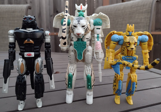
For a feline beast mode comparison, here he is in-between Covert Agent Ravage and Cheetor. You can tell how different the proportions are between the three of them. Tigatron feels the most proportionate to the real-life animal due to his Voyager budget, and you can definitely compare how he looks next to Cheetor, who makes the most out of his Deluxe budget pretty decently. Ravage, while very distinct as a jaguar due to his head sculpt and similarly bulky front body, does have to go with the compromises of trying to be show accurate to the robot mode. And as you can tell, Tigatron's not exactly the same as Cheetor, because apart from being an obviously different beast mode, the parts that cover the gaps for the shins in beast mode are not the backs of the feet, the hinges are less noticeable, and the paws have more articulation than with Cheetor.


For a Maximal beast mode size comparison, here is sTigatron next to everyone else in the line. Amusingly, Rhinox feels undersized in his beast mode while Primal and Dinobot are close to each other. Obviously, some sacrifices were made because of the sizes being prioritized for the robot modes, but it is amusing to see how funny they all look. I think some more dynamic shots can help reduce any size discrepancies.


Transformation might seem reminiscent of Cheetor's at first glance, but it's a case similar to how Kingdom Rodimus Prime uses an improved version of Studio Series 86 Hot Rod's transformation; the increased budget allows Tigatron to have forearms that don't have any remaining pieces of the beast mode, while the front legs can fold away better, and the shins don't stick out as much as they did on Cheetor. Even the tiger head transforms a little differently, being on different hinges on top of not requiring the jaw to open so it can tab in. This does mean that the back of the tiger head ends up as the back of the robot head unlike Cheetor, but I'll take it. The resulting robot mode ends up being better than Cheetor's, all thanks to his better proportions as well as improved engineering. While it has most of the same points that Cheetor had previously showcased, you'd get a better sense of how much better Tigatron turned out compared to the younger, shorter Maximal. Though one should keep in mind that the budget between Deluxes and Voyagers are clearly different.


Head sculpt is pretty accurate to how it looked in the show, as it was a mature version of Cheetor's face with the appropriate red eyes and teal green face. The mouth is even more catlike than on Cheetor! The funny thing is that they shared the same heads in the shitty Netflix show but because the Beasties were not made with the same CAD files of their toys they end up being pulled out of the animators' asses. Anyways, the red paint on the eyes looks nice, though it does look a little faint on the forehead. His articulation is consistent with every WFC figure. His head's on a ball joint, shoulders can move front and back as well as in and out, the biceps swivel, the elbows bend at two points instead of one, and the wrist swivels. The waist swivels, the hips move front and back, in and out, the thighs swivel, the knees bend, and there are ankle pivots. 


The accessories he comes with are the tail whip not unlike Cheetor's and a gut gun. Now, the former is pretty much more of a whip because of the position it's sculpted in, and it lacks the blade that would make it count as an homage to the Transmetal version of Cheetor, so it more than makes up for that nonsense with the latter weapon. It's got the stomach organs painted in pink as is the case for the organic weapons, and it manages to be a nice addition after Cheetor was missing his. Weirdly, Tigatron has both a buttflap that Cheetor didn't have as well as a very tight crotch panel that doesn't move as easily as Cheetor's, and it only goes less than 25% of the range. It's a strange addition because of just how unnecessary they both seem, especially with how difficult it is to move the latter.


For the only reuse of the mold so far, this is Mutant Tigatron, so named because of the bio stating that a quantum surge (not me btw) killed nearly every Maximal and Predacon, yet he was weirdly left mutated and much more aggressive than before. This means he went from a white tiger to a normal tiger and also has a newly sculpted mutant head similar to but not exactly like Shadow Panther's. This deco also evokes the original prototype of the 90s toy before it was changed to a white tiger.


And Takara would later make a show-accurate repaint featuring stark white plastic and metallic paint apps for the Beast Wars Again line. Packaged with a Blackwidow figure (the Japanese version of Blackarachnia, not the Avenger), this guy better not yellow.


For a robot mode size comparison between him and the two other cats, here he is in-between Tigatron and Cheetor once again. He definitely towers over the two, and it especially shows how much more of a budget he has when compared to the others. Cheetor is an average Deluxe, and Ravage is basically a Deluxe that tries to be screen-accurate to a fairly basic robot mode that has his beast head as a robot head and skinny arms. Tigatron definitely wins overall.


For a robot mode size comparison with the other Maximals, let's recreate a photo that is used regularly in the Season 1 lineup courtesy of Mainframe. As you can see, the size really isn't that accurate between everyone. I guess it fits between him and Cheetor, but he's not supposed to be taller than Primal, nor should he be the same size as Rhinox. Rhinox and Dinobot are fairly close but both should tower more than a head than Primal. And of course, Rattrap should be bigger. The scale itself isn't going to make me lose my sleep, but it's something amusing since they're not 1:1 with the scale compared to the WFC Trilogy Autobots and Decepticons. As for Tigatron himself, he's definitely worth getting. While there are a few things I don't like about him, mainly the weapon storage and the unnecessary flaps, he's a worthy purchase to get, especially if you can get him before the holiday season makes him disappear. The improved engineering that he gets as a Voyager is undoubtedly a godsend if you ask me. 


Final ranking: ⭐⭐⭐⭐ out of ⭐⭐⭐⭐⭐

Sunday, December 19, 2021

Transformers Studio Series 2021 ranked

2021 was an interesting year for Studio Series. We started to have some reuses and a few new molds for the Movieverse while the 86 subline started to get all of the attention from Hasbro. They would generally consist of new molds mixed with reuses that vary from last year to the beginning of 2018. As for the 86 guys, they consist of characters that are either made specifically for the line or were carryovers from the WFC trilogy or were made to be Studio Series figures. With how some of them lacked the 5mm ports that other figures had, it's possible that almost all of them were made specifically for Studio Series 86; that and the softer sculpted details in comparison to the heavy sculpt work on the WFC guys except for the Dinobots. So with all that said, let's take a look and see how the line held up. First, it'll be about the Bayverse Buddies before we go to the Classic Crew.


9. B-127: We've gone full circle for this guy. We go from a really nice Offroad Bumblebee to a promising-at-first-then-majorly-disappointing Cliffjumper and back to Bumblebee, now with some stupid-ass codename that does the long-overdone precursor name schtick. This guy's got the same backpack issues, loose thighs, and leg panels that don't stay on. Also don't like how weirdly bright the yellow is compared to his other toys. That's more fitting for G1 Bumblebee, honestly. The battle mask would be cool if it wasn't on this mode since he used it more on the Offroad design. And no, head-swapping it won't help because the shades of yellow don't match. Now, there is a Buzzworthy version of the mold coming soon, with a more accurate shade of yellow and the unmasked head with darker face paint to boot, so I look forward to that at the very least, even if the mold still sucks.


8. High Octane Bumblebee: This is a figure that I don't own yet I must explain why it has to be on this part of the list. So back in 2014, the movie line was in a time period where the toys were given the same level of being scaled back much like the Thrilling 30 of the Generations line. The AOE toys were not given the same level of engineering that original trilogy lines had, and they weren't even as refined as what the Studio Series had for its new molds. As a result, High Octane Bumblebee stands out amongst the other releases for having dated engineering, a gaudy color scheme of yellow legs that look cheap, and an overall appearance that makes him more primitive when put next to the other Bumblebees in the line. Things like the way the roof is folded within the hood, or the more creative leg transformation, and the winglets that were carried over from the Masterpiece Movie toy, are not present in this figure because it was made before those new traits were added. I think it's a shame Hasbro didn't make a heavy retool out of the high octane figure because that would be a great way to revive the design with more modern engineering, especially when the stubby arms, elongated legs, and flat clown feet with the wheels sticking out on the sides don't make him feel as refined. And to make matters worse, this is the Tribute 3-pack version with the missing paint apps and the brighter yellow that doesn't fit the character! Look at that banana missile! RIDICULOUS!!!


7. Starscream (Bumblebee): When I first saw this mold, I set aside any anti-Beewun design bias and was genuinely interested in seeing how far they'd take Blitzing into Starscream. Turns out he has no parts in common with him. Either way's he's a worse version of Blitzwing. The tetrajet mode's pretty cool, I'd say more insectoid and alien than the Siege version. The transformation is pretty cool, but the robot mode is a mixed bag. The wings feel pretty weak with the tolerances, the legs don't feel straight, the head can't look up in spite of being on a ball joint, and the weapon stays on worse on the arm than with Blitzwing (on top of not flowing with the rest of the arm), and the null rays are a joke! They don't need to be on the forearms, but can they PLEASE not come off the wings too easily? I'm missing one and can't find it to this day! 


6. Thrust: The only other figure we got in the non-86 Studio Series line that was a Voyager was a reuse of Starscream. Yes. Thrust has some of the same issues that Starscream had, but I'll give credit to them for making it slightly more tolerable. I dig the new conehead piece that completes the silhouette, the wing transformation somehow works better, and the Armada color scheme is so appreciative instead of the cliche G1 deco. So yeah, it's kind of a case of Hasbro polishing a turd, but at least they put a little more effort here.


5. Grindor: Blackout was an already impressive Leader, sacrificing his size in robot mode for a robust size in vehicle mode and a complex transformation that made Grimlock feel like a Voyager by comparison. The only thing I'd improve on would be actual ratchets for the hips and sturdy shoulder tabs for the transformation. Then we get to Grindor, who I'd say is fine for a repaint this late in the line since we have had new molds for the Leaders and the only times we got reuses were the two Constructicons in the size class as well as Blackout in a Lucky Draw campaign and Megatron in the Universal Studios ride. Grindor is also similar enough that you can pretend he's Blackout with some new additions. Sadly, apart from the hands and Ravage, he's worse than Blackout due to the rust paint apps being as bad as the ones on TLK Squeeks. The paint that was added in the vehicle mode is appreciative, but the quality control on the tabs and the shoulders as well as the digitigrade knees make him worse than Blackout. If that's not enough, the propellor blades are free for the vehicle mode but that comes at the cost of making them loose in robot mode. So yeah, a serviceable repaint of a great figure with plenty of QC issues.


4. Jolt: NGL, I was first anticipating this guy to make it to the number 1 spot for how creative he'd be, but after handling him, there are plenty of things that pull him back. Firstly, the vehicle mode looks softer on details than the other Studio Series cars we got, even if it's a licensed vehicle. I also find the articulation to be a bit hit and miss, with the legs being in need of an ankle pivot as well as the hip kibble getting in the way. It's manageable but could be better executed. His whips are cool in detailing but could be even better if they were pre-posed or had wires implemented. Hell, even hinges would suffice. The part swapping with the thumbs is a creative method but be careful with keeping track of them. To his credit, he's very screen-accurate, and the head sculpt works well, but there is room for improvement.


3. Dino: Many people shat on this guy for the inaccurate vehicle mode and the backpack that he has. The former makes sense because it's not easy to get the licensing of the Ferrari, and the latter is forgiving given that there is so much that can be added for this guy in the $20 price tag. The bumper butt's weird, and he may look fat from the from because of the backpack, but it's tolerable in hand. I do like how the articulation turned out, but I do wish he'd have an ankle pivot. Still, I'm happy to accept this Dino over no Dino because the official version from before was just a red Sideways, and the third-party offerings, especially Alien Attack Firage, are very concerning.


2. Bumblebee (ROTF): While the front of the vehicle mode is a little incomplete for paint apps and the gray parts are a lighter prototype shade instead of the dark gray of the first Camaro Bumblebee, the new shade of yellow is appreciatively closer to the movie, I like the new rims, and the figure still carries over the same engineering we got from before. You know, the faux chest elements, the mini wings, the leg transformation that woul be great to see on the High Octane design?! Sam Witwicky is a nice addition for the figure due to his inclusion of being Bumblebee's friend, and despite being a miniature, Allspark-less version of the MPM guy, he's a nice accessory to have. 


1. Sideswipe: I'm amazed that they were able to find a way to make the retooled backpack work without it compromising the figure. While it can take some getting used to for those who have the DOTM version, it makes up for it with an even nicer vehicle mode and a better-colored robot mode. Gone are the light gray robot parts in favor of darker gray parts and a silver-painted head. This is how you improve on previously released figures without compromising anything crucial! Shame Sideswipe managed to be the best figure in the line. Hell, all of the Deluxes apart from the Bumblebees based on movies released in this decade manage to be higher on the list!


And that covers the regular Studio Series line! With them out of the way, let's go to the 1986 movie and see what its characters had to offer! I have to say that I was annoyed that they kept shoving G1 down our throats but perhaps that'd be fine if they let the toys be good and be of equal quality all around. If anything, being a great toy is all that I'd hope for each release. So let's see how they turned out!

9. Scourge: This guy is so boring. His vehicle mode is the same space boat that pales in comparison to Cyclonus, and the sculpted details feel flat compared to the WFC Trilogy. The transformation is simple and doesn't have the creativity that the WFC or Studio Series line has, either. I guess the robot mode is screen-accurate, but it feels more like an excuse for why a figure is lacking elsewhere instead of being a robust toy that doesn't just rely on Sunbow accuracy to be good. Like, I love the WFC trilogy, but their engineering and sculpted details make them superior reasons to love them more than Sunbow accuracy. The open left hand is cool, and the effect piece is funny for how phallic it looks. Still, not the best, and I don't plan to get the Sweeps anytime soon.


8. Gnaw: I always wanted a Gnaw figure, and while he's the best with the screen-accuracy and darker colors that the G1 toy and Titans Return release have, he's got some new issues of his own. The legs are far back from the body in beast mode, which makes him very front-heavy, and it comes from a new step in his transformation. A swivel for the chest to make most of the upper body fit with the rest of the robot mode proportions, it's not something either the G1 or Titans Return figure did at the cost of not having a waist swivel like Siege Apeface, Earthrise Starscream, and Kingdom Blackarachnia. Then again, most Studio Series figures don't have waist swivels. The robot mode looks accurate, and his sculpted details and paint make him comparable to the Allicon, but he's still doing that accuracy-as-a-crutch excuse for how underwhelming he is. 


7. Blurr: I was initially looking forward to getting this guy because I was hoping he'd be better handled than the Titans Return version. When I got him in-hand, I found him somewhat annoying in some areas. Many have an issue with his crimson chin, but I found the details to be boring and flat compared to the Titans Return version. Additionally, I wish he had wheels, but I guess that wasn't a concern. His articulation is not too bad, though I don't like how the wrist swivels are connected to the fenders of the vehicle mode. All in all, another case where they prioritized show-accuracy over making for a memorable figure.


6. Kup: This guy's an interesting fellow, what with him having some of the scupted details I love in the WFC line mixed with some slightly weaker plastic than the norm. The robot mode is where the toon accuracy remains obvious, and while many would prefer the Titans Return version for the Marvel look or the Generations version for the IDW look, this guy isn't bad. He does have the limb-removing feature with the use of 5mm ports, but I honestly like the clear chest on him more than the solid one on the Buzzworthy version being opaque. I know that one is closer to the show model, but this guy feels a little more unique with it, and those sculpted details are nice to have. He could have a better head sculpt, but he's not a bad figure, and he balances the toon aesthetic and details quite well.


5. Jazz: Another figure that has the balance done quite well, Jazz may be seen to many as the best version of the guy for his Sunbow accuracy. I agree that he looks the part, but I feel something is missing: the decals. I'm not upset at the 14 on paper but the execution is pretty lacking. I do want to go a step further and give him Reprolabels since those would make him much more satisfying than he currently is. I will have to warn you on the clear plastic being somewhat fragile if you don't transform him properly. He may not look as cool as the WFC Trilogy gang, but he is my favorite of the Deluxes in this line-up. And hey, it's funny how we've gotten Jazz in a cartoon-accurate design while the Masterpiece line has yet to complete the Autobot Cars of 1984! Also this one beats the crappy POTP version.


4. Wreck-Gar: I like Wreck-Gar's character. I think he's fun in G1. I'm also thankful that he wasn't butchered in the WFC Netflix show since he didn't exist in there. That being said, this Wreck-Gar is definitely in the looks over quality department since the feel of this guy is on-par with the plastic feel of Kup. It's not bad, but it makes him feel a little less robust than the WFC Voyagers excluding the Beasties. He's definitely the best-looking Wreck-Gar, and I appreciate his weapons and ab-crunch in theory, but I'll admit I like the creativity of the Reveal the Shield one more for how badass it looked. I don't think I'll get a Junkion unless he has a unique deco and a new head.


3. Hot Rod: Many will consider this guy to be the best version of Hot Rod that we've gotten in a G1-based line. And while that is true for the accuracy and the engineering, I do find that there are a few issues with him. The sculpting feels softer than it should be, even if it's there. The shoulder articulation takes some getting used to due to how they work differently from any other shoulder joints. I'm sure some will be annoyed that the knees and especially the cockpit hinge at the roof are yellow like the spoiler, but my main thing is how simple he feels next to the WFC Trilogy guys, who balance cartoon aesthetics with new details and engineering. He does have some cool accessories, and that justifies him being a Voyager, though compared to the other contenders, it's the end of the road for him!


2. Slug: I'm surprised we'd get a Leader Class Slug in the line. After the Power of the Prime Dinobots, I assumed Hasbro would be fine enough with those releases because they'd be the closest to being G1 updates of the team, along with their combining abilities, but we're getting Leader Class versions of them and they're coming out little by little?! We got two of them already this year, and Slag's definitely a strong addition to the line. I like the details that are added to him, and the transformation he has is quite astounding. Daniel Witwicky sucks, and he could go for a sword. Otherwise, an impressive Leader Class figure that makes me miss when they made the size class feel exciting.


1. Grimlock: This guy is indeed king. Unlike Slug, who did suffer from having more of the prominent prototype gray parts and somewhat wishy-washy red, Grimlock feels a lot more premium with the prominence of gold and dark gray. That and how nice the blue visor looks on the black helmet. I'd say this Grimlock looks better than the Masterpiece version due to how it didn't make the proportions weird, and that's not a knock at the MP version since it was an impressive take on the guy. While he does come with a (better done) gun and a slightly better Wheelie, he still doesn't have his signature sword. Still, those aren't as annoying with Grimlock compared to the other Dinobots, who felt like they needed their weapons compared to Grimlock, who'd make all the damage with his fists or beast mode at times. In any case, he's already great, even without the upgrade kit (which I plan to get).


And that wraps up the line-up. What an interesting year this has been, huh? Well, next time you see me, I'll be talking about who's missing in the Studio Series line as far as new characters and other designs are concerned. But until then, have some additional countdowns and reviews!

Thursday, December 9, 2021

Transformers Power of the Primes Elita-1 review

 Elita-1 is one of those characters that doesn't pop up as often, and don't count on her to make an entirely new incarnation apart from Animated Blackarachnia or her brief appearance in Revenge of the Fallen. If anything, Arcee and Chromia have been much more popular. Obviously, Chromia was not as frequent in new universes as Arcee, but she did at least pop up in a new cartoon without becoming a new character (basically, she showed up in Cyberverse with her IDW design). That being said, Hasbro has given the G1 iteration a few toys of the character, first in the form of a Cybertron Thunderblast repaint and recently in the Netflix WFC line. In-between those two was a Voyager Class figure in the Power of the Primes line. Yes, it's kind of hesitant to revisit that line after not only having the superior War for Cybertron series but also the Titans Return series, which I think is the best Prime Wars line. Regardless, it is something we can look back on to see what did and didn't work. Does Elita-1 work well?


Here is Elita-1 in her jet mode. From the top, I like the design of it, as it feels very unique for her and quite fitting for the character design. The parts that are an honest-to-Primus portion of a jet work well enough. I especially love the colors used, especially when they make for a nice balance between looking feminine and badass at the same time. The sculpted details that are there are pretty lacking compared to the stuff we'd get in the WFC Trilogy, but most of the details are in the form of stickers. I hate them. The chrome stickers clash badly on the plastic, and they don't stay on as well as they do fit in a decently aligned place. I'd wish to have a Reprolabel set that makes the jet mode better but the one we have doesn't look as good. These stickers are neat in concept but poor in execution.


The undercarriage is where the altmode doesn't work all that well. People complained about how the shortened arms and folded up legs are not hidden with the Siege Seeker mold, but this is even worse! The feet look kind of slapdash on the undercarriage, but the arms do not contribute to the transformation and basically lay there. On top of that, the head is just facing the back. If this was the Aero-Bot figure from the Playskool Gobots line, it'd be acceptable since the main purpose would be the fun chunkiness as well as lights and sounds. But this is a collector's item, and even if it was a mass-released one, it failed to be good with the aerodynamics even compared to Silverbolt from the Combiner Wars line.


Here she is next to Earthrise Starscream, a character that shared the same figure Elita-1 has. I like how different the designs are from one another; while Starscream is more traditional as part of the WFC trilogy making new figures of G1 guys, Elita's instead a new, sleek design that I feel would look even better if she had no brick underneath her. The differences in how the wings, thrusters, and fuselage look makes them distinct overall, though I have to admit that while it's a bit lame that the Earthrise Seeker mold borrows the transformation of its decade and a half older counterpart from the Classics line, at least the undercarriage is nowhere near as awful as it is here. It even gets worse if you add the robot feet.


Transformation is very basic. You just straighten the legs, tab in the gap cover for the inner part of where the knees hinge, shift the fuselage off the front, and swivel the wings around. If this was from Armada or Energon, it'd be perfectly fine, but as far as the engineering is concerned when compared to Voyagers made around the time it was made, it's even simpler than Motormaster. The resulting robot mode is actually not quite bad. While the design is bulkier than the norm for her, It fits well along with the likes of RID15 Strongarm. They're quite fitting for a character who could lead her fembot team, especially when they help her stand out compared to the other fembots. The colors are once again a strong highlight of the figure, and the kibble itself is perfectly fine here. The backpack is distracting for Starscream since he had a faux chest, but it works a little better for Elita-1 (but only a little because of how under-engineered the figure is). The figure has stickers for the forearms, shoulders, and part of the chest. Only the Autobot insignia stickers look fine.


Head sculpt is very nicely done. The Prime Wars trilogy began to do a better job with capturing the look of the characters made in the line than before, and the design it has is better than the G1 version. Even if her forehead looks like Shockwave's chest. Her articulation is pretty average for a figure of the line, with a head that is on a ball joint, shoulders that move front and back on ratchets as well as in and out on ratchets, bicep swivels, elbow bends, hips that move front and back, in and out, thigh swivels, and knee bends. Her articulation is way less than most figures in the line. Her shoulder spikes can be used as guns, and you can place the feet on the wings for some stupid reason. Yeah her weapon choices suck.


As far as reuses are concerned, this figure barely had any repaints. And honestly, that's fine with me. Starscream came first, and he is definitely worse than Elita-1 in plenty of aspects. The proportions on him looked RIDICULOUS! The attempt to mix the Popeye aesthetics with the normal G1 design made it look worse than the normal G1 design, and the stickers being chrome silver on white plastic looked even worse than with Elita-1. Also, LOOK AT HOW LONG THOSE NULLRAY POSTS ARE ON THE SHOULDERS. I did not lose any sleep over this guy having no Seeker repaints because man did he look stupid! I don't care if his torso looked like Moviescream with the Coronation head, this is really pathetic!


For a size comparison, here she is in-between Earthrise Starscream and Optimus Prime (who is the Netflix version) and the WFC Netflix Elita-1 figure who is a retool of Arcee. She is taller than the Air Commander and likely taller than Optimus Prime. It's kind of amusing but it makes sense given how she serves as a torso for a combiner. I have to say that while the POTP figure may not be as accurate to the cartoon as the WFC Netflix figure tries to be, I honestly prefer this design or at least the concept of it. It's much more unique and she doesn't have to be too skinny.


The transformation into the torso mode is certainly more involved, which is weird because one would expect the normal robot transformation to be as involved. The arms become the thighs a la Superion, but now the backpack is used in becoming a chest similar to that f Movie Starscream. In fact, this was why the toy began as Starscream since it was meant to homage that version of the character. And that may explain why the feet are done up like that. As for Elita-1...well, with a certain number of figures I guess she can be called Elita-Inf1nite, but let's be honest and say it doesn't fit her. The robot mode works better for her than it does for Starscream, but the torso mode proved that the two were designed with certain modes in mind. Now, new to the POTP teams are the feet, which are better than the Combiner Wars versions due to them having ankle pivots as well as a height boost. The hands of the figures that are legs can be used as heels. Oh, and the Enigma of Combination can be stored on the chest. It's basically a shell version of a Titan/Prime Master.


Head sculpt is also nicely done, and it's even better than the original version! Her articulation is the same as before, but with the added improvements of double-jointed elbows, wrist swivels, slight finger articulation, and ankle pivots as well as swivels for the 5mm ports. Now I don't think I mentioned this but I don't think I want to get the other fembots because the Moonracer mold sucks. I don't want to buy 4 repaints of it just to make a fembot combiner. I already own Siege Chromia and don't like her much. As for Elita-1 herself, she makes for an interesting purchase even in spite of her flaws. If you see her for a cheap price, get her. Otherwise, wait for Legacy to solve the issue.


Final ranking: ⭐⭐⭐ out of ⭐⭐⭐⭐⭐