
Starscream's got plenty of different appearances over the years, whether it's the standard G1 design, the swordsman-themed Unicron Trilogy design, the more alien Movie design, or the stylized Animated design. The Aligned continuity, on the other hand, gave Starscream a G1-esque design in the games and an Animated/Movie hybrid design for his appearance in Prime. Like most versions of Starscream, this incarnation is constantly chased by fangirls because it's required by law for them to make chibi/cutesy 5versions of these characters, but of course, by the time Tumblr became a thing, they started to do this sort of shit with TFP Screamer. He's got more moments of looking like a coward, and more than the other incarnations, as he's shown to be a lot more expressive than the other guys. Still, cowards do survive and all that. Now then, let's take a look at the stiletto-wearing air commander in the form of the First Edition Deluxe!

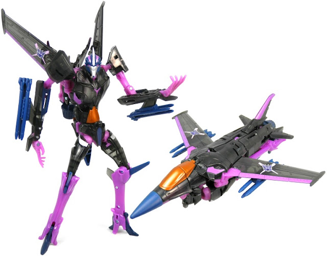
Here is Starscream in his vehicle mode. The jet design looks pretty good from the top and thankfully has the proportions accurate to the robot design. The problem occurs when you go to the bottom and realize that there is a bit of junk in the trunk. I say that because the literal waist-down is exposed badly from underneath, and no attempt has been made to integrate the waist and legs with the rest of the jet mode. I get that the jet mode is frail compared to the standard jet mode Starscream takes the form of, but it doesn't mean that the waist and legs should look as if they come from a different toy. This is almost as bad as POTP Starscream and Silverbolt in general, but at least this figure has the excuse of being a Deluxe. Still, even with that excuse and the tiny bumps representing landing gear, it doesn't really mean the altmode should look like that.

You can tell that the back doesn't attempt to hide the legs, as the stiletto heels are still there, even if they're folded upon. So in terms of jet mode proportions, this figure is the stereotypical example of Jetformers: decent from the top, weak from the bottom.

Transforming the figure is thankfully different from the Seeker norm, as this figure consists of steps like a waist swivel, arms that are made from a portion of the fuselage rather than being part of the torso, not using the cockpit be the central portion of the chest (instead, Starscream's chest is an homage to the Movie version). It's a fairly involved transformation that fits the First Edition engineering, and my favorite part is the ability to adjust the wings more upright. Starscream's wings are generally seen like a dog's ears in the show, as they can be lowered when he's sad or worried but upright when he's scheming. He even flapped his wings a little bit when he attempted to transform.
Now for his robot mode, it's certainly the skinniest Starscream we've gotten to date, even more than Animated Starscream and Cyberverse Starscream. Considering the approach for combining aesthetics in the show, Starscream has the colors, posture, and voice (sort of) from his Movie incarnation yet has the sleek look and dynamic wings are that of the Animated incarnation. Certainly one of the more glaring examples of game-to-show translations (as the game's bulky like the Movie version but has the G1 head, colors, and design cues), but he does have more of a G1/Animated look to him in RID15. As for the figure itself, it's got everything you'd expect Starscream to have in the show, from the proportions to the knee spikes, and the included hunched posture. The only glaring problem I have with the toy is the nosecone sticking out from the back like a wasp ass. Still, the figure looks pretty good elsewhere, though I wish the Decepticon insignia is red...


...and speaking of Red, this guy's forehead spike was painted red by me because I wanted the figure to look a little more show accurate. Plus, red's a color that's sort of missing on this figure. Yeah, the eyes, chest eyes, tailfins, and abdomen have bits of red, but there is some red that's yet to be added, like the Decepticon insignia and the forehead spike as seen here. Oh, and his eyebrows should be a little more prominent. As for the articulation, the head is on a ball joint, shoulders are on ball joints, the biceps swivel, the elbows bend at two points (one for bending front and back and the other for bending inward), though not as a double elbow. The wrists bend inward due to the transformation, but they don't swivel. The waist sort of swivels, but it's mainly for the transformation and not for articulation. The hips move around on ball joints, they swivel at the thighs (albeit tightly), and the knees bend.


The forearms have slots meant for the missiles he used in the show, and while it's cool to have three missiles in a rack per arm, he only had one missile on each arm, so these are kind of inaccurate. Also, they were red.

In terms of any differences that were added to the Japanese version, the darker grays are more black than blue, but that's pretty much it. There are sadly no actual additions to this figure that would encourage fans to get this version of the mold, not even any red for the forehead spike, missiles, and Decepticon insignia.

Here are the reuses associated with Starscream. This is the Canadian-exclusive version of the mold, which is supposed to be Starscream infused with Dark Energon. This version of the mold looks more like a bleached version of the mold, and neither he or the Bumblebee that came with the set are accurate to the show. Still, they make for great ways to get the First Edition figures at the time the PRID line showed up.

This is another Dark Energon repaint of the mold. The Skywarp-esque colors are pretty nice for this mold, even if it's a little translucent and has some blue highlights. His Decepticon insignias are over X signs for some reason. He was sold along with similarly themed versions of Optimus Prime, Megatron. Bumblebee, Knock Out, and Wheeljack, and is curiously the only First Edition figure to be used in the line.
In terms of repaints associated with any other characters, this is the actual Skywarp released in the line. He's not only got the traditional deco for the character but is also given Arms Micron ports in the form of the bombs that replace the missiles as well as an Arms Micron named Balo, who turns into his drill or ninja star.

Then there's Thundercracker, who's about the same as Skywarp, only blue. His Arms Micron is also a Balo, but dipped in silver chrome.

Finally, here is Slipstream, who's unique in that she has a new head that replaces the Starscream one. You can actually transform her without the hunched posture so she can look a little more natural. Still, I wish the chest is retooled and came with other weapons.

For a design comparison with some other Starscream figures, here he is next to the Prime: Robots in Disguise Voyager. The Voyager does have a better head design, and I don't mind aspects of the figure, though the purple arms, the waist not tabbing in, and the Powerizer gimmick have turned away fans. Still, it wasn't an awful figure, especially considering how FE purists treated it like trash. Also its jet mode was sleeker.

This version of Starscream's one that is great to own if you're a TFP fan, though the jet mode does kind of suck with how bulky the undercarriage is. I would only get it, however, if you can find it for an affordable price. To this day, fans refuse to give up their TFP First Editon toys for a good price, so in the meantime, try going to any toy shops and look for any conventions that have him for less than $40.

Final ranking: ⭐⭐⭐⭐ out of ⭐⭐⭐⭐⭐
No comments:
Post a Comment