In a rather unusual twist, we started to get only one Masterpiece Movie figure per year instead of two. Granted, we had 3 in 2018, but that was due to VW Bumblebee being rushed out which meant that Ironhide didn't get to be refined in time as shown with his unstable chest. While the 2020 MPM offerings were pretty solid with some minor problems here and there (Ratchet's chest fenders and Starscream's lack of bicep swivels), it looks like there was initially no hope for the MPM line starting with 2021. Of course, budget constraints to have these in Target prevent some figures from being as perfect as they could be. While some have been able to turn out pretty well in terms of accuracy or engineering, two figures haven't been as lucky when it comes to the movie accuracy; and both were from the Bumblebee movie. In spite of his inaccurate robot mode, I'd argue Bumblebee manages to be fairly decent. As for Optimus Prime, however, it's a different story...
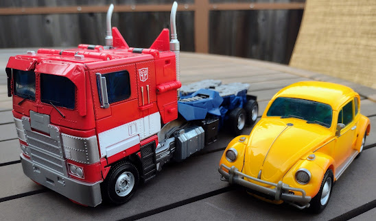
Here is Optimus Prime in his vehicle mode. Yes, this is what it's supposed to look like. It's not mistransformed, it's not experiencing any design flaws, this is the intended transformation for the alternate mode. This has got to be the worst example of a G1 truck mode I have ever seen in recent years, and it's not like it's got a gimmick involved that benefits the robot mode, or there was a size limitation that keeps it from being refined. This truck mode has been revisited since 1984, and while Ultimate Battle and Hybrid Style Primes both have shitty truck modes, this is by far the worst I have ever seen for a truck mode when compared to many other versions of the flat nose cab. And sure, people can say that this is a Movie design which is more complicated, but as you'll see, that's bullshit. I'll give it credit that the paint apps are nicely applied on the figure, and the blue windows look lovely in addition to the grill being painted silver. The fade on the white stripe is a little awkward given how it's only on the corners, but that may just be me. Speaking of unusual paint app logic. some may find the Autobot insignias in the wrong spots given how that's more commonly expected to be in the spot where the shoulders would lie, but those silver pipes under the insignias are left unpainted on the bottom part. But the paint apps aren't the problems of this toy; the truck mode can only look passable from one specific angle because you have the cat ears, the broken-up gaps for the side profile, and the exposed robot thighs which are normally passable for a smaller figure but are embarrassing for a figure this size. The truck mode isn't even accurate to the movie on the front; it looked more like the Freightliner that he took the form of while this feels more like a weird amalgamation of it and the Marmon 97 that Optimus took the form of in Age of Extinction. And people can say that the cat ears can be folded away, but nope, they're molded to stay like that. How much money are they saving by not including the hinges for that?
I know the truck mode is trying to replicate the back section of the original truck mode, but while I want to remain objective and set aside my own thoughts on that truck mode, I want to instead comment on why this fails to work as intended: With how most of the robot parts are moreso made for that mode, there is no proper flow nor additional engineering to make the back section look convincing to a real-life model. I'm not expecting it to have the back chunks of legs that Primes tend to have, but at least make it look more smoothly done than it currently is! The bottoms of the feet have that idea in the right mind, and it is apparently compatible with the trailer of MP-44 (which I don't have). And as far as die-cast parts are concerned, I can only say that those gas tanks are made of die-cast.
The gun stores on the back of the truck mode and not in the most convenient way. Sure, figures like MPM-4 Optimus and -11 Ratchet have their guns sticking out on the back but at least they try to pass off as vague weapon modes. I can see them trying to fit this in a method similar to MP-10 Prime's gun, but the difference is that it actually had a spot to be stored in while ALSO having the space necessary thanks to its smaller size. This would probably work better if it was stored underneath the vehicle mode. Alas, it is not the case.
I normally don't compare vehicle modes between Studio Series and MPM, but when you think of the current state of the truck mode, it has to be said that the $30 manages to have a much better truck mode than the so-called Masterpiece Movie figure. The proportions are much more accurate to a proper truck, there are no gaps in the truck that keep it from looking broken up, and the back section, while still representing the fifth wheel that is normally found on the back of the truck mode, actually looks realistic to a real vehicle! Sure, the truck mode is closer to the Evasion truck and not the G1-accurate Peterbilt, but I think it looks much better in terms of execution than the new toy does.
And here he is with the Volkswagon Beetle version of Bumblebee from the same line. It's quite amusing that the smaller toy has the superior vehicle mode while the larger toy with a bigger budget doesn't look like it has said budget. If anything, it should be no surprise that this guy has none of the same levels of engineering that the other figures had. You can argue that they were held back compared to the G1 Masterpieces, but they weren't as severe as this! This truck mode shouldn't be hard to get right at a Leader scale, and they messed it up so bad!
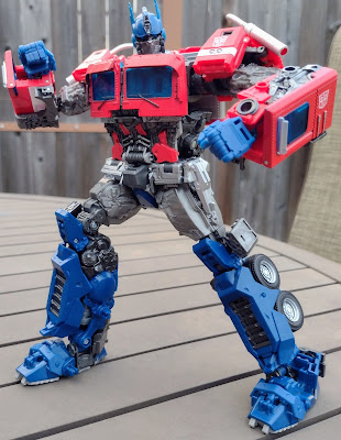
Transformation is pretty simple for this guy, as it's more or less identical to the Studio Series figure. I guess if it works for that toy then it may be just as good for this guy, right? Well to be fair, it isn't entirely like the Studio Series figure, as the arm kibble is slightly different between both figures as well as the head transformation is slightly more in-common with standard Optimus transformations than the other hinges that were used for the Studio Series guy. It's definitely easy for fans that wanted to have a more accessible Masterpiece figure, and I will say that the leg transformation feels accurate (and might I add that the closest to that is from the fucking Chip & Dale movie?)...it's just a shame that what the legs become in truck mode aren't that great. The robot mode is accurate to the movie, what with the G1 but moviefied look to him. It's got the proportions and details right, certainly moreso than the Studio Series version, with the only oddities being the forearms having the kibble on them. Granted, there's less bulk on them compared to the Studio Series toy, but when viewed from the back, they kinda throw me off since those parts of the vehicle mode would usually be hidden away to make the truck parts look like they're the same ones in robot mode. And while his truck mode is that of an Earthly variety, the robot mode is still the same Cybertronian look that has some vague differences. The lack of a grill makes him look as though he has no stomach, but turns out they didn't bother making his robot mode look Earthly, and I thought Bumblebee's top swap was bad.
Head sculpt is very accurate to the movie, with the greebling of the mouthplate, the gunmetal gray paint apps, and the kinda sad-looking eyes that lack the stern heroism of his 2007-TLK design, but while the head itself turned out well, I want you to realize that the ears are actually PVC instead of being a sturdier material. Why that is I can't tell you since they're not making it easy to justify some of the cost-cutting. Oh and the light-piping sucks too. His articulation is the norm for the line: his head can turn left and right and can only hang low in shame, the arms move front and back on swivels, in and out on ratchets with the spring-loaded shoulder pads moving out of the way; the biceps swivel rather tightly, the elbows bend deeply on ratchets, the hands rotate, bend downward somewhat, and the fingers have a single index finger and three conjoined fingers in addition to a ball-jointed thumb. The index finger can't point properly somehow. There is a waist swivel, hips that move front and back as well as in and out on ratchets for both of them, skirt armor that moves out of the way while being seamless for the design, swivels above the knees, knee bends on ratchets, and ankle pivots as well as rockers.
His Ion Blaster can be held in either of his hand, and you can pose his arms so he's holding it with both hands as he runs into battle, which is my favorite pose of his in general for this design. In fact, having him dual-wield it may work better since his right-hand sags down and his left-hand doesn't. Why? I do not know. I even tried to tighten it with the screw but nope. Rather baffling is the inclusion of the Matrix of Leadership. I mean, it is cool that they added it, but he never had it in the movie; not only was it left somewhere in Egypt, but it doesn't look like this! Now inb4 people rant about how Bumblebee's a reboot and is totally unconnected to the Bayverse, Bumblebee's still got the Movie design elements, Sector Seven's involved in the movie, Transformers in this universe (and in general for most franchises) can overhaul their designs, and we even have a Camaro to boot. In fact, Rise of the Beasts is moving away from the Bumblebee movie since we're now in the 90s and have bigger fish to fry! I don't know how the trilogy schtick will make it more or less connected to the movie...
...but anyways let's get back on topic. The Matrix can be removed, but while his hands can hold it to make the Light Our Darkest Hour pose, I think getting him to hold it isn't that easy. His biceps are already too tight, and while the deep elbow bends are helpful with the articulation, the upper parts of the elbows detach backwards a little too easily, and I think it's a tight fit for the hands as they hold the Matrix. It's manageable but I think I chipped some paint. And yeah, the arm kibble on the bottom doesn't make it look as cool as on other Primes.
For those who hated TLK's idea of Nemesis Prime (which I don't blame you for), Takara gave this figure a black repaint with Decepticon insignias to boot. I think this design works better for Nemesis Prime than it does for Optimus (the Bumblebee movie version at least), what with how sinister he comes off. The Matrix is ime green, but the truck mode still sucks.
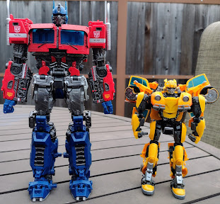
For a robot mode comparison, here is the leader with his scout, Bumblebee. I'll admit that Optimus has the stronger robot mode compared to Bumblebee, who I felt doesn't quite capture the robot design of the movie even next to the Studio Series version or the Power Charge toy, but I think it's at least able to have a superior vehicle mode overall. Plus, I like how funny it is to have Bumblebee give him the middle finger, which is one of the few Masterpiece figures to do that. It's because of him, we have a shitty truck mode for Optimus.
And for another robot mode size comparison, here he is next to the 2007 version of Optimus Prime. Look, I'll once again say that the Bumblebee design is much closer to its CG model than the 2007 design. I'll admit that. Yet even in spite of the compromises, the previous figure has, I can at least say it tries some new tricks to make it more distinct from the ROTF Leader. Whether or not they won everyone over is one thing, but I prefer the ambition we got with the previous MPM. Oh and the new guy's shorter than the older guy, which makes it perfect for making him look like he's going to bully him and confiscate his Matrix of Leadership away...speaking of...
It's no secret that the ROTF Matrix is very impractical for lighting our darkest hour unless it's an arc reactor blast type of thing, so I always wanted to see how other Transformers would look if they got to recreate that pose; now let's see what we have in terms of who's worthy of using the Matrix! Optimus Prime and Bumblebee are perfect, with the two of them having their wrists angled so as to make the poses more naturalistic (maybe they can also hold it from the front, too), Ironhide's a little awkward with his massive chest but can be done if it's over his head only, Jazz's hands are a little awkward but he can hold it over his head, Ratchet can pull off a similar thing with slightly more normal hands, VW Bumblebee's got the same results as his Camaro counterpart, Barricade can only hold it with his thumbs, Starscream's PVC fingers make it a little awkward to pull off properly, and Megatron looks like a bunch of tree branches are corrupting it.
Overall, this is a pretty hilarious Masterpiece if I'm being honest. While he doesn't have the over-expensive frustrations of the current G1MPs, he's the worst victim of the MPM budget restraints, because even if the rest of the line isn't as highly engineered as the G1 line or the third party line (compare these to the Unique Toys or Alien Attack offerings), none of the other figures suffered from the same compromises that we get here with the Beewun version of Prime. I'm amazed that this guy has a shitton of eBay listings in the triple-digits that seemingly try to paint this as a highly sought-after version of Optimus Prime, but apart from the robot mode, the transformation isn't that interesting, the vehicle mode looks like ass, and the engineering has some questionable design choices. I'm kind of happy that we're getting Blackout this year, because I can honestly saw in full confidence that Optimus Prime nearly killed off the MPM line.


No comments:
Post a Comment