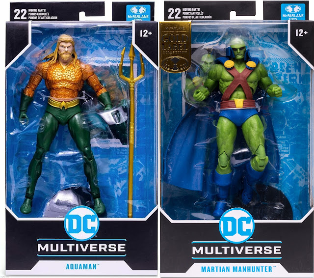
Here we have Aquaman in-hand, based on his appearance in the Endless Winter arc. I'm sure you could pretend that this is a classic Aquaman if Arthur had a clean shave, but with the fact that Aquaman had a design overhaul in the 90s before we reverted to a mostly similar look to his classic self in the New 52 era and an eventual tweak in Rebirth, with the 90s beard and mullet now kind of piggy backing the likeness of Jason Momoa's version. Think of how Marvel would have their comics and shows resemble the MCU (a drastic step further than making a TV show a year after a Marvel movie comes out back when Disney wasn't involved). The costume itself at least works well if you want a more vanilla take on the character, and the colors are classic enough without being too vibrant. The chain mail texture is a nice touch, and it helps contrast the green in the gloves and pants. The best part would be the fins in the back of the legs, which I'm amazed are included since it would be easy to reuse blank legs with no unique tooling to them. Annoyingly, the pins are facing outwards in the ankles when they are normally inwards. I guess if the pins on the knees and elbows are going to be a thing then this is acceptable. It's weird since I think Hasbro manages to make their ankle joints painless since they brought back Legends. The anatomy is generally good, though the legs could use a little more bulk to them.
His head sculpt is at least done very well, with the hair looking naturalistic in addition to the beard being appropriately rugged and seasoned for another take at a cooler Aquaman look. He does look like he's about to wonder what's for DINNER. With his tridents in his hand, his articulation is standard for the DC Multiverse line. He consists of double-ball neck joint, ball joints for front and back motion in addition to having them shift around with the rotator cuffs hiding said joint, hinges for outward arm movement, bicep rotation, double-jointed elbows, and double-purpose wrists that can rotate at two pegs, with the connection at the forearm allowing the hands to hinge either vertically or horizontally. The torso includes a diaphragm joint and dumbbell waist, hips can move front and back as well as in and out, slight thigh rotation is included, knees bend with double-joints, and the feet can rotate, hinge, and pivot. Finally, the toes can bend for natural walking poses.
Now let's talk about the side eye. Other than the lack of accessories beyond the card, stand, and trident, this is an issue I have with the figure given how 10 times out of 10, you'd want it to look straight forward. If there were alternate faces with the eyes facing different directions or if this was a statue, then the decision would make sense. As it is, this along with the first version of Battinson and Superboy Prime suffer from side eye syndrome. It is funny in certain pics, but then again, not needed.
As far as other versions of the sculpt are concerned, we have a black and white version with yellow accents exclusive to BBTS. A Digital version in classic colors comes with two alternate heads that would probably look better if they weren't in flowy hair. Not to mention the mediocre smile that contrasts his card art. His alternate hands make me wish the EW version had them. Also Q'wisp exists. The Task Force version, based on the fighting game for the SNES, is what I'd call wasted potential. While the idea of basing the figure (and the wave) off of the game is a neat idea, the constantly flowing hair combined with the lip stick paint let the figure down. While his pixelated deco looks decent like Batman's (the same can't be said for Superman and Flash), the lack of proper mentions for the game the wave is based on made this McFarlane's greatest dud yet. See, McFarlane haters? It's possible to be a fan of the line and still criticize it. Same goes for EVERY line.
As for the Martian Manhunter, this figure captures the comic proportions differently than how Aquaman does, though it does result in the arms being somewhat small on him OR his torso being somewhat undersized. The latter could be from the straps worn in his very simple costume, which is a just as revealing as on someone like He-Man. The anatomy could be hard to pinpoint what exactly feels off, though the textures on the bare skin are admirable. The prominent use of green combined with the primary colors on what little he's wearing does make him come across as the kind of toy you'd consider "neon" or "attention-grabbing", but they are at least applied in the right spots. He's also a happy medium in a "not quite Super Powers gaudy" way. His cape is made of PVC materials, which makes me wonder if Todd's going to do a more limited edition run with a wired cloth goods cape than this already is.
His head sculpt has the signature huge forehead in addition to the red eyes. Though shading is used minimally, I guess the most logical spot would be for the eyes (not to mention the black outline). Much like Aquaman, he has the same articulation and lack of accessories, but he has a flight stand. Is it really hard to give him fists for both arms???
As far as other uses are concerned, we have the original Rebirth version of the sculpt, which contrasts the classic by covering his shoulders and legs in addition to the legs. I kind of like this redesign more, and I was happy to see similar versions in the CW and in the Snyder Cut. The black and white version is basically the same figure but with grayscale applied to the skin, buttons, and cape.
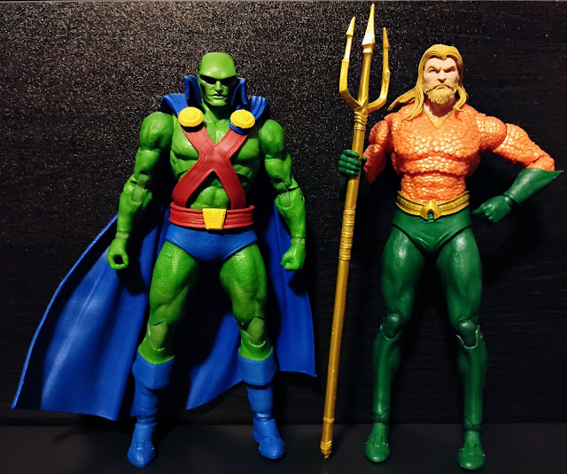
For a size comparison with Aquaman, if we assume Aquaman is 6'1" and Martian Manhunter 6'7", then the scale with these two is swapped. Even the figure Jon J'onzz was retooled from, Red Tornado, is not the right height. If we were to get an updated Martian Manhunter either from McFarlane or from Mattel (assuming they stay in the same scale), then making him better proportioned and taller than Aquaman should be a priority. That and making them both have more accessories than they currently do. Both figures are alright otherwise, but while Aquaman is pretty easy to get for cheap, the Martian Manhunter, being a Gold Label figure AND a classic design, will be difficult given the aftermarket value.
Final ranking: ⭐⭐⭐ and a half out of ⭐⭐⭐⭐⭐ (Aquaman)
⭐⭐⭐ out of ⭐⭐⭐⭐⭐ (Martian Manhunter)


No comments:
Post a Comment